Friday, 1:00pm
18 January 2019
(Typographic) Noted #89
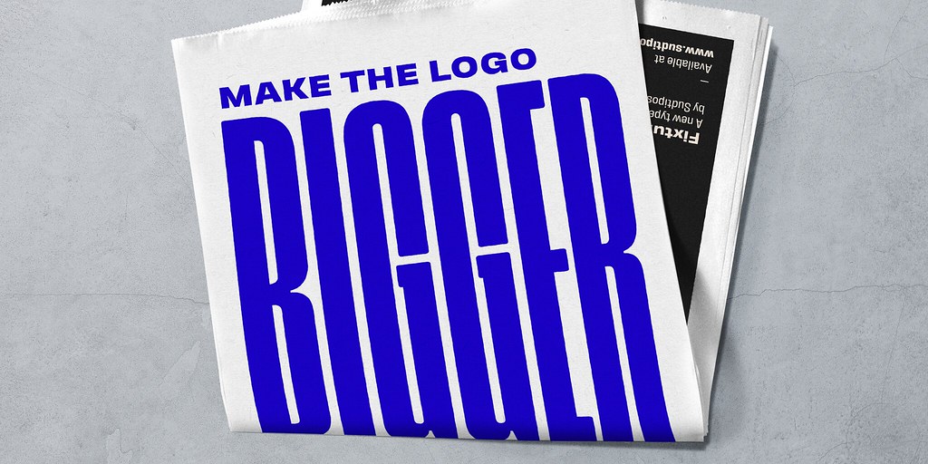
Raymond, Fixture, Typeset in the Future, Heldane and Letterform Archive

Here is a selection of type-related things – type specimens, new releases, a type book and a newly digitised archive – that caught our attention in recent weeks.
Raymond is a typeface named after its designer’s grandfather.
Spreads from designer Daniel Reed’s type specimen for Raymond, a bold serif font named after his grandfather.
Top: Fixture by Alejandro Paul.
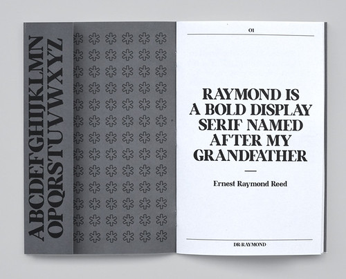
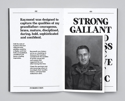
Raymond, designed by Daniel Reed (DR-Foundry), is a bold serif display font named after Ernest Raymond Reed, who served in the Second World War. In this break from conventional type specimens, Reed compares his intentions for the typeface to the qualities of his late grandfather’s character – brave, mature, disciplined and so on. The specimen forms an evocative documentation of life through type and image, from early war portraits and detailed images of his medal collection, to the extensive character set.
One of several animated specimens by Amuki for Alejandro Paul’s Fixture.
Fixture, designed by Alejandro Paul of Sudtipos.
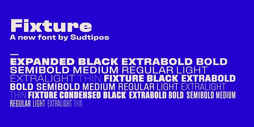
Argentinian type foundry Sudtipos recently released Fixture, an ambitious 72-font family that takes its inspiration from late-nineteenth century Grotesk typefaces, posters and wooden letterpress fonts. The family, designed by Alejandro Paul (see ‘Different strokes’ in Eye 80), is uncharacteristic for a foundry best known for elegant script typefaces. In his description of the family, Paul writes that ‘each different width and / or weight of this face ended up pulling a different dominant trait from the melting-pot origins of the entire family. It’s almost like a tribute album to some famous band’s covers of older songs.’ For Fixture’s specimen, Paul teamed with Ecuadorian design studio Amuki to make a series of short animations.
Spreads and cover from Dave Addey’s book Typeset in the Future: Typography and Design in Science Fiction Movies.
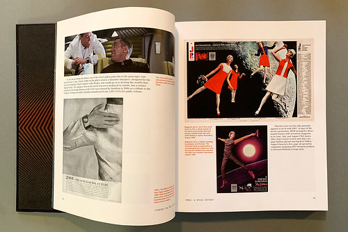
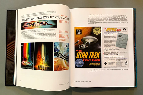
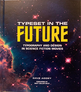
Dave Addey’s Typeset in the Future: Typography and Design in Science Fiction Movies (Abrams, £30) forms an extension of his website Typeset in the Future, where typography and iconography that represent an idea of ‘the future’ are examined. This dense volume provides a focused, yet humorous study of seven classic sci-fi movies – A Space Odyssey, Star Trek: The Motion Picture, Alien, Blade Runner, Total Recall, WALL-E and Moon – all of which have made use of Aldo Novarese’s Eurostile Bold Extended.
Heldane, designed by Kris Sowersby of Klim Type Foundry.
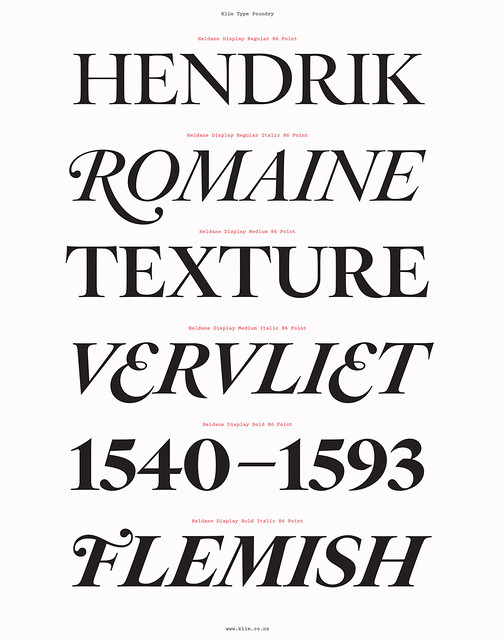
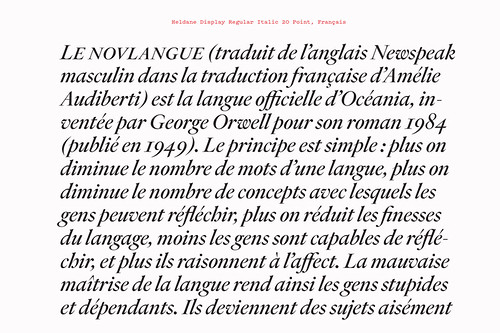
Heldane is Kris Sowersby’s extensive serif family that draws its inspiration from historical fonts by Hendrik van den Keere (1540-1580), Claude Garamont, Robert Granjon and Simon de Colines, while creating the kind of complete type families designers expect today. The face is very much a modern interpretation of the sources, taking what Sowersby regards as the most interesting aspects of several fonts. Van den Keere, for example, did not cut any italics, so the inspiration for these is the later Stempel Garamond. Heldane contains a finely detailed display family and a more robust text family for use at smaller sizes.
See ‘Reputations: Kris Sowersby’ by Mark Thomson in Eye 79.
A demonstration of the Letterform Archive’s online archive currently available to members who get exclusive beta access this year.
San Francisco’s Letterform Archive have begun the process of digitising their archive, starting with 1,000 highlights of graphic design and typography artefacts. Labelled as ‘an archive designed for designers’, the platform seeks to inspire designers through ‘radical accessibility’; the newly digitised items are currently available exclusively to members.
Eye is the world’s most beautiful and collectable graphic design journal, published quarterly for professional designers, students and anyone interested in critical, informed writing about graphic design and visual culture. It is available from all good design bookshops and online at the Eye shop, where you can buy subscriptions and single issues.
