Saturday, 10:00am
20 September 2014
Village people
Eric Gill
Edward Johnston
Phil Baines
Philip Hagreen
Frank Brangwyn
Hilary Pepler
David Jones
Design history
Graphic design
Typography
Ditchling’s elegantly revamped museum places Eric Gill in the everyday context of extraordinary craftspeople

The small Sussex village of Ditchling, near the South Coast of England, was in 1907 already something of a haven for a growing arts and crafts community when Eric Gill moved there with his expanding family, writes Catherine Dixon.
Others from Gill’s Hammersmith circles soon followed, including calligrapher Edward Johnston (1912), artist Frank Brangwyn (1918) and would-be printer Hilary Pepler (1916). There, spurred on by the fervour of his recent conversion to Catholicism and encouraged by the successful expansion of his letter-carving practice into sculpture, Gill arrived at what his biographer Fiona MacCarthy identified as, ‘the quintessential Gill philosophy: the concept of the artist as skilled person, the artist as creator in the context of everyday community activity.’ (Eric Gill, Faber & Faber, 1989).
The siting of the Stanhope Press as quasi-altar within ‘a chapel-like space’ is far from architectural fancy given the religious underpinnings of the St Dominic’s Press. Fiona MacCarthy notes a letter from Pepler in which he wrote to Gill on the pleasure of printing from his wood-engraved blocks: ‘It is rather splendid that we can as it were worship together in their use’.
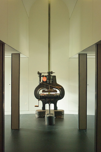
St Dominic’s Pressroom.
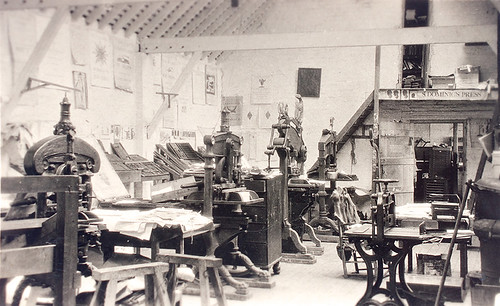
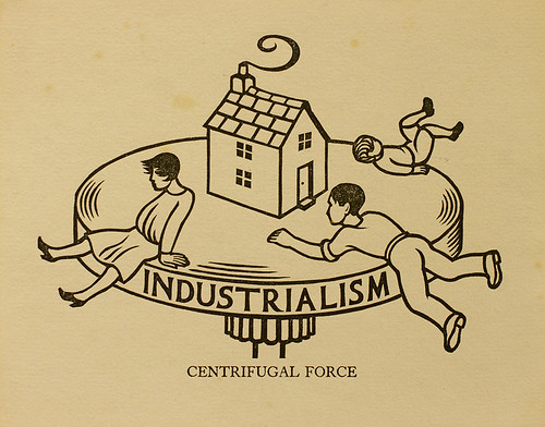
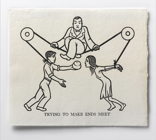
In 1921 this new-found philosophy prompted the founding in Ditchling of the Guild of St Joseph & St Dominic, where handwork was akin to worship. Through the St Dominic’s Press (above) Gill was able to further expound his theories, attracting still more practitioners to the community. Among the mix of weavers, stone-carvers and silversmiths, notable arrivals included the artist David Jones (1922), and wood-engraver Philip Hagreen (1923) who used his work to campaign for social change, the wit of his illustration illuminating difficult political issues to great effect (below). In fact many of Gill’s followers into the community were to outlast him there, subsequent generations sustaining the Guild until 1989, though Gill himself had moved on by 1924, restless and struggling to reconcile too many deep-rooted internal contradictions.
Philip Hagreen, Centrifugal force. Hagreen championed in particular the land reform theories of the Distributist movement producing illustrations for their magazine The Cross & The Plough, as well as for many of the St Dominic’s Press and Guild publications.
Philip Hagreen, Trying to make ends meet.
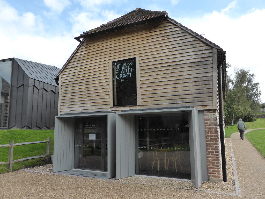
In 1985 the weaver Hilary Bourne and her sister Joanna, aged 76 and 78 years old respectively, bought the former school in the village and opened the first Museum – the Ditchling Museum. The recent renovation project builds on their vision and sees the previous muddle of buildings and outbuildings sensitively reconfigured by Adam Richards Architects into a fit-for-purpose space for housing a collection of international influence (below). Under the curatorial guidance of then director Hilary Williams, a once disparate array of exhibits has now found its focus in the remarkable convergence of craft practice to have emerged within the village, arranged along a ‘spine’ of tools and reflected in the updated name, Ditchling Museum of Art + Craft.
Ditchling Museum of Art + Craft.
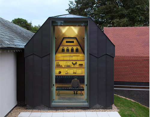
The new Museum has been a critical and popular success; it was named RIBA South East Building of the year and won a RIBA National Award. It was also one of the six finalists in contention for the 2014 Art Fund Prize for Museum of the Year.
Phil Baines (see Reputations, Eye 69) designed the identity for the Museum. His largely typographic scheme balances a concern for communicating an appropriate visual ethos with the pragmatics of the way such an identity is applied in analogue and digital contexts, especially the contemporary abundance of screen formats.
The four configurations of the main identity by Phil Baines.
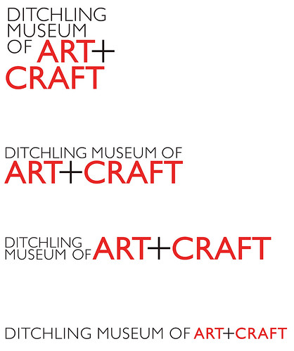
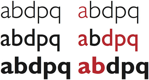
A typographic approach was selected early on to provide the necessary flexibility, though given the wealth of the typographic legacies housed within the collection, its execution was less straightforward than might appear. Gill’s typefaces were seen originally as being ‘too obvious’ a choice: early workings looked to both Johnston and Hagreen. In the end it was Hagreen’s pattern-making, combined with the work of Gill which prompted both the stacking arrangement and selection of Gill’s sans serif for the main identity text, with his typeface Aries used for body text. Baines requested permission from Monotype to redraw certain characters – ‘a’, ‘d’, ‘p’ and ‘q’ – aligning the museum version of Gill Sans more closely with the original metal version of the typeface.
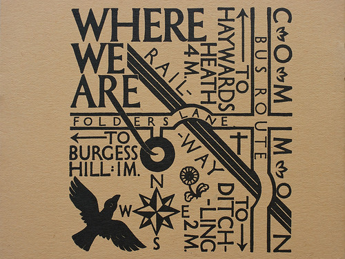
Hagreen’s map of how to get to Ditchling.
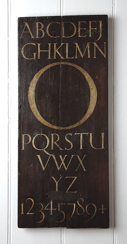
Alphabet by Eric Gill painted on wood, ca. 1905.
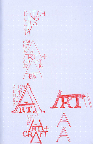
Early sketches for the identity by Phil Baines.
Following the 1989 publication of Fiona MacCarthy’s biography of Gill, with all its revelations concerning his unsettling sexual habits, evaluation of his work has become fraught with controversy. However the Museum has decided to include Gill and reference his work in its identity without, says Williams, condoning the choices he made in his private life.
One of the strengths of the new museum is that Gill is shown as just one artist among many. In such a way his work is not polarised, but rather contextualised, with the brilliance of the other practitioners around and after him finally in evidence to see.
Redrawn characters by Phil Baines and Natalie Braune by kind permission of Monotype.
Catherine Dixon, designer, writer, lecturer in typography, Central Saint Martins, London
Eye is the world’s most beautiful and collectable graphic design journal, published quarterly for professional designers, students and anyone interested in critical, informed writing about graphic design and visual culture. It is available from all good design bookshops and online at the Eye shop, where you can buy subscriptions and single issues.

