
Wednesday, 1:00pm
5 August 2009
Visual rhetoric
What we mean when we talk about form, by Leslie Atzmon
Like the late American comedian Rodney Dangerfield, aesthetic form ‘don’t get no respect’, writes Leslie Atzmon.
Indeed, it is purposely avoided, and design is conspicuously missing, in certain predominant strands of visual scholarship. This absence makes me wonder what’s so visual about visual culture studies. As a linguistically based discipline, visual culture studies ‘verbalises’ visual artefacts by casting them as passive objects of looking and seeing, or as visual representations that circulate in a given culture.1
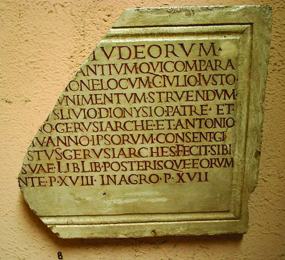
Top: Roman monumental lettering, second century, from the presidential estates in Castelporziano, near Rome. The original is in the Museo Nazionale Romano. Picture by Giovanni Dall’Orto, 12 April 2008.
Speaking at the Design and Semantics of Form and Movement (DESFORM) conference in 2006, Richard Thomas claimed that: ‘In essence, form has no meaning; it is an invitation, a window to possibility. Meaning resides, and is latent within us [the users].’ Thomas does make a good point – users are important participants in design’s meaning-making capacity. But there is more to form than meets the eye. I suggest that the form of design is impurely aesthetic: visual material is not merely an inert prompt for user-generated content but embodies a range of meanings that owe much to the designer’s beliefs and to the historical contexts in which the artefacts were designed. As W. B. Yeats asked (in his poem ‘Among School Children’), ‘How can we know the dancer from the dance?’
My own experience as a design practitioner has made me acutely aware of the meanings that my choices for the material aesthetic form of my design may create for my users, and how these meanings reveal aspects of our contemporary culture. It is clear that there is an unfortunate disconnect between this essential aspect of design practice and the thrust of contemporary visual theory.
Seeing and thinking
I sometimes wonder if our love affair with linguistically based theory is a self-aggrandising attempt to ensure that visual research is seen as intellectual. I wasn’t sure whether to laugh or cry when I read David Thompson’s Agenda about ‘Art bollocks’ (‘Artspeak: How did “Art bollocks” become the default way of writing about visual culture? Could Mao have the answer?’ Eye no. 62 vol. 16). I was particularly struck by its twin complaints that pure aesthetical concerns are ‘apparently inadequate’ to many artists, tutors and curators, and that ‘theoretical “relevance” is the order of the day’. Is there a way that visual theory can be aesthetically oriented and intellectual at the same time, and can it be better adapted to designers, design scholars and design educators? In a nutshell, then, how might visual theory address design’s material aesthetic form?
In her introduction to Defining Visual Rhetorics (Lawrence Erlbaum Associates, 2004), editor Marguerite Helmers considers the communicative function of material aesthetic qualities: ‘One of our projects as visual rhetoricians is to differentiate ourselves from semiology by studying material as rhetoric. What does the character of a texture of pencil on paper or a smooth and reflective wall with names etched into its face impart to the meaning that the spectator takes from the object?
We tend to think of rhetoric as composed of verbal or visual messages that have a tactical persuasive objective – a speech that wants to convince us to vote for someone, or an ad that tries to persuade us to buy a particular product. We tend to overlook a different level of rhetoric that has to do not with a calculated objective but with a broad set of meta-beliefs. Design artefacts are particularly effective at this second level of persuasion; they offer audiences communicative data that reflect, and also orchestrate, an array of cultural concerns. This persuasive substance includes the aesthetic form and material composition of any object.
Below: Maya Lin, Vietnam Veterans Memorial, Washington, D.C., 1982. Photographer Alan Languirand.
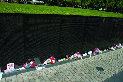
Take Maya Lin’s Vietnam Veterans Memorial in Washington DC (above). The V-shaped granite wall and pedestrian path that begins below ground level and then rises to the earth’s surface lead visitors through what has been described as a ritual enactment of the process of death and renewal. But Lin’s typographic choices for the monument – the chiselled, equally spaced Optima uppercase letters, the consistent size type, and the deep ‘rag’ – also contribute pertinent content. Optima capitals are based on Roman monumental lettering but also suggest the sans serif fonts favoured by the military-industrial complex that boosted the Vietnam War (the font is also used in the campaign material for the Republican presidential candidate, John McCain). Lin’s discussion about the type she chose for her 1989 civil rights memorial in Montgomery, Alabama, in Boundaries ( Simon and Schuster, 2000), offers some insight into her design thinking:
What this movement was really about was the acts of an entire people ... I wanted to convey this even in the specific typeface I chose for the memorial. The lettering style is based upon a Roman text and was designed by John Benson, a master stone engraver and type designer. It’s what he described as the common [Roman] people’s text as opposed to the more formal [Roman] serif lettering. Benson, who also acted as a consultant for the Vietnam Veterans’ Memorial, has a different approach to letter cutting than a typographer might ... when text is excised into stone, the tablet is read as a whole before it is read line by line.
From a distance, in fact, the deeply ragged text blocks of the Vietnam Veterans Memorial resemble a tattered shroud relic encased in granite. The content generated by its Optima text blocks is modified by their material form – the monument would offer a rather different set of meanings if the text were printed on vinyl, for example, instead of incised in granite. The meanings that may be associated with Lin’s design – death and renewal, classical military grandeur juxtaposed with corporate self-interest, and reliquary – come together for me in a rhetoric of timeless conflict, monumental sacrifice and personal loss in the service of a political agenda. These meanings might be understood differently or even glossed over by other users, but that does not negate the designer’s intentionality or the aesthetic form’s intended meaning-making capacity.
Essence of bling
Although visual theory rarely explicates typographic material, ornamental form has had an especially bad rap; it is typically relegated to the status of hollow decoration. In 1908, the architect Adolph Loos proclaimed: ‘The evolution of culture is synonymous with the removal of ornament from utilitarian objects.’ However, a resurgence of embellishment in contemporary graphic design makes this is a good time to elaborate the ways ornament reveals and shapes cultural motifs. Design critic Alice Twemlow sees this newfound passion for embellishment as an ironic ‘celebration of uselessness ... directed at fellow designers’ ‘The Decriminalisation of Ornament’, (Eye no. 58 vol. 15), which dissociates work from its content. I understand her point, although it seems to me that this slice of contemporary design practice might have a lot to say about the character of current design culture. At any rate, some contemporary ornament actually does emerge from its project’s content (a fact that Twemlow acknowledges in her essay).
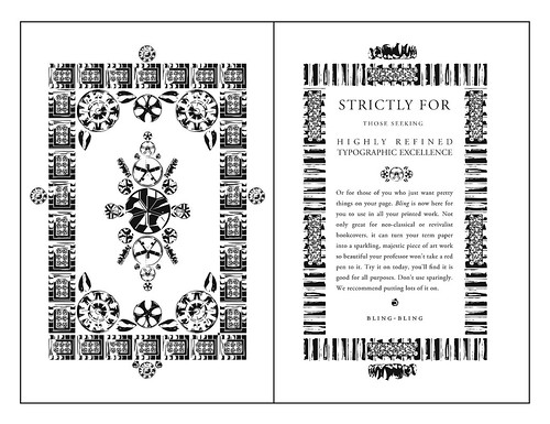
Above: Ryan Molloy, Spread from the visual essay ‘Iced Up” and ‘“Platinum Plus”: The Development of Hip-Hop Typographic Ornaments’ forthcoming in Visible Culture: Visual Rhetoric and the Special Eloquence of Design Artifacts, Leslie Atzmon, editor.
Graphic designer Ryan Molloy’s bling-inspired font is a shining example of lucid ornamental form. Molloy was motivated, in part, by the way personal status earned through excess pervades hip-hop culture and artefacts. Obviously, his ornaments reference bling – embellished hip-hop-style automobile hubcaps, grilles, gold teeth and diamond-encrusted accessories. But, as he explains, they ‘also celebrate visual appropriation in general, while they simultaneously serve as a tongue-in-cheek commentary on the mainstreaming of hip-hop’ status symbols.2 In his design process, Molloy purposely fuses bling elements with sampled bits of Art Nouveau and Art Deco ornament: ‘Like a hip-hop DJ, I integrate these older forms with my newly designed bling-inspired ornaments. I am not, however, merely borrowing indiscriminately; I am deliberately choosing these ornamental forms and assimilating them in celebration of hip-hop culture’s penchant for discontinuity.’ The form of his ornament is also driven by hip-hop culture’s unabashed inconsistencies – ‘rappers wearing gold chains and driving luxury vehicles, for example, while rapping about living in poverty’.
Molloy consciously references traditional type design techniques by making careful pencil drawings (below) based on samples from a Diablo wheel rim catalogue. He replicates the basic geometry of the original object, observing carefully how the reflected light alters its form: ‘The drawing process ... create[s] a heightened illusion of depth, an immaculate shimmer on the surface of the page.’
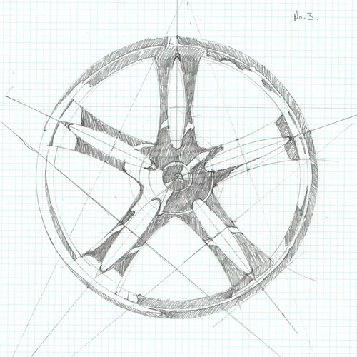
Above: Ryan Molloy, Sketch for Bling ornament.
‘Simultaneously, it is an exaggeration of form that fuels the underlying satire.’ Since these ornaments need to function as a working font, Molloy carefully renders them in digital form.
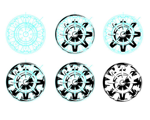
Above: Ryan Molloy, Digital rendering process for Bling ornament.
But he also flouts typographic conventions in order to maximise usability. These ornaments function as an easily applicable commodity, according to Molloy, and he associates them with commercial merchandise like Bling Ring stick-on Swarovski crystals for mobile phones (below). His ornaments transform hip-hop’s glorification of luxurious excess into a set of easily reproducible artefacts whose meanings resonate in popular culture, in hip-hop culture, and in design culture.
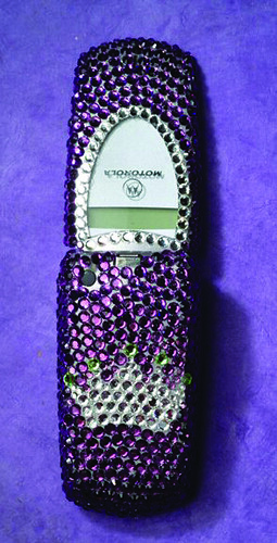
Above: Bling Ring stick-on Swarovski crystals on a mobile phone
Looking closely at Molloy’s sources and his ornament, I am struck by the lavish abstract geometric and anthropomorphic forms. The perceptual psychologist Rudolph Arnheim argues that ‘geometric shapes, schematic, symbolic, or so-called ornamental representations ... provide the most clear-cut images of the basic configurations of forces that ... underlie man’s life, and therefore man’s thinking, even in refinement and complexity’.3
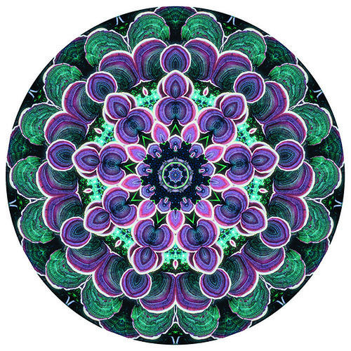
Above: Contemporary mandala made from a photograph of tree fungus.
In other words, geometric shapes are frequently used to represent the human condition. Molloy’s abstracted circular rim and diamond forms resemble mandalas – ritualistic circle forms that connect users with the cosmos. Like Molloy’s ornament, mandalas are complex designs that are visually organised around a circle’s centre point. Perhaps Molloy has captured, in his ornaments, a sort of transcendental rendering of the human desire to be connected to a greater power.
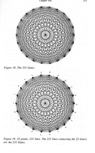
Above: ‘The 231 Gates’, Circular diagrams using Hebrew letters, from Sefer Yetzirah by Aryeh Kaplan, 1997, Red Wheel / Weiser.
The notion that geometric and anthropomorphic forms are magical or even sacred is not new; it has its roots in classical Platonic philosophy. These ideas resurfaced in the Kabbalah, a set of esoteric teachings that originated in medieval Judaism. Some Kabbalistic practices link the Hebrew letterforms and two-dimensional geometric diagrams simultaneously with the body and with the incomprehensible aspects of God. The seminal Kabbalistic text Sefer Yetsirah (The Book of Creation) equates individual Hebrew letters – which happen to be remarkably anthropomorphic – with parts of the body. The letter mem, for example, is a square-shaped letter that Kabbalists commonly associate with the stomach. Circular arrays of the twenty-two Hebrew letters, such as those pictured in the figures above, were believed to be able magically to evoke cosmic forces, including God’s creative power. According to the historian Peter Murray Jones,4 medieval medical diagrams likewise used circular forms to portray relationships between the body and the cosmos (below). In Sefer Yetsirah , as in medieval medicine, the circle serves as powerful delineating force that conjoins the letters of the alphabet with both the body and the cosmos.
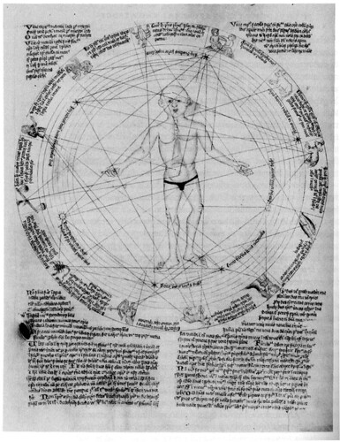
Above: Medieval medical diagram that shows how the body is interconnected with the circular cosmos. In Medieval and Renaissance Medicine: An Introduction to Knowledge and Practice by Nancy G. Siraisi (from the Wellcome Apocalypse, Wellcome Institute Library, London).
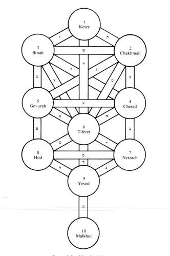
The Kabbalists’ Sephirotic diagram (or Sephirot) is structurally associated with the supernal ‘man’, a celestial ‘prototype’ for human beings. But this diagram is also an abstract representation of the human figure broken down into its basic formal components – a bilaterally symmetrical series of circles (spheres) interconnected by rectangles (cylinders).
Below: The ‘Supernal’ Man (top) mapped on to the Sephirotic diagram (bottom), from Sefer Yetzirah by Aryeh Kaplan, 1997, Red Wheel / Weiser.
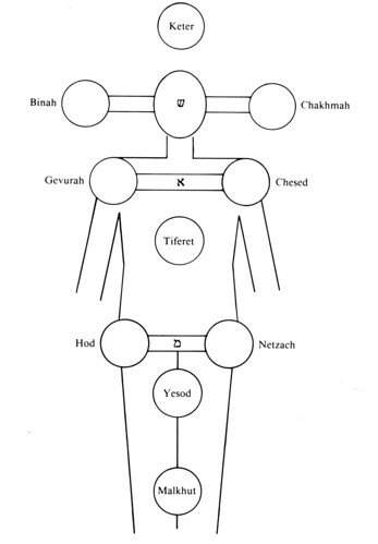
Contemporaneous anatomical drawings are similarly two-dimensional and diagrammatic, with figures drawn in frog-like postures. Medieval depictions and descriptions of the system for dispersing vital humours and fluids throughout the body, moreover, bear a particularly striking resemblance to visual and verbal renditions of the Sephirot. The belief that God’s essence, as a vital force, descends from the upper Sephirot to the lower ones, for example, parallels the notion of the descent of the anima or vital force through the body in medieval physiology. There are no designer notes about this diagram. But designerly analysis of the diagram’s form – bolstered by copious descriptions for its use – offers new insights into the relationships among medieval medical theory, the function of mystical geometric symbols, and the nature of Kabbalistic culture.
These case studies demonstrate that the special eloquence of visual form has been lost in the drive to rid ‘new’ theory of the older emphasis on aesthetic objects. I think we need a re-conception of formal analysis of visual objects –a new focus on visual form as a site of rich rhetorical material. The design historian Victor Margolin argues that we need to locate design in the historical circumstances of its production, and work from there to do formal analyses. I’d like to build on Margolin’s ideas by demonstrating that the rhetorical analysis of formal material can also lead to new insights about the historical circumstances in which these entities function. Narrowly constructed ideas about the aesthetic form of visual objects have stifled innovative discourse that I believe could reshape how we understand aesthetic form. In response to David Thompson’s wry title, I would say that Mao doesn’t have the answer: the answer is right before our very eyes.
[Ryan Molloy will discuss his Bling font in a panel discussion at the Design History Society conference, University of Hertfordshire, UK, 3 > 5 September 2009.]
FOOTNOTES
notes and further reading
1. The discipline of visual culture studies embraces a theoretical approach that developed in response to nineteenth-century ‘reflectionist’, object-focused art historical models. In Visual Culture: The Reader, Jessica Evans informs us that ‘in the historicist narratives upon which art history’s early disciplinary rationale was founded, successive schools of painting move steadily toward a goal of the perfect reproduction of reality ... their adequacy as reflections of an external “reality”.’ Evans and co-editor Stuart Hall point out that the ‘linguistic turn’ or ‘cultural turn’ in the social sciences makes it impossible for the analysis of visual entities to ‘turn back to the pre-semiotic assumptions of reflectionism’. The evaluation of the aestheticised object in art history, Evans and Hall further explain, has been superseded by analysis of ‘visual metaphors and terminologies of looking and seeing’ in cultural studies.
2. Quotes from Ryan Molloy are taken from an essay to be published in Visible Culture: Visual Rhetoric and the Special Eloquence of Design Artifacts, edited by Leslie Atzmon (West Lafayette, Indiana: Parlor Press, in preparation).
3. Rudolph Arnheim, ‘Perceptual Analysis of a Cosmological Symbol’, in The Journal of Aesthetics and Art Criticism, 19, no. 4, (Summer 1961): 398.
4. Peter Murray Jones, Medieval Medical Miniatures (The British Library, 1984).
Eye is the world’s most beautiful and collectable graphic design journal, published quarterly for professional designers, students and anyone interested in critical, informed writing about graphic design and visual culture. It is available from all good design bookshops and online at the Eye shop, where you can buy subscriptions, back issues and single copies of the latest issue.