
Wednesday, 11:29am
19 April 2017
Winding up with Mills and Beckett
John O’Reilly reflects on Samuel Beckett’s Murphy and Russell Mills’s artwork for Picador’s Beckett series published in the late 1970s and early 80s
‘The sun shone having no alternative on the nothing new.’ That was Dublin in 1983 and we laughed appreciatively with the grim humour of Beckett’s opening line in Murphy, writes John O’Reilly.
Beckett’s Murphy is based in London where myself and other fellows would end up as home, and the central character ends up (like one of my best friends) getting a job in a psychiatric hospital – the ‘Magdalen Mental Mercyseat’. The research for the book was partly based on Beckett’s analysis with Wilfred Bion in the 1930s, and partly by visits to his friend Dr Geoffrey Thompson, who worked at the Bethlem Royal Hospital in Beckenham.
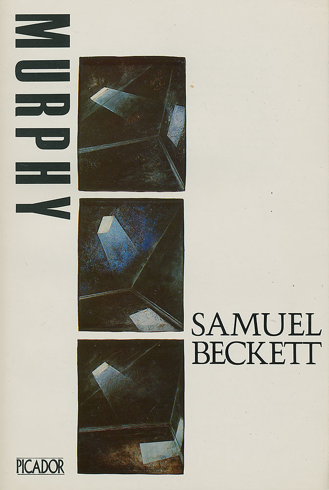
The cover image of the book was as spacious, fluid and stifling as Beckett’s story, a commission by Pan Art Director Gary Day-Ellison of illustrator Russell Mills. Mills’s set of images are called Murphy – Zones. In the novel, Murphy describes three zones of consciousness – light, half-light and dark – and these are Murphy’s zones of the imagination to play in, a typically minimalist Beckettian formula. Consciousness as repetition, difference, variation. Minimalism has been applied as a concept of style, in art, design and literature but Beckett invented a minimalist metaphysics that was modern and spatial, dark and funny. Beckett’s characters struggle for representational forms – Godot famously never appears – and like the chess game in Murphy, representation and its breakdown, is about a darkly humorous play of process about the failure of representation, about the creative experience of change.
In Eye no. 5, (‘Russell Mills: Material and metaphor’), Marco Livingstone reveals that Day-Ellison saw a project by Mills on Beckett, a series of around 80 drawings in graphite or white chalk of the human head motivated by Mills’s readings of some short Beckett works. Mills then produced a series of images for Day-Ellison that moved away from representational drawing into working with materials. ‘I’d grown tired of making these very raw, direct, figurative drawings,’ says Mills, ‘and was once again exploring mixed media ways of interpreting Beckett – much to the consternation of the editors at Picador. The most difficult and paradoxically most liberating aspect of working on these works for Beckett was to abandon the figure, to avoid any specificity, to allude, to suggest, rather than describe or define.’
These images are a more oblique encounter with materials (working with materials other than graphite and chalk) that parallels Mills’s own professional encounter with Samuel Beckett himself.
My encounter with Mills was via email and he reflected on the encounter with Beckett, mediated through letter-writing and human intermediaries – the material and format of the letter was very much part of footnoting, parenthesizing and folding the encounter into the work. Though Beckett was reclusive in the sense of drawing a line around the idea of the public, his publisher John Calder saw the commercial relationship with Picador as an entry point to a wider audience. ‘My letters were generally about my ideas for each cover,’ says Mills, ‘peppered with questions about aspects of interpretation and meaning, accompanied by sketches of ideas for each book. He would respond on plain postcards delivered in an envelope, which in its turn was within another from Calder, each simply printed with his name in black. His responses were typically cryptic or sparse. He would offer guidewords or succinct phrases, such as “Wraith-like beings in wraith-like places”. If he was happy with an idea or a direction he’d simply encourage me (non-specifically of course) to carry on. And if he was unhappy with an idea, he’s simply say, “No, not right”, or words to that effect. Eventually we got there, and as far as I knew from Calder, Beckett was, gratifyingly, very happy with the covers.’
Beckett’s exploration of minimalism was also played out in the postcards he sent to Mills who had an eye for repetition and variation. ‘Years afterwards I came across the cards that Beckett had sent me,’ reflects Mills, ‘and discovered something very interesting, very Beckettian. I noticed that by placing the postcards one on top of the other in chronological order that each was fractionally smaller than the previous one, say a millimetre off each side on each subsequent card. Chance? The result of imprecise trimming at the printers? Or another example of Beckett’s craving for yet more compression, a device that obliged him to write less?’
Mills, now better known in certain circles for his intensely graphic packaging for Nine Inch Nails, muses, ‘Beckett’s work is still very central to my work: zones of consciousness; consciousness as collage as contingency; stuff happens; Dante, et al.’
Which is how Darrach and I read Murphy, as an assemblage of words inside the book, Mills’s cover, as contingent performance in our replaying the chess game at the end of the novel between Murphy and the schizophrenic Mr Endon in the ward of the Magdalen Mental Mercyseat.
The night before our first year Beckett tutorial, Darrach and I found a table in UCD’s Belfield bar – a prefab, beer-soaked improv of a building. We got the chess set from behind the counter and sustained by pints of stout moved the figures according to the chess game plotted by Beckett. After an hour of drinking and playing, Black ends up with his pieces exactly where they were on the adjacent side, the territory was the same, the geography was different. Dry.
In Ireland, and now in Brexit Britain, too, Republicans, Loyalists, Unionists and Nationalists are all fine at marking territory and borders, but rubbish at the contingency and creative possibilities of geography. Unlike Mills’s Murphy – Zones cover image, which challenges our perception of figure and ground, challenges the idea that they they are fixed, that they are closed entities like the Ireland of 1983 like the wall of Trump, like the cultural and nativist wall of Brexit Britain.
A shorter version of this appears in Varoom 35, ‘The Storytelling Issue’, February 2017.
John O’Reilly, journalist, editor of Varoom, London
---
More Pricks Than Kicks (1982): nails, etching varnish, paper, acrylics, enamelled wood.
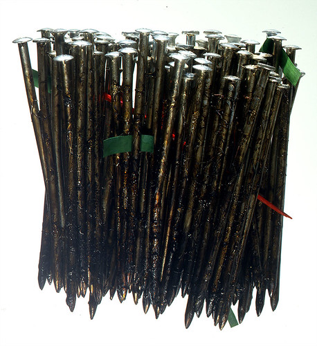
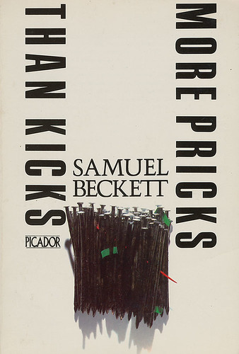
The title is a parody of the phrases ‘to kick against the pricks’ and ‘more kicks than ha’pence’ echoing the Biblical Acts of Apostles (IX 9:5 and XXVI 14), says Russell Mills talking to John O’Reilly: ‘It is of no use to rebel: if thou do, thou sickest against the pricks: and every act of rebellion against Him is a wound to thine own soul. God will either end thee, or mend thee: will thou then kick on?’ For Beckett his title suggests an individual’s struggle against fate and authority.
The work uses four-inch nails, densely packed, like a forest, covered in a thick glutinous bog-brown etching varnish. Claustrophobic, they allude to Irish censorship, as well as implying the sexual connotations in Beckett’s usage. Poking out of them are a couple of tiny rectangles of green paper, like flags, representing the green of Ireland, and a bright red enamelled pointed toothpick – a painful irritant to authority and the censors. Needless to say More Pricks Than Kicks was banned in Ireland until 1972.
Company (1982): plaster, oils, acrylics, enamelled wood in cardboard box.
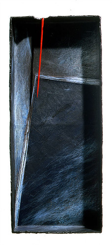
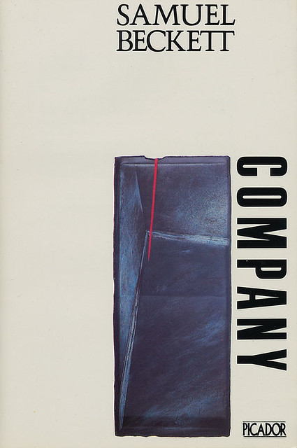
Part autobiographical: an old man lying on his back alone in the dark is spoken to by voices devised by the listener for company; the story or fragmented stories are clearly taking place inside the old man’s head. In a state of ‘relaxation of consciousness’, imagination takes over and the self becomes liquid, malleable and multiple. The voice-tormented listener struggles with a need and obligation to imagine as well as his anguished awareness of waning powers and an inability to connect to the past. Beckett says, ‘Confusion too is company, up to a point’.
The artwork suggests an enclosed space, a room, a box. It is pierced by a single bright red spear-like spike of enamelled wood, implying an intrusion, something unsettling, unwelcome or menacing, it is both an unavoidable irritant and a necessary prompt to trigger memories.
Murphy (1983): plaster, oils, acrylics in three cardboard boxes.
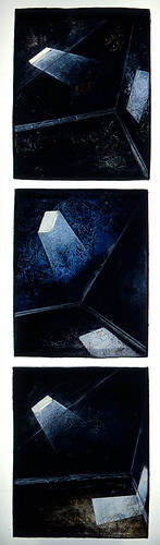
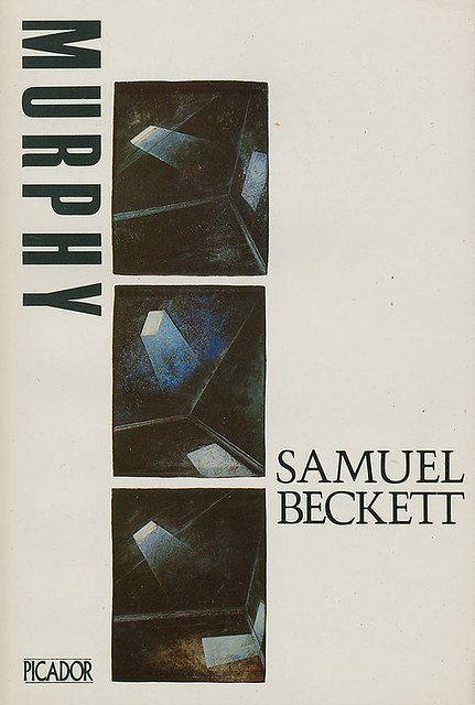
Murphy lives in West Brompton, a condemned mew – used in the singular rather than the usual ‘mews’, originally signifying a cage or building for trained (and especially moulting) hawks, and also, as a verb, meaning ‘to confine in a restricting place or situation’. Sat naked in a rocking-chair, secured by seven self-tied scarves, able to make ‘only the most local movements’, Murphy, his body appeased and his mind freed, seeks ‘that self-immersed indifference to the contingencies of the contingent world which he had chosen for himself as the only felicity and achieved so seldom’ to achieve a kind of Nirvana.
The work, using three boxes, with the changing beam of light from a skylight, attempts to deal with Beckett’s explorations of Murphy’s three zones of consciousness that, through this habitual restrictive practice, he travels through in his desire to attain an existential state of being.
Trilogy: Molloy, Malone Dies, The Unnamable (dated 1979 but this edition was either 1982 or 1983): stones and chalk on scratched slate.
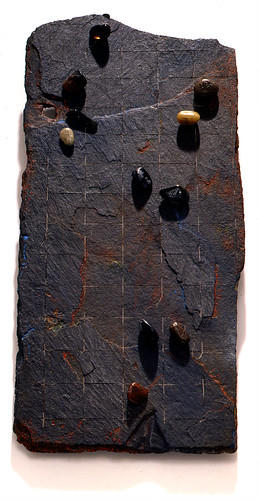

As this cover had to deal with three novels I decided to concentrate on an image and an idea that would encapsulate the essence … Beckett’s concern with the disintegrating relationship between subject and object. As an exercise in withdrawal and striving to illuminate the illusions that we hide under – rather than face – the awful truth, Beckett seeks to reduce expression to communicate his bleak view of the world. In his efforts to escape the illusions that we live under, the need to think, the need to communicate, the need to comprehend everything around us, Beckett came to frightening conviction that this was beyond our faculties. Nonetheless we go on. We continue, somehow on, devising strategies for coping, for evading the awful truth. I decided to use the famous and hilarious ‘Sucking Stones’ passage in Molloy as my motif.
A Samuel Beckett Reader (1983): plaster, oils and acrylics on board.
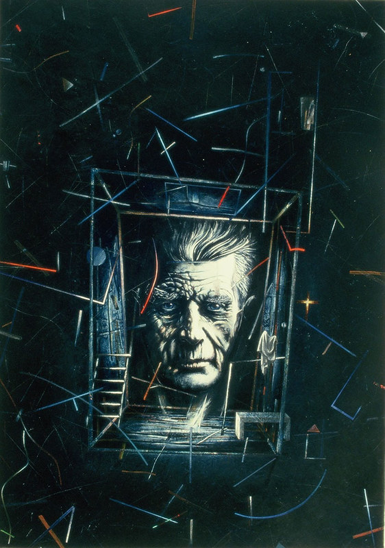
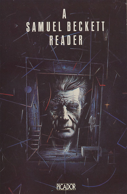
This necessitated a portrait, so I attempted one. Beckett’s head floats, ghost-like against and within a ground suggestive of numerous motifs from Beckett’s canon: a night sky and its possible astrological clues and cues, a transparent room or box merely defined by lines, stairs, draped fabric.
Beckett has been a hero of mine since my teens and his writing still informs much of what I do. That commission was a real honour for me. I’m also pretty proud of them for their abstracted nature, made as they were when much of the illustration work being commissioned was still predominantly figurative and literal.
Russell Mills in conversation with John O’Reilly
Eye is the world’s most beautiful and collectable graphic design journal, published quarterly for professional designers, students and anyone interested in critical, informed writing about graphic design and visual culture. It is available from all good design bookshops and online at the Eye shop, where you can buy subscriptions and single issues.