Monday, 12:25pm
9 January 2012
Words in practice

Writing and designing are part of a continuum of communication skills.

Graphic design has always been about words and images. Nowadays words play an even bigger role in design practice because designers are expected to provide a written context, narrative or explanation for their work, writes Jim Northover.
It’s not that images have given way to words – so much of today’s media is defined principally by the dominance of imagery over text – but words and writing have become integral to the design process.
In the world of brand and identity design, practitioners invariably talk about ‘storytelling’, the need to build a narrative around the defining visual elements of a brand. They refer to ‘verbal’ identity and speak about tone in terms of ‘voice’ as well as colour and imagery.
For some designers this comes quite naturally: they see writing, drawing and designing as part of a continuum of communication skills, not separate disciplines. Others, either by aptitude or training, are more comfortable with the formal aspects of visual design. Many have come into design because literacy and fluency with words were not their strengths, and although the teaching of typography has changed radically over the years, it has been an article of faith that the Modernist typographer ‘erected a window between the reader … and that landscape which is the author’s words’1 (in Beatrice Warde’s famous metaphor). The typographic designer helped frame the view, but nothing more.
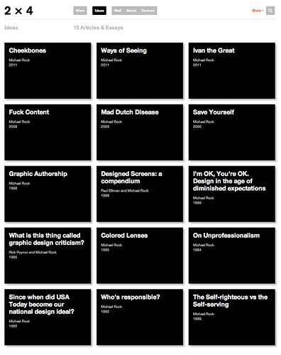
Since then the debate about the designer’s role in relation to content has continued. Paul Rand has been quoted as saying that ‘design is the method of putting form and content together’2, seemingly acknowledging that while the designer has total responsibility for form he or she may have some or no responsibility for originating the content. When Michael Rock addressed the same issue three years ago he declared that designers needed ‘to find ways to speak through treatment via a whole range of rhetorical devices – from the written to the visual to the operational …’
‘Our content’ he went on to say, ‘is, perpetually, Design itself’3. See 2 x 4 website, below.)
It seems to me that designers who retreat to the formal visual aspects of design as a safe haven restrict the power and influence of their work. Design should embrace all the communication devices it can to get a message across. Words are just part of the whole. Designers often need to spell out exactly what it is they want to say: to their clients, and to those whose work they coordinate, be they photographers, illustrators or copywriters. Without words we are lost.
For these reasons, now more than ever, we need designers with writing skills who understand the craft of communicating with words, and can combine these with complementary visual skills. Given this trajectory of the contemporary designer’s role, I lament the closure of the one postgraduate course in Europe4 that attempts to reconcile writing and design and look critically at how the disciplines interact.
Footnotes:
- Beatrice Warde, The Crystal Goblet, Sixteen Essays on Typography, 1956.
- Paul Rand, Interview with John Maeda at MIT, 1996, published in Maeda@Media, Universe Press, 2001.
- Rock, Michael ‘Fuck Content’ 2009.
- London College of Communication MA Design Writing Criticism, see ‘Not enough critical mass?’ on the Eye blog.
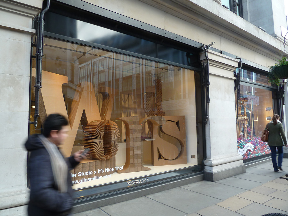
Top: window installation by Giles Miller / It’s Nice That for Selfridges in London.
Eye is the world’s most beautiful and collectable graphic design journal, published quarterly for professional designers, students and anyone interested in critical, informed writing about graphic design and visual culture. It’s available from all good design bookshops and online at the Eye shop, where you can buy subscriptions, back issues and single copies of the latest issue, Eye 81.

