Wednesday, 11:00am
8 September 2021
Year of the pictograms

various designers
Kamekura Yūsaku
Yusaku Kamekura
Katsumi Masaru
Yamashita Yoshirō
Kōno Takashi
Hara Hiromu
Ashihara Yoshinobu
Tange Kenzō
Brand madness
Design history
Graphic design
Information design
Posters
Reviews
Events and exhibitions
Tokyo 1964: Designing Tomorrow, 5 August – 7 November 2021
Curated by Japan House London in collaboration with Yamashita Megumi and David Phillips. Produced by Japan House London in collaboration with Japan Sport Council. Exhibition design: Mentsen‘Tokyo 1964’ demonstrates the lasting influence of that year’s games on design for the Olympics

As this year’s Tokyo Olympic Games were nearing their end, an exhibition exploring the legacy of Tokyo’s 1964 Olympics opened at Japan House in London. ‘Tokyo 1964: Designing Tomorrow’ is a comprehensive case study of the 1964 Olympics and its lasting design legacy, writes Gabriela Matuszyk.
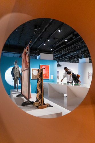
The exhibition features an abundance of artefacts including posters, programmes, design guide sheets, uniforms, medals and Seiko stop watches. The jubilant cinema trailer to Ichikawa Kon’s 1965 documentary Tokyo Olympiad welcomes visitors to the space. (Japan House is also hosting free screenings of the 170-minute movie.)
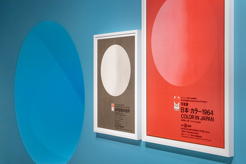
Right and top. Installation photographs of ‘Tokyo 1964: Designing Tomorrow’ at Japan House by J. Souteyrat, 2021. Top image shows the groundbreaking sports pictograms designed by Yamashita Yoshirō.
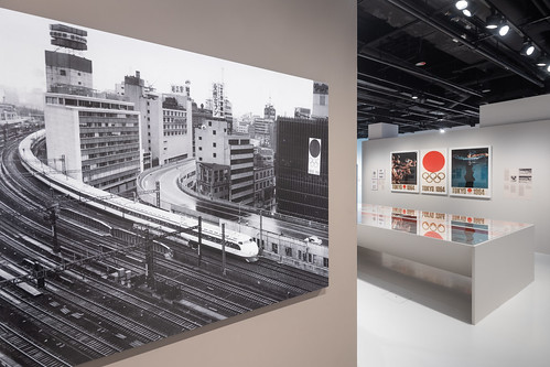
On the wall hangs a triptych of multi-coloured photogravure promotional posters designed by Kamekura Yūsaku – beautifully art-directed runners and swimmers captured in motion. There are type experiments with Haettenschweiler and Neue Haas Grotesk), and an abundance of printed ephemera, including the first brand guidelines (of sorts) for an Olympic event.
Poster designed by Kamekura Yūsaku, 1964. Courtesy of Prince Chichibu Memorial Sports Museum.

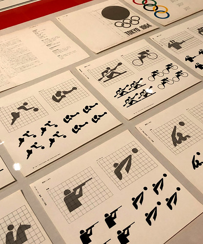
Visitors learn that the World Design Conference, held in Tokyo in May 1960, marked a defining moment for Olympics design. In the wake of the conference, the ten-strong Olympics design committee – led by design critic Katsumi Masaru – aimed to create an inclusive visual language that would communicate to an international audience. One result of this ambition was the set of twenty pictograms illustrating sport in action, which were designed by Yamashita Yoshirō. At the time this was a revolutionary addition to the visual language of sport, and one that embraced the event’s universality.
Graphic materials on display at ‘Tokyo 1964’ showing guidelines for the first-ever Olympic pictograms.
Tickets with analogue clock faces.
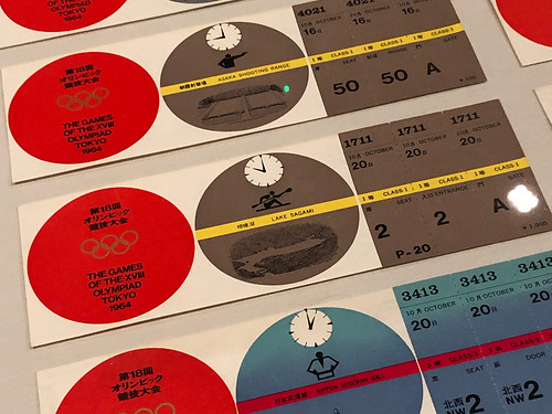
Design strategies that sought to transcend language barriers are prominent in other designs, such as the analogue clock faces (for times) in the colourful tickets for sporting events.
Elsewhere in the exhibition is a section covering other innovations devised for the 1964 Olympics, such as the plans for Komazawa Olympic Park drawn by architect Ashihara Yoshinobu, a model of Yoyogi National Gymnasium with the world’s largest suspended roof span, designed by Tange Kenzō and a scale model of a bullet train.
Installation photograph by J. Souteyrat, showing an architectural model of the Yoyogi National Gymnasium and Annexe by Tange Kenzō.

Curated by Yamashita Megumi and David Phillips, ‘Tokyo 1964: Designing Tomorrow’ tells the graphic design story of the 1964 Olympics while showing how Japan used the games as an opportunity to ‘rebrand’ itself after the Second World War.
Poster. The Tokyo 1964 games were the first to use the term ‘Paralympic’.
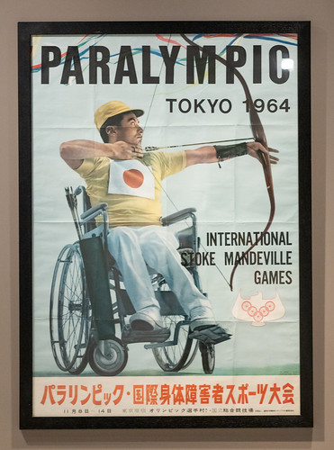
Installation photos of ‘Tokyo 1964’ by J. Souteyrat, 2021.
‘Tokyo 1964: Designing Tomorrow’ continues at Japan House, 101-111 Kensington High Street, London W8 5SA until 7 November 2021. Ticket links below.
Gabriela Matuszyk, designer, writer, educator, London
Eye is the world’s most beautiful and collectable graphic design journal, published quarterly for professional designers, students and anyone interested in critical, informed writing about graphic design and visual culture. It is available from all good design bookshops and online at the Eye shop, where you can buy subscriptions and single issues.
