Thursday, 4:00pm
18 June 2015
The man who branded Sainsbury’s
Sheffield designer Leonard Beaumont created the UK supermarket’s first postwar identity

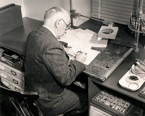
Sheffield-born Leonard Beaumont (1891-1986) was the graphic designer who gave Sainsbury’s supermarkets and products a consistent identity in the postwar era.
He had been producing work for Sainsbury’s as a freelance for some years, and in 1950 was appointed as the store’s first in-house design consultant. Joint managing director Alan Sainsbury wanted to emulate the example of the big supermarkets he had observed in the United States.
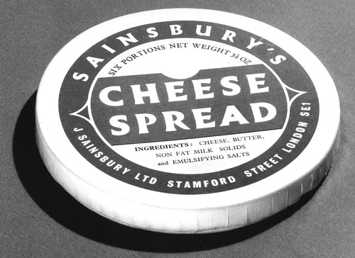
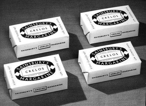
Beaumont’s new role was all-encompassing – he designed everything from signs and shopfronts to an enormous variety of own-brand packaging for the new self-service outlets.
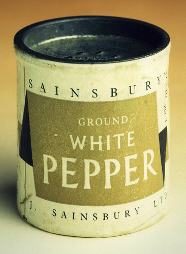
Sainsbury’s own-brand white pepper.
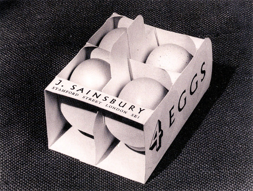
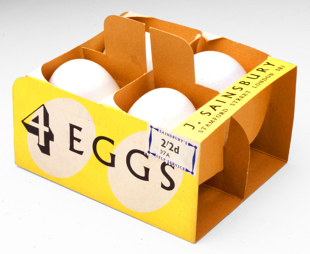
Top: Shortlived design for a mini crate of four eggs, 1953.
Courtesy of The Sainsbury Archive, Museum of London Docklands.
This was a time of great change and invention in the food industry, and Sainsbury’s shops, like many others, were moving away from traditional counter service, which involved weighing, measuring and wrapping goods – often quite minimally – in paper.
Many items had never been packaged before, but by 1954, when rationing came to an end in the UK, most food products on the shelves of self-service shops required packaging. There was scope for innovation, using materials both old (card, paper, cellulose) and new (plastic film, polythene).
Alan Sainsbury took the controversial step of removing all his competitors’ point-of-sale display advertising, and his supermarkets soon became a sea of Beaumont’s branding, both inside and out.
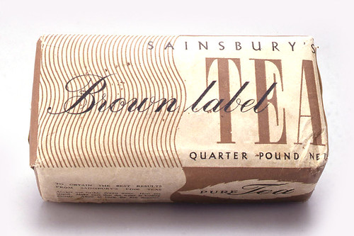
Sainsbury’s brown label tea packet, 1950, courtesy of The Sainsbury Archive, Museum of London Docklands.
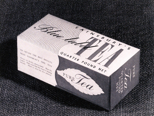
Blue Label Tea, 1952. From Leonard Beaumont, a Biography & Print Catalogue Raisonné by Timothy Dickson, 2013.
Some items went through many design incarnations. They needed to be sturdy, stackable, easily identifiable on the shelf – all new concepts. Initially, eggs were always sold loose, so Beaumont was asked to create a pack of four in the form of a crate (see main image). However this did not stack, nor did it protect the delicate contents, so the design was soon phased out.
Beaumont’s over-riding approach was to make everything clean and simple. White was the main colour used and type was bold and big, applied to all sides of the object. His preferred typefaces included Albertus, Trajan and Venus.
The refreshing simplicity of the Beaumont era has been somewhat be overshadowed by interest in the Swiss-influenced work of the 1960s. (See Own Label (Fuel) and the Eye 87 article ‘Sans serifs in suburbia’.) In fact Beaumont inititated Sainsbury’s modernisation by suggesting that the company establish an international design unit. When Beaumont retired in 1964, the company followed his advice. Peter Dixon took over the Sainsbury’s brand, and established a new look.
Beaumont’s stint at Sainsbury’s crowned an illustrious career that began with striking drypoints, etchings and linocuts, all made while he worked full time in the Sheffield Daily Telegraph’s art department. His talent for illustrations and book design led to work designing film posters for United Artists, and he left Sheffield for London in 1936. After going freelance, he worked for a wide range of clients, from the GPO and The Festival of Britain to The Times and Sainsbury’s. You can read more about Beaumont’s life and work in Timothy Dickson’s Leonard Beaumont, a Biography & Print Catalogue Raisonné published by Derwent-Rye 20th Century in 2013.
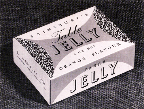
Orange flavour Table Jelly, 1956. From Leonard Beaumont, a Biography & Print Catalogue Raisonné by Timothy Dickson, 2013.
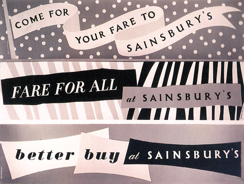
Window display posters for J. Sainsbury Ltd. From Leonard Beaumont, a Biography & Print Catalogue Raisonné by Timothy Dickson, 2013.
Egg box design, 1953. From Leonard Beaumont, a Biography & Print Catalogue Raisonné by Timothy Dickson, 2013.
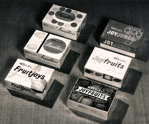
An example of Beaumont’s freelance work during his time at Sainsbury’s: a redesign for Nestlé’s fruit pastels. From Leonard Beaumont, a Biography & Print Catalogue Raisonné by Timothy Dickson, 2013.
More about food design and branding in Eye no. 87, the food design special issue.
Eye is the world’s most beautiful and collectable graphic design journal, published quarterly for professional designers, students and anyone interested in critical, informed writing about graphic design and visual culture. It is available from all good design bookshops and online at the Eye shop, where you can buy subscriptions, back issues and single copies of the latest issue.

