Monday, 12:00pm
4 May 2015
Watch with mother
Martin Aitchison
Robert Ayton
John Berry
Jack Matthew
C. F. Tunnicliffe
Harry Wingfield
Eric Winter
Book design
Design history
Graphic design
Illustration
Information design
Visual culture
Ladybird by Design
De La Warr Pavilion, Marina, Bexhill on Sea, East Sussex TN40 1DP. Co-curators: Lawrence Zeegen and Jane Won. 24 January-10 May 2015Ladybird by Design
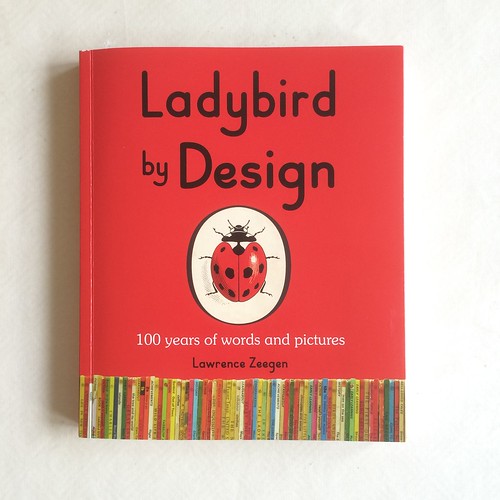
Ladybird Books / Penguin Random House UK, £20. By Lawrence ZeegenLadybird’s illustrative visions of mid-century Britain, on display at the De La Warr Pavilion and in a new book

A visit to the spacious light-filled De La Warr Pavilion – one of the most iconic Modernist buildings in Britain – is always a pleasure, even on a cold rainy wind-swept day, writes Clare Walters.
The building, now Grade One listed, was opened in May 1935, when the Earl De La Warr declared it to be ‘a new model of cultural provision in an English seaside town which is going to lead to the growth, prosperity and the greater culture of our town’.
This message of hope, though overshadowed by the clouds of war four years later, is echoed in the images in its current main exhibition ‘Ladybird by Design’.
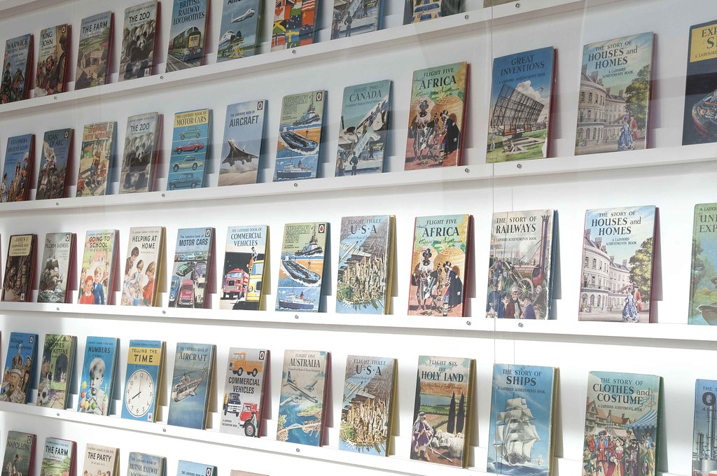
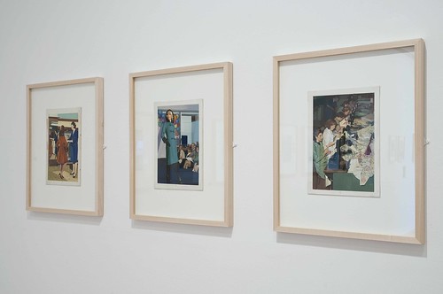
‘Ladybird by Design’, 2015 at De La Warr Pavilion.
Right: framed artwork by John Berry from Ladybird’s ‘People at Work’ series.
Top: racked copies of Ladybird books from the exhibition.
The pictures, taken mainly from Ladybird’s publishing heyday – from the 1950s to the 70s – typically depict a secure world of happy children living in comfortable two-parent households, where the adults have jobs that earn them respect and dignity, and the children have easy access to a cornucopia of information that will stimulate their growing intellect and physical skills.
Harry Wingfield, illustration from Shopping with Mother, 1958.
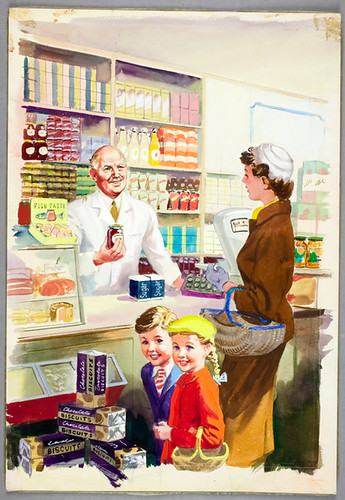
Looking at the paintings in this exhibition, the sense of optimism is palpable. But, as co-curator Lawrence Zeegen explains in the introduction of his book Ladybird by Design (Ladybird Books, £20), the familiar format of these little hardbacks was born out of austerity. As the paper shortages of the Second World War began to bite, the printing company that produced Ladybird books at that time, Wills & Hepworth, came up with the design for a 56-page book that could be printed in full colour from a single sheet of 40 x 30in paper. At this mini size, each book could be sold at an economical 2/6d (or 12 1/2p). And from 1940 to 1971 (when decimalization was introduced in Britain) this low price remained – making them affordable to virtually all.
Douglas Keen’s pasted-up dummy (1952) for A Book of Birds and Eggs. This established the format for Ladybird’s Nature series, which began the following year.
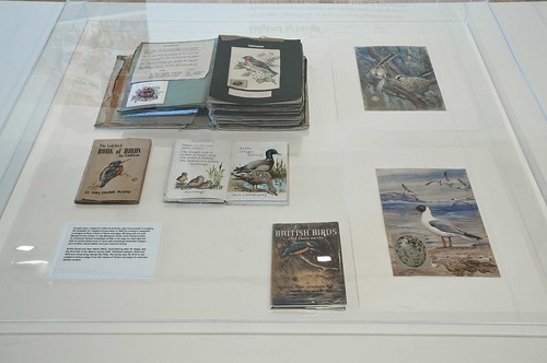
The books sold in their millions, and were such a familiar part of the mid-twentieth century publishing landscape that this exhibition will have a strong element of nostalgia for certain generations of visitors. But the pictures – sharp, crisp and detailed – invite reappraisal whether or not you recognise them from your own childhood. Drawn by some of the top illustrators of the day, not only are they an accurate social document of the period, but they are also impressive paintings in their own right. This exhibition, which shows a range of original artwork (as well as many examples of the books), makes this clear.
John Berry, from the ‘People At Work’ series, 1962.

Among the artists featured in the exhibition are: Harry Wingfield, who created Peter and Jane for the Key Words Reading Scheme; C. F. Tunnicliffe, a renowned painter of birds and wildlife who illustrated the ‘What to Look for in Winter’ (Spring / Summer / Autumn) series; Eric Winter, a commercial artist who brought to life many of the ‘Well-Loved Tales’ series; John Berry, a former war artist who painted the People at Work series; Robert Ayton, who illustrated around 50 titles for Ladybird, including ‘The Story of …’ and ‘Great Inventions’ series; and Martin Aitchison, one of Ladybird’s most prolific artists, whose work appears in nearly 100 titles. Aitchison was also involved with ‘Key Words’, as well as the ‘Great Artists’ series and ‘Puddle Lane’.
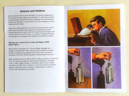
Spread from ‘Ladybird by Design’ catalogue showing some of Robert Ayton’s illustrations from Tricks and Magic, 1969.
Eric Winter, Cinderella, 1964.
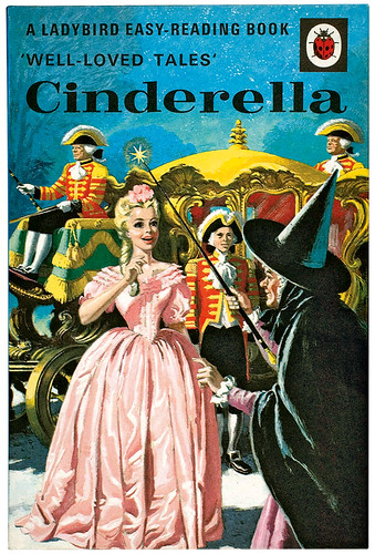
In the books, the pictures these artists produced were combined with entertaining, accurately researched and well written text, set in easily legible type. This made them enormously appealing to children, and the brand went on to become a British icon. Just as the De La Warr pavilion did back in the 1930s.
Jack Matthew, illustration from Flight Three USA, Ladybird Books, 1959

Ladybird by Design by Lawrence Zeegen (Ladybird, 2015). This has the same format as Puffin by Design (see review in Eye 77).
See Adrian Shaughnessy’s article ‘Mystery and clarity’ about Ladybird in Eye 52.
Clare Walters, journalist, author of children’s picturebooks, London
Eye is the world’s most beautiful and collectable graphic design journal, published quarterly for professional designers, students and anyone interested in critical, informed writing about graphic design and visual culture. It is available from all good design bookshops and online at the Eye shop, where you can buy subscriptions and single issues.
