Summer 2008
Absolutely the ‘worst’

How does a graphic work claim its place in history? Notoriety and originality helps, but nothing beats repeated publication. Critique by Rick Poynor

Canonical designers are easy enough to identify. The situation with canonical designs is more complicated. Graphic designers create millions of new designs every year. How does a tiny percentage of these pieces, which most viewers will never hold in their hands, come to be regarded as crucial works, designs of influence that deserve a lasting place in the narrative of graphic design?
Reproduction alone is not enough. Much of the work that appears in magazines and annuals for a brief moment in the limelight soon falls by the wayside, even if it remains in the published record, notionally available for future consultation. Online archiving will increase its chances. Projects that have not been published in any form are unlikely to be remembered for long, but if someone – usually the designer – takes the trouble to preserve good copies, there remains a slender hope of discovery some day.
The crucial requirement is repetition. The more often the work appears in the right places, the more its future appearance is assured. These ‘right places’ are simply the venues that critics, historians and curators are likely to consult when trying to gauge the most significant examples of a particular type of work to show in their projects. Once a graphic work becomes part of a major museum collection, its longevity is guaranteed, though this alone will not be enough to make it canonical. It needs to be seen regularly.
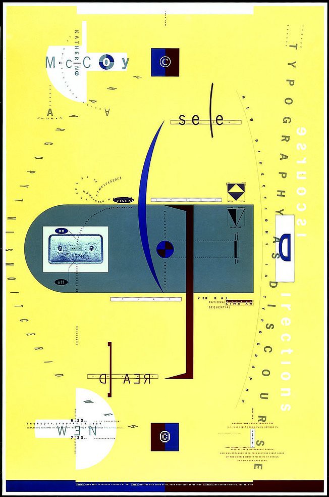
A good example of the process in action is the American designer Allen Hori’s Typography As Discourse poster, produced in 1989 at Cranbrook Academy of Art, while Hori, then 29, was an MFA student. This first surfaced in 1990 in the book Cranbrook Design: The New Discourse (edited by Katherine and Michael McCoy). To some eyes, it looked untutored, chaotic and alien.
Rudy VanderLans describes sitting in on one of Wolfgang Weingart’s design classes at the Kunstgewerbeschule in Basel. Weingart, a regular visitor to Cranbrook, pulled out a copy of the poster. ‘This, he proclaimed, was the absolute worst of what was currently happening in graphic design,’ recalls VanderLans. ‘I knew then that the Typography As Discourse poster was a very special piece of graphic design.’
The poster’s subject is a lecture given at Cranbrook by Katherine McCoy, co-chair of the design department – an expanded version of her article with the same title published in I.D. magazine (March / April 1988). The outsized parenthesis and bracket recall similar devices in the magazine’s layout by another Cranbrook designer, David Frej. Hori constructed the poster as a mechanical artwork, with manual letterspacing, Rubylith masking film, tracing paper and acetate overlays, and an elaborate mark-up. He sent intricate type compositions from the Macintosh to an output service and collected the hard copy the next day.
A communications theory diagram referred to by McCoy and the students provides the poster’s underlying conceptual framework. It encapsulates the idea that text can be perceived as a visual image as well as read, while images can be read as well as seen. If visual communication is intuitive, holistic and simultaneous, then verbal communication is traditionally regarded as rational, linear and sequential – all keywords that appear in the poster. The scattered nodes of information, linked by meandering typographic pathways, challenge the usual seeing / reading distinction by encouraging exploration, which can begin anywhere and proceed in any direction. Hori refined the design over several nights and he recalls how McCoy would leave Post-it notes for him in the morning with questions and comments. There was also discussion in the studio about the way his design interpreted the familiar diagram.
In spring 1991, Eye published an article about ‘deconstructed’ design at Cranbrook by Ellen Lupton featuring the poster (no. 3, vol. 1). I could hardly fail to include such an extraordinary and emblematic piece of new typography in the survey Typography Now: The Next Wave, published later that year. Around the same time, VanderLans reproduced the poster in Emigre no. 20, along with other work by Hori and an interview.
Nevertheless, it might have stopped there. Plenty of work from that time is now forgotten. Lupton, one of the most perceptive critics of Cranbrook design, helped to prolong the poster’s iconic afterlife by publishing it twice in 1996. It features in her collection with Abbott Miller, Design Writing Research, in the essay ‘Deconstruction and Graphic Design’, where they describe it as ‘a manifesto for a design practice informed by literary theory’. Lupton also included the poster in her book Mixing Messages, which accompanied a major exhibition of contemporary American graphic design that she curated at the Cooper-Hewitt National Design Museum in New York. The poster is in the collections of the Cooper-Hewitt, the AIGA Design Archives and Cranbrook Art Museum. Only a few other copies survive.
Even if I hadn’t known the poster already, all of this would have been enough to ensure its place in my own No More Rules (2003), a study of graphic design and postmodernism. The ultimate sign that the poster has entered the graphic design canon and is likely to stay there is its appearance in chapters on postmodernism in Stephen J. Eskilson’s Graphic Design: A New History (2007) and Johanna Drucker and Emily McVarish’s Graphic Design: A Critical History (2008). Drucker and McVarish describe it as ‘a classic of postmodern design’, noting its ‘clean and rather distilled aesthetic’.
This is an astute observation. Although detractors professed to see only disorder and confusion in Cranbrook’s output, Hori’s poster is an entirely self-aware, delicately controlled visual essay, which makes its case with great precision. Current typographic taste doesn’t much care for the complexities of this kind of work. It is a measure of the poster’s originality, and the way it still radiates the heat of its moment, that it lives on regardless.
Top: Typography As Disclosure, lecture poster, 1989. Design: Allen Hori.
Rick Poynor, writer, founder of Eye, London
First published in Eye no. 68 vol. 17 2008
Eye is the world’s most beautiful and collectable graphic design journal, published quarterly for professional designers, students and anyone interested in critical, informed writing about graphic design and visual culture. It is available from all good design bookshops and online at the Eye shop, where you can buy subscriptions and single issues.

