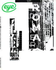
Winter 2004
Brand madness 1

Letter from Paul Blackburn
I am writing to say how much I appreciated the editorial theme ‘Brand Madness’ (Eye no. 53 vol. 14), and in particular the article ‘The steamroller of branding’. It’s high time that a critical design magazine should broach the two important subjects of designers working within the area of branding, and the encroachment of corporate brand values into the cultural arena.
It’s still a mystery to me how perfectly competent and creative designers end up working for the great branding machine. I was wondering if any other designers question this role that we seem to have found ourselves cast in.
As far as I remember, branding wasn’t a career path I chose, and I certainly have no recollection of having formally learnt the ‘brandspeak’ that I find myself slipping into when conversing with clients, marketeers and now, sadly, other designers. Up until now, I have been grappling with these issues largely on my own or occasionally with a sympathetic ear down the pub, but thankfully Eye has given me the impetus to air a couple of grievances that I have about the brand world in general.
Firstly, the unquestioned rule that simple and consistent application of a logotype and set of brand attributes is the key to a brand’s success. Is there any research to back this up? Or is it just a mantra to enable a quick and easy sell for a particular idea? I’m fed up of hearing: ‘It’s got to be consistent’; ‘the client won’t be able to implement anything other than really simple anyway’; ‘got to talk in the same voice all the time’. Why should a brand talk in the same voice all the time? People express themselves in many different and interesting ways, they’re varied and unpredictable, so why shouldn’t brands be, too? I’m fed up of doing consistent – is anyone else?
Secondly, the ultimate head-in-my-hands comment: ‘Let’s do it in Helvetica because that’s what the client has got on all their PCs.’ Is there a client anywhere who would argue with this? Well, I don’t really need to go into this one too much at the moment, other than to say that it’s a nightmare that is getting worse. If designers don’t take the lead on this, then ‘consistency of message’ will dictate that brands adopt Helvetica as their headline typeface as well as their text face. I’m not kidding. It’s happening. Stop it now.
Ah, that’s better.
On a positive note, ‘The steamroller of branding’ article made me realise that there is a lot of very important graphic design work being produced currently that doesn’t get critically discussed. London’s Barbican and the Whitechapel Art Gallery are major British cultural institutions, and they belong in large part to us – the gallery-going public. The re-design of their identities is a significant event, but for some reason it doesn’t seem to get the press coverage and discussion that it should. I’d like to see more of this type of article, with the practitioners who execute this work presenting and explaining it to the design fraternity. It’s interesting,
I would like to know more, and I want to feel included.
I agree with Nick Bell’s view that typographic ‘one message’ solutions have assumed prominence over content and narrative in the world of ‘cultural identity’, and I also worry that the procedure of creating a ‘corporate identity’ is being applied too readily to the creation of cultural identities.
I’d be interested to know where the impetus is coming from: is it from marketing managers within these cultural institutions trying to make an impression? Or from design groups who are too tired, cautious, or underpaid to afford the time to develop anything other than tried-and-tested project procedures?
The Barbican is a venue that for fifteen years I’ve loved because of its variety of cultural activities and the unassuming nature of its physical environment. It’s a venue for watching, listening, reading, learning and thinking. I would hope that the visual identity develops in a way that enhances and reflects these activities, and doesn’t create another unnecessary level of visual noise for the sake of typographic experimentation. What I’ve seen of the identity so far is interesting, and I’m sure that the execution will be perfect, but visually (and similarly to the Tate / Whitechapel / Camden) it doesn’t look like the identity for a venue that promotes and embraces the arts.
At a time when cultural institutions are pouring money into their identities like never before, I can’t help feeling that an opportunity is being missed.
London
First published in Eye no. 54 vol. 14 2004
Eye is the world’s most beautiful and collectable graphic design journal, published quarterly for professional designers, students and anyone interested in critical, informed writing about graphic design and visual culture. It is available from all good design bookshops and online at the Eye shop, where you can buy subscriptions, back issues and single copies of the latest issue. You can also browse visual samples of recent issues at Eye before You Buy.
