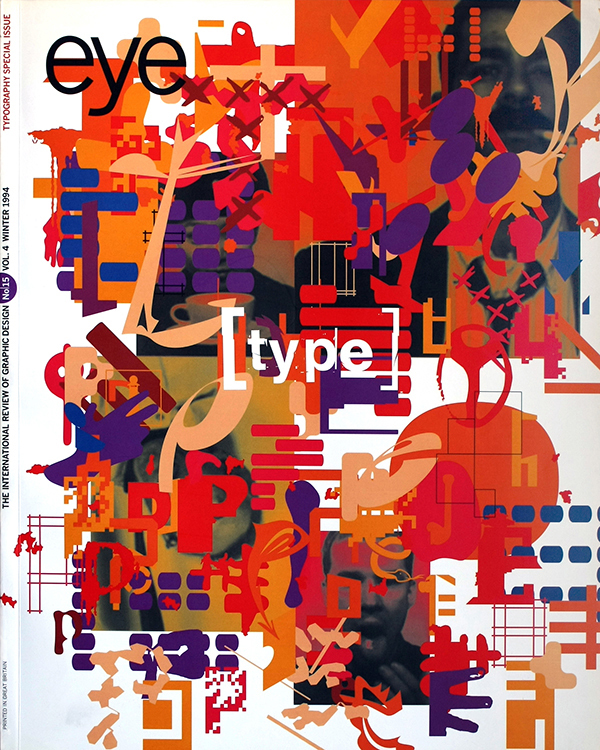
Winter 1994
Editorial Eye 15
In the three and a half years since Fuse, the interactive type magazine, was started by FontWorks, it has established itself – alongside Emigre – as one of the world’s most interesting forums for experimental type. Its gathering momentum culminates, this month, in a conference and exhibition at which many of its contributors will discuss their work to date and the task ahead. From its first issue, Fuse set out to be more than simply a supplier of surprising and sometimes outlandish fonts. Essays by editor Jon Wozencroft establish a theme for each issue and the designers themselves are encouraged to write notes. Confronted by the givens of the alphabet, Fuse’s innovators have launched themselves on a process of continual reinvention, twisting familiar alphabetic structures into ever more extraordinary shapes. At times, a deep suspicion of language itself is apparent, with letterforms that cancel themselves out, or become increasingly degraded the more you type. After ten issues, the magazine finds itself, as Michael Rock argues in his essay on page 26, at a crossroads. With its recent ‘Freeform’ issue, Fuse fulfilled the promise (or threat) implicit in many of its earlier fonts and abandoned alphabet and language for keyboard-accessed collections of abstract marks. Seen from inside the graphic design world, as a test of originality for the designers and an aesthetic diversion for its buyers, this is fair enough. But Fuse’s rhetoric constantly suggests that it is engaged in an experiment with a larger aim and meaning for the world outside. Looked at from the outside, though, the purpose of Fuse’s reinventions is by no means clear. In our feature on mass-market style, the art editor of a women’s magazine discusses the narrow range of typefaces favoured by his publication. This is a world – in publishing terms a vast one – in which the use of a typeface such as Erik Spiekermann’s Meta (positively sober by the standards of Fuse) would constitute an aesthetic revolution. Fuse’s achievement is real and, as a fellow publication committed to graphic experiment, we salute it. But it would be helpful in the next ten issues if the magazine clarified its more iconoclastic arguments with examples of imaginary and actual use.
Rick Poynor, writer, Eye editor, London
First published in Eye no. 15 vol. 4 1994
Eye is the world’s most beautiful and collectable graphic design journal, published for professional designers, students and anyone interested in critical, informed writing about graphic design and visual culture. It is available from all good design bookshops and online at the Eye shop, where you can buy subscriptions and single issues.

