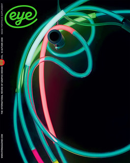
Autumn 2008
Eye Editorial 69

The mood and structure of this issue is somewhat different from the last...
The mood and structure of this issue is somewhat different from the last: Eye 69 is not a ‘special’. There are several long, substantial features that deal mainly with contemporary practice, and a couple that are hardly about graphic design at all: Steven Heller’s timely piece about political parody, and David Crowley’s fascinating investigation into the concept of sous rature, Derrida’s term for writing ‘under erasure’.
But we make no apology about this, since Eye’s remit has long been ‘graphic design and visual culture’. Crowley’s examples, from overprinted Iranian banknotes to Leo Fitzmaurice’s installations, are undeniably graphic. Yet certain practitioners, working in education and service design, would like to outlaw the term ‘graphic design’. Rick Poynor’s essay, ‘It’s the end of graphic design as we know it’, is an entertaining and thought-provoking response to the dark prognostications of business / education guru Richard Buchanan. As to what label we should use, Poynor prefers ‘visual communication’, but he’s happy to remind our institutional gloom-mongerers that ‘the essential purpose of graphic design is still to shape graphic form.’
There’s plenty of such form in Véronique Vienne’s article about posters, which is accompanied by some exemplary work from the poster festivals at Chaumont and Warsaw. Most examples are from Europe rather than the us, but Shepard Fairey’s Barack Obama image is a vivid reminder of the power of graphic form in public life. Vienne makes the point that the most effective examples tend to be for the best clients, citing the theatre, concert and festival promoters who are more likely to treat designers like artists – and permit the idea of performance to inspire great posters.
Jason Grant’s ‘Awards madness’ essay is the latest in our long-running series of pieces about things that delight and frustrate designers, often at the same time: conferences, branding, and now competitions. They’re all around us, for every kind of activity (I know a writer who was named ‘British sandwich journalist of the year’) and it seems that everyone loves to slap the phrase ‘award-winning’ on to biographies and resumés. Grant’s evidence supports the stance of Bruce Mau, who writes in his Incomplete Manifesto for Growth: ‘Don’t enter awards competitions. Just don’t. It’s not good for you.’
But the ‘Just say no’ position is easier said than done, and Alissa Walker, in her ‘Mad about awards’ feature, has tracked down several designers – both young and mid-career – who advance reasonable arguments in favour of entering and exploiting awards results. And despite many reservations about design awards in general, ‘Awards madness’ author Grant supports schemes such as Memefest (in Slovenia) as a positive move towards more responsible and constructive forms of competition.
Phil Baines, the subject of Reputations, is a designer whose prolific writing and busy teaching schedule has sometimes obscured his design achievements, from experimental typefaces, through nicely nuanced art catalogues, to the popular Penguin ‘Great Ideas’ covers. Christopher Wilson visits Baines in his shed to sketch out a conversational portrait of this eccentric and quintessentially British graphic designer. In an curious way, Baines connects many of this issue’s subjects (including graphic form, education and overprinting) with our own pragmatic approach to making a magazine and a blog: selecting and shaping a stimulating ‘pick’n’mix’ of elements that remain true to their authors’ points of view, their contents and materials.
First published in Eye no. 69 vol. 18 2008
Eye is the world’s most beautiful and collectable graphic design journal, published quarterly for professional designers, students and anyone interested in critical, informed writing about graphic design and visual culture. It is available from all good design bookshops and online at the Eye shop, where you can buy subscriptions and single issues.
