Spring 2016
From trade to poetry
Barcelona’s new Museu del Disseny shows how design can claim a space for itself. Critique by Rick Poynor

The question of how graphic design should be exhibited in museums is guaranteed to provoke reaction among designers. Some call for as much contextual information as possible, some doubt that putting ephemeral graphics on the wall can ever convey how these pieces function and some feel the answer is to turn the exhibition into an elaborately designed installation. What cannot be disputed is that major museum space devoted to graphic design remains a rarity. In London, we look forward to seeing how the relocated Design Museum responds to this challenge when it has more real estate at its disposal.
Any curator interested in these issues should pay a visit to the Museu del Disseny de Barcelona, which opened in 2014. This dramatically angular, purpose-built institution, designed by MBM Arquitectes, is an ambitiously conceived palace of design culture, although it doesn’t yet appear to be a crowd-puller. Situated outside the city’s bustling centre, the museum was surprisingly quiet for such an impressive venue when I paid two visits last July, as the tourist season began to get under way.
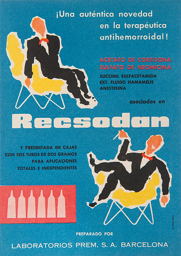
Pharmaceutical advertising by Amand Domènech, 1950s.
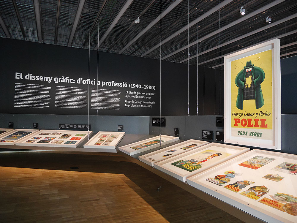
Top: The opening display of ‘Graphic Design: From Trade to Profession’ at the Museu del Disseny, Barcelona. Poster for an insecticide to protect clothes by Josep Artigas, 1940s. Photo by Rick Poynor.
The permanent collection is spread over four floors devoted to product design, decorative arts, fashion and, at the top of the building, graphic design’s evolution ‘from trade to profession’ during the years 1940-80. The display – curated by Anna Calvera and Pilar Vélez and drawn from the museum’s graphic design collection – contains around 550 pieces, which will be on show for three years; it will be followed by an exhibition about the 1980s design boom. Even from this outline, the specialness of the project is clear – there is no long-term display on this scale in London or New York devoted to the history of graphic design.
Catalans take great pride in their culture and language, and the show focuses exclusively on graphic design’s growth as an organised discipline in the region. The display system devised by BOPBAA Arquitectes, with graphic design by Clase bcn, is one of the most effective I have seen for graphic material. Most of the pieces, including many posters, are grouped in generous frames perched on angled tables, which are suspended from the ceiling by steel cables so that the entire exhibition seems to float in the gently illuminated space. Held in a natural reading position, everything is engagingly close. Where necessary, larger posters occupy vertical frames attached to the back of these tables. All the elements are screwed into a modular grid, permitting great flexibility when devising future displays.
Posters from the 1960s displayed on the Museum del Disseny’s angled tables. Photo by Rick Poynor.
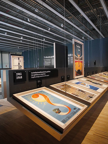
The curators have taken the decision to ‘leave sociological elements to one side and concentrate on strictly graphic aspects’. Their belief in the graphic worth and impact of the material has paid dividends. The sensitively lit frames give the leaflets, books and posters an aura of preciousness and value. That seems entirely justified, given that the graphic work has competition from superb examples of imaginatively displayed furniture and fashion elsewhere in the museum, and it is a vital first step in engaging non-professional audiences with graphic design.
For an outsider, the displays are loaded with previously unseen work by unfamiliar names. While a few local designers, notably Javier Mariscal, achieved international renown in the post-Franco 1980s, the field’s older pioneers – figures such as Josep Pla-Narbona, Amand Domènech and Tomás Vellvé – have not been so widely celebrated. In parallel with other countries, including Britain, Catalan graphic design progressed in the years after the Second World War from pictorial design, which was drawn and painted, to a more structured style influenced by Swiss typography and Concrete art. However this onset of graphic purism was soon counterbalanced by the illustrative influence of Pop Art, a life-embracing expressiveness that seems fully in keeping with both the national and regional character. Spanish and Catalan design are never dry.
Publicity material designed by Enric Huguet for a calcium supplement, 1974, Museu del Disseny de Barcelona.
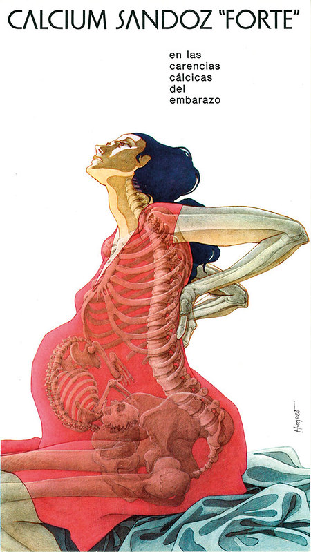
A brilliant example can be seen in the exhibition’s extensive displays of pharmaceutical graphics. In 1974, Enric Huguet created a series of designs for Calcium Sandoz Forte, a calcium supplement to strengthen bones. In beautifully sinuous and deeply felt colour illustrations of an elderly man, a small boy and a pregnant woman, their clothes and bodies become semi-transparent and we see the curvature and stress of the bones inside. Huguet’s typography is similarly taut. ‘A graphic designer is a poet and linguist of the visual images of the world,’ he said in an interview. ‘Every work must have emotion, feeling and clarity.’ In this remarkable series, quotidian promotion attains the gravity of an artwork. Pieces like this are a revelation, and the Museu del Disseny’s graphic design floor is off to a flying start.
Rick Poynor, writer, Eye founder, London
First published in Eye no. 91 vol. 23, 2016
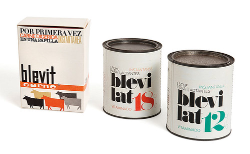
Packaging by Àngel Grañena for instant milk for babies, 1961, Museu del Disseny de Barcelona.
Eye is the world’s most beautiful and collectable graphic design journal, published quarterly for professional designers, students and anyone interested in critical, informed writing about graphic design and visual culture. It is available from all good design bookshops and online at the Eye shop, where you can buy subscriptions, back issues and single copies of the latest issue.You can see what Eye 91 looks like at Eye before You Buy on Vimeo.

