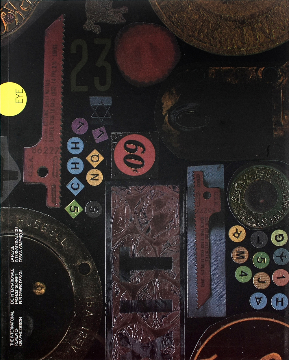
Winter 1990
Green’s grey zones
It has always been the duty of graphic designers to challenge conventional wisdom. Designers have long upheld the rationalism in communications, defended consumers’ real interests and, in an internationalist spirit, called for sensitivity to the cultural goals of the South. So it is high time that the design community took issue with the more retrogressive nostrums of the green cause.
Britain, a country where leftish views have until the 1980s been quite strong, is a relatively moderate convert. The same is true of France. In countries such as Germany, where post-war labour movements have been weak, obsession with natural rather than social problems has gone much further. Yet even in Britain, “green graphics” has now reached a level to eco-hysteria. And examined more closely, many efforts seem examples of singularly ill-directed concerns.
Take the countless tales of marketing directors of major corporations who insist that their annual reports be printed on recycled paper. These same corporations do not pause to ask themselves whether that extra money they spend in flaunting their “responsible” attitudes might not be put to better use in less visible but more worthwhile pursuits: in filtering the gases and effluents they put out, for example. Not for the first time, we find that even pro-green decisions are made with bottom-line considerations in mind.
Or take the Body Shop, a chain of stores which stretches from Prague to North America and trades on its image of environmental awareness. The packaging of a Body Shop lotion such as its Vitamin E night cream seems to require not one, but three labels. There is the monochrome Art Nouveau disc on the container’s top, complete with postcode, stock reference number and five different typefaces. There is a green price tag on the bottom, with the reference number again and two more typefaces, Finally, on the side, there is a white tag and another two typefaces.
We come here to a basic contradiction of green commericalism. On the one hand, at a time when the recession is already forcing everybody to tighten their belts, green thinkers are telling us to consume less (a message which would be funny in the Third World were the impoverishment of that area not to tragic). On the other, the elaborate packaging of many green products takes little account of the supposed need to economise on resources – a fundamental obscurity of logic reflected in packaging, graphics and copy that are equally obscure.
The range of cleaning fluids sold by Belgium’s Ecover or by Britain’s top two supermarkets – J. Sainsbury (under its Greencare label) and Tesco – is a good example. All the bottles are covered in blue and green, making it hard to distinguish between washing-up liquid, clothes detergent, cream for scrubbing sinks, and unsound old bleach. Look more closely at the copy on Ecover and you will find at least ten typefaces: reversed-out type filled in because of poor printing; blurred and broken type; excessive use of punctuation and capitals; measures seventy characters long over a curved surface; footnotes and windows; abbreviations which embrace harmful substances (“NTA, EDTA”). Clarity of language and of layout seems to escape the green movement.
We should beware of the misplaced, facile conservatism that passes for so much greenness today. Our environment is indeed under threat. But human lives are being ruined and ended already by developments that have much more to do with society than with the ozone layer. And in this “grey-green” area – of the urban, of transport systems, of information technology and of literature – a clearheaded, sensible graphics could, inexpensively, do more than ritual breastbeating.
In cities, clear maps and sign-posting would lower stress and speed that emergency services on their way. Car crashes would be reduced by unambiguous “product graphics” at the dashboard; by the same token, office workers would breathe less photocopier fumes and save on paper if control panels were made intelligible enough to obviate the millions of dud copies the world runs off each day. In industry, services and the home, tasks would be made easier and safer if instruction manuals boasted proper symbols and diagrams. The elderly would be helped if bills from utilities companies and other documents were effectively illustrated and properly translated.
The lesson is simple. We should reject green fads in graphics, together with every myopic idolisation of nature. Instead, we should raise high the banners of ergonomics, psychology, and language; of humanism; and of rational information design.
First published in Eye no. 2 vol. 1 1991
Eye is the world’s most beautiful and collectable graphic design journal, published for professional designers, students and anyone interested in critical, informed writing about graphic design and visual culture. It is available from all good design bookshops and online at the Eye shop, where you can buy subscriptions and single issues.

