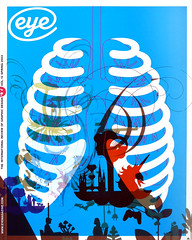
Spring 2003
Playground surrealism

What does BBC3’s animated ad say about the new channel? Critique by Rick Poynor
In the late 1990s, after the storm of digital typography and the collective obsession with the word-as-image had passed, designers used to wonder where the ‘next big thing’ in graphic design would come from. Most had ignored illustration for so long that it wasn’t obvious, until perhaps 1999, that the next big thing was the illustrated image. Four years later, if a fashionable look is what you are after, illustration is indisputably the medium of the moment. Graphic design, by comparison, looks distinctly stuck in the mud, except where it merges with illustration, which it so often does.
I say ‘fashionable’ advisedly because to some eyes, especially those closely acquainted with earlier forms and movements in illustration, being fashionably cool seems to be the primary goal of much of this work. Other than that, it often isn’t at all clear what it might be trying to convey. Take another look at the Jasper Goodall illustration showing a topless woman flashing a diamond ring in Eye (no. 42 vol. 11, p26). Is that a ‘discordant view of luxury’, as the caption claims, or an image that seems entirely seduced by its own louche glamour, like so many similar examples? It could simply be that a disengaged, retro-minded, postmodernist way of constructing images has come to the often conservative world of illustration rather late.
Goodall, a talented image-maker, is certainly one of the leading figures in this school. He contributed to the print campaign behind the launch of the BBC’s new digital channel for BBC3 (available only to viewers with digital ‘set-top boxes’, cable or satellite), but it’s the launch commercial that I want to focus on here. This 60-second spot, directed for the Fallon agency by Johnny Hardstaff, whose previous credits include Radiohead and PlayStation, shows postmodern illustration in full bloom.
The idea of the number ‘3’ – such as it is – connects every element on screen. Three tourists, shot as live action, set out on a meandering journey in a three-wheeled ‘tuk-tuk’ (a Thai taxi) that takes them through a dense, fantasy wonderland of images and drawings based on the numeral: a child’s tricycle, traffic lights, triplets playing a game, a triceratops, a trident, a tripod, a triplane, a pair of 3D spectacles, the Bermuda triangle, a woman with a third eye on her forehead and exotic flowing hair. The images coalesce in a ripple of movement intensified by occasional cuts and it takes several viewings even to notice some of the smaller details artfully secreted within this intricate tableau.
With its whimsical, playground surrealism, striking dislocations of scale, touches of Victoriana and elegant graphic linework, it’s as though the montage-based illustrative style often used in 1960s psychedelic posters and the underground press has come to life. A partially clad woman with three ‘X’s across her breasts and another woman posing in a peekaboo nightie introduce a tiresomely laddish contemporary note. In a clever finale, motifs and other elements from the journey regroup around several TV screens in an ensemble that rotates into view on a turntable playing ‘Three Times a Lady’.
As a piece of image-making, considered separately from its purpose, the BBC3 commercial is an accomplished essay in the currently fashionable style. As an attempt at strategic channel branding, though, it seems much less sure of itself. Channel controller Stuart Murphy said that BBC3 would ‘experiment with the unexpected’, but the commercial’s unchallenging generic imagery has only the sketchiest relationship with the channel’s mix of news, current affairs, arts programmes, original drama and entertainment aimed at 25- to 34-year-olds, a section of the public already generously served by British television. The commercial’s happy-clappy mood and the inclusion of several children – unlikely to be much of an inducement for a generation postponing or avoiding parenthood – seem better suited to kids’ TV. According to the soundtrack song, a comfort blanket for the ear that becomes more irksome with every outing, ‘Three is a magic number. Yes it is, it’s a magic number.’
For a grown-up channel, this is embarrassingly Teletubby-ish, but it didn’t stop the BBC from commissioning a whole series of teaser ‘blipverts’ based on the bland and meaningless ‘magic number’ theme. Meanwhile, the channel idents created by Lambie-Nairn feature humorous, talking blob-people (a familiar trick from Aardman of Wallace and Gromit fame) that once again suggest a channel inexplicably inclined to underestimate its audience’s capacity to cope with anything too adult or taxing.
Rick Poynor, writer, founder of Eye, London
First published in Eye no. 47 vol. 12 2003
Eye is the world’s most beautiful and collectable graphic design journal, published quarterly for professional designers, students and anyone interested in critical, informed writing about graphic design and visual culture. It is available from all good design bookshops and online at the Eye shop, where you can buy subscriptions and single issues.
