Winter 2004
‘Type-only Penguins sell a million’ shock
Jim Stoddart
David Pearson
Phil Baines
Catherine Dixon
Matthew Carter
Alistair Hall
Derek Birdsall
Book design
Typography
Monitor
Penguin uses design to revitalise its back catalogue with Great Ideas and a revived Reference Library

Since its innovative start nearly 70 years ago, the design of Penguin books has had a rollercoaster ride. Crudely speaking, its design history runs something like this: 1935: gatecrashed publishing in a riot of colour and Gill Sans. Late 1950s: bowed with extreme reluctance to the inevitable and introduced illustrative elements. 1961: introduces Romek Marber’s grid. Mid-1960s: embraced the image wholeheartedly (and occasionally at the expense of good taste and loyal authors). 1970s on: largely lost its way and ultimately its identity. 2000 on: begins to re-emerge as a strong and identifiable brand.
And while design for fiction more or less disappeared – its covers camouflaged in a sea of brash mediocrity – Penguin always remained distinctive and brand-conscious in discrete series; backlist staples including Poetry, Reference and the Classics never strayed too far from the ideals, if not the actual look, established by such as Tschichold, Schmoller and Germano Facetti.
In the best Penguin design there has always been a strand of continuity, a family tree that traces its roots back to great or significant ancestors. And it is largely this continuity and kinship that makes two new ventures stand out so clearly: the rebranded Reference Library; and the occasionally controversial Great Ideas series – twenty books by radical thinkers throughout history that are supposed to have changed the world.
Covers from the Penguin Great Ideas series, 2004. Art direction: Jim Stoddart. Design: David Pearson.
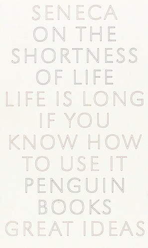
Seneca. Artwork: Phil Baines. Centred arrangement with sans serif type reflects early carved inscriptions.
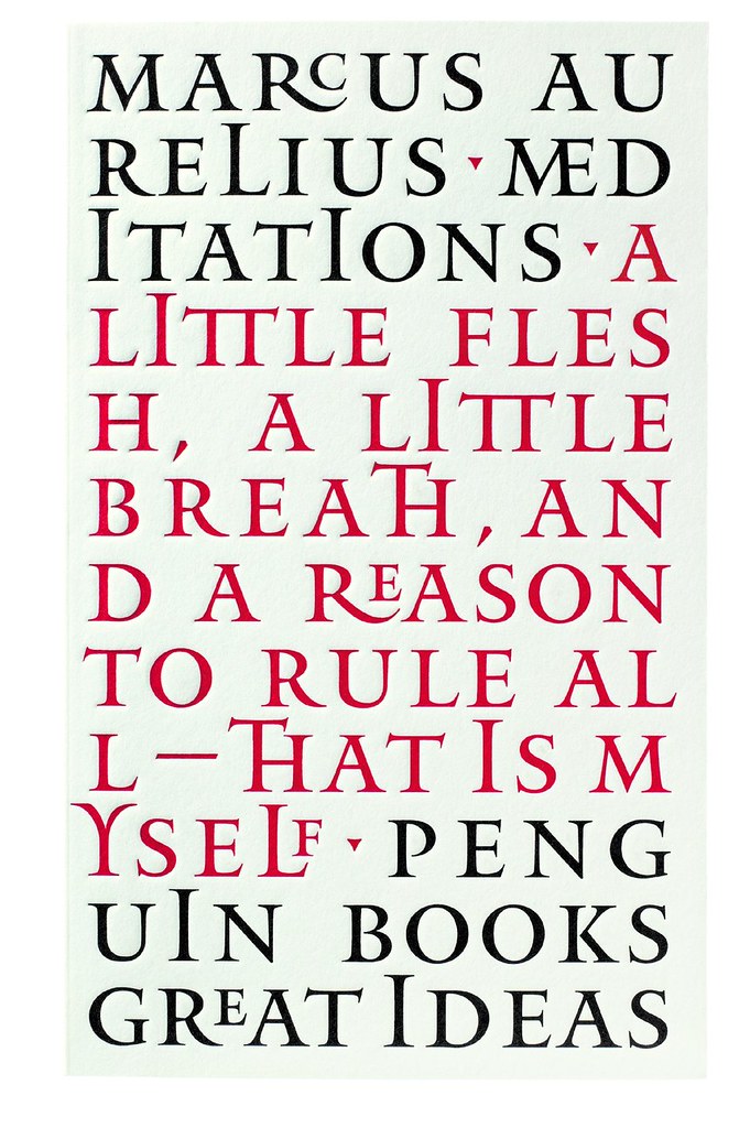
Top: Marcus Aurelius. Artwork: Phil Baines. The font is Mantinia designed by Matthew Carter, based on Renaissance letterforms by Mantegna.
Under the art direction of Jim Stoddart, David Pearson was the in-house designer responsible for both. He came up with an original yet familiar look for the Reference Library, but pulled out all the stops on Great Ideas, producing thirteen of the covers himself, with the others delegated to a fellow ex-student, Alistair Hall, and Phil Baines and Catherine Dixon, their former tutors at Central St Martins. With the covers largely relying on type, clear family ties can be traced both to Nicolete Gray – a major point of reference for Baines and Dixon (see ‘Letter Rich Lisbon’, pp.26-33) – and to Penguin’s A-format origins of 1935.
‘We were really trying not to be retro,’ Stoddart stresses, with regard to the Reference look. ‘We don’t want to hark back to what was modern then; we’ve always got to be modern now. It’s meant to feel fresh – not that they’re old books.’
The Great Ideas covers are strikingly different from pretty well anything else in bookshops today. So much white cannot fail to catch the eye: they look like books with their covers missing. Black and red debossed type on plain uncoated white gives them an extraordinarily tactile feel, like Letterpress gone berserk. Assailing more than one sense is a sure way to engage emotional involvement. (In the 1960s it was seriously proposed to add a garlic aroma to Len Deighton’s Penguin cookery titles.)
They may get grubby quickly, but the designers neither mind nor care: they will look well used and by implication pronounce favourably on their owners – of whom there are plenty. It appears that a million Great Ideas titles have been sold already.
‘I’ve felt for years,’ says series editor Simon Winder, ‘that there are frustrating limits on what it’s possible to sell in Classics and that we could make other kinds of books out of what we already have.’ Rebutting well reported accusations of timidity and cynical marketing, Winder believes the titles have an internal consistency and continuity of their own: ‘These are twenty major works and they all, in effect, talk to each other: later writers revered – or reviled – the earlier writers in interesting ways. We were very keen to make sure they did not for a moment look like a new “Classics” range, that they should look sufficiently “all over the place” and informal.’
Jim Stoddart’s direction was consequently deliberately limited: each cover should contain title, author name and a key quote from the texts. ‘He stressed that the covers could be very much design led,’ Pearson explains. ‘It seemed obvious to go straight to the text for inspiration and let the flavour of the writing directly influence the look of the cover.’ The designs bring the insides of the book, the unashamedly decorative or ornate nature of a title page, to the outside. And Phil Baines and Catherine Dixon, with their extensive knowledge of the history of the printed word, and experience in designing books as well as covers, were a natural choice for Pearson.
The designers simply used styling contemporary to the texts – but only as a starting point. Great Ideas could easily have turned into a visual history lesson but Pearson found that half the fun was finding more abstract links to the subject matter. Phil Baines’s take on Roman inscriptions with Marcus Aurelius’s Meditations is a confident masterclass on the history and use of type: ‘Breaking the author’s, and Penguin’s, name over two lines,’ notes an admiring Pearson. ‘I don’t think anyone else could get away with it!’
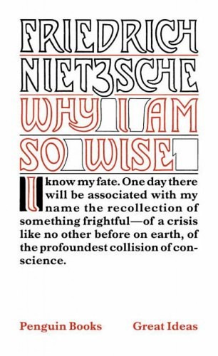
Friedrich Nietzsche. Artwork: Phil Baines. ‘I came across some drawings by Henry van de Velde for Ecce Homo, with the word “Nietzsche” on it. This is based on a pencil rough of that word. Frederick Marns, the guy who wrote the word “filter” on the B&H packet, drew the artwork.’ (PB)
The joy of text
A sense of joy pervades the whole series. Talking about the frustrations of constantly emphasising to students that you only change type size for specific reasons Catherine Dixon says: ‘And then they open these glorious old Bibles and find every line is a different size. And they look fantastic.’ John Baskerville’s 1776 Holy Bible provided both inspiration and punctuation for Phil Baines. ‘There’s a comma on Baskerville’s title page and it needs it visually,’ he explains, with reference to a spurious comma he added to the cover of The Christians and the Fall of Rome.
He continues gleefully: ‘And the title’s broken like that because one of my favourite bands is The Fall, so “the Fall” had to be accentuated in the the middle.’
The twenty covers were presented for approval in a virtually finished state: collectively they made the strong-est statement, both in the individual treatments of the front, and the unifying structure of the spine and rear covers. What could anyone say? That there’s no penguin on the covers? The whole series was approved almost immediately; a unique experience for the designers, and almost their undoing. Gradually concerns were voiced about ‘impact’. It took frantic last-minute negotiations (spurred by the certainty that he’d have to produce seven new covers) for Pearson to overrule a suggestion to have the covers printed in fluorescent ink.
Great Ideas is a concept you either buy into or not. The Reference Library titles are a harder sell – they are rarely bought on impulse. People buy them because they have to, and there is always a wide choice. And why even bother with a book when so much is available online? Yet Alistair Hall is adamant that books communicate emotionally, and the Internet can never compete on that level. ‘Books have authority, because we know they cost time and money to create; they have permanence and solidity. You don’t have to worry that a book’s going to crash, or that you’ll open it one day and someone will have reformatted or re-edited it. We buy books not just for their content, but as objects which say things about us, and you’re unlikely to get that with the Web.’
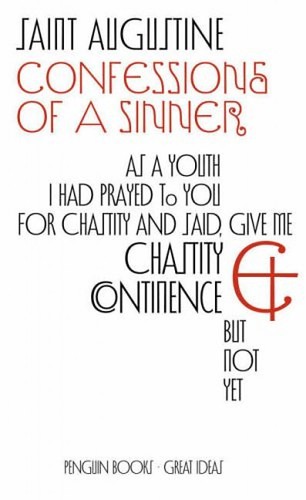
St Augustine. Artwork: Catherine Dixon. ‘Phil had created the font, Vere Dignum, that’s loosely based on some lettering we found in a book by Nicolete Gray. It’s the decorative nature of the lettering that goes back to the idea of inscriptions, celebrating the letterforms themselves.’
It’s not a relaunch, it’s a repackage
Penguin has a long tradition and strong presence in reference works, and thankfully steered clear of an otherwise pervasive tendency to announce dictionaries with computer-generated swirls of blue. All the same, a problem was identified: ‘The last look was only redesigned four years ago,’ Stoddart explains. ‘They were good at the time but dated pretty badly. This isn’t actually a relaunch; it’s repackaging the covers.’
They analysed what made dictionaries sell. It is easy to buy a Penguin; the company is as familiar as the BBC. Penguin still retains a place in people’s hearts, but that is no guarantee that the books are bang up to date. They decided to soften the impact of a strong, brand-based approach. ‘There’s something very approachable about them [dictionaries],’ Stoddart feels. The rounded corners make the books practical, usable; there’s a friendliness about the whole pitch.’
And the three-band covers and choice of typeface? ‘It’s actually Futura,’ he says. ‘We relaunched the Modern Classics in 2000, and black Classics last year, and used Futura as a branding element. This was after a lot of discussion with our American counterparts; we did originally suggest Gill Sans and they thought it was too “English”. So Futura is almost becoming a kind of house font.’
With the problem of even abstract, image-led covers dating so quickly, they needed something fairly ‘timeless’, and type was the natural choice. ‘If they’re going to be typographical, there’s only so much you can do,’ Pearson continues: ‘Establish a brand section, title section, and floating descriptive section; and giving the title prominence in the page makes sense. It had to look like a manual, something one needs. A strong typographic statement does all those things for you; it doesn’t need any embellishment.’
In many of the 1970s Penguin Education titles, Derek Birdsall dragged the title the whole length or width of the cover. Pearson happily acknowledges his influence. Similarly, the spines are crucial: the lettering fills the space here. Using these elements as starting points, the books almost designed themselves. Of some 70 titles given this treatment, about half incorporate a simple photographic element in the top panel. More abstract subjects – how do you illustrate literary theory? – just use a block of plain colour from an agreed palette.
For the Reference treatment, there is a clear ancestor in Birdsall’s designs. The way he could make the strongest bold statement appear entirely effortless was an inspiration. And the three-band covers and black branding element have an unassailable Penguin pedigree. But the rounded edges produce a final touch that softens the whole concept and adds intrigue and an irresistible tactile quality. It is unlikely to catch on. The process is extremely labour intensive and even a little profligate.
Everyone at Penguin was at pains to stress that there is nothing nostalgic
in this reversion to a version of the typographical covers that once defined the Penguin brand. With the Great Ideas series in particular, any illustration would be superfluous and irrelevant: the covers are already illustrative. The period of each book is neatly referenced in the choice of typeface or lettering, and in the layout. The strength and passion of the work is reflected clearly in the designers’ supremely confident improvisations and occasional games. Such affection can be contagious.
Marx & Engels. Artwork: David Pearson.

Steve Hare, writer, Derry Hill
First published in Eye no. 54 vol. 14 2004
Eye is the world’s most beautiful and collectable graphic design journal, published quarterly for professional designers, students and anyone interested in critical, informed writing about graphic design and visual culture. It is available from all good design bookshops and online at the Eye shop, where you can buy subscriptions and single issues.

