Feature

Andy Altmann remembered
Mark Sinclair, David Jenkins, David Ellis, Chrissie Charlton, Gordon Young, Gert Dumbar, Justine Tabak, Andy Stevens
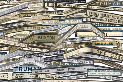
Truman’s show
Empire of posters
John L. Walters, Stefan Sagmeister, Noel Douglas, Liza Enebeis, Jonathan Barnbrook, John Warwicker
Type, art and The Beatles

Reputations: Samar Maakaroun
Supernova
Eye Type reviews 109
Dan Reynolds, Toshi Omagari, Linda Kudrnovská, James Clough, Silvia Sfligiotti