Autumn 2000
8vo: type and structure
For fifteen years this UK practice has given typography a central place in graphic design

The small, London-based design practice 8vo has an unusual position in the recent history of British graphics. Formed in 1985 by three then unknown designers, Simon Johnston, Mark Holt and Hamish Muir, a year later it published the first issue of Octavo, a typographic magazine of intense seriousness and overt graphic sophistication. Now, a decade and a half later, many typographers still remember vividly the impact of seeing a copy. For a few, it changed the course of their careers.
The eight issues of Octavo appeared intermittently until 1992, when the final issue, a CD-ROM, was released. Since then, the practice has gained a reputation for a dislike of publicity that verges on the reclusive. Little of their work has appeared in design magazines, though their identity for a television production company was shown in a four-page article in Eye no. 3 vol. 1. 8vo has been working steadily ever since, with projects for the Dutch museum Boymans-van Beuningen, the Fluxus music festival in Scotland and billing systems for utilities such as Thames Water.
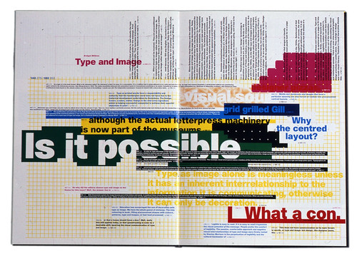
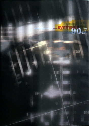
Top and below: Cover and spread from the seventh issue of Octavo (1990).Designed and edited by 8vo (Mark Holt, Hamish Muir, Michael Burke). Front cover: art direction by 8vo; photography by Nitin Vadukul.
Today, in a small studio in south London, Muir and Holt look back at 8vo’s time as an entrepreneurial publisher with amusement. ‘It was kind of naive, wasn’t it?’ says Holt. ‘I think it was more a weird sort of madness,’ says Muir. You can see their point: the seventh issue of Octavo, published in 1990 – just as the economic recession was really starting to bite – cost £40,000 for a print run of 4000.
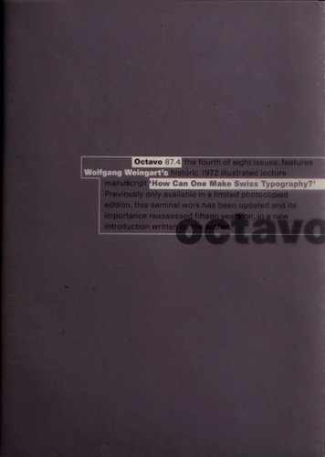
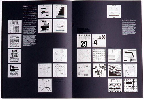
‘We had unlimited amounts of intent, things we desperately wanted to do,’ says Holt, ‘but then the bills came and you realised that you’d maybe gone overboard.’ An example of this is issue four (87.4), published in 1987, the whole of which is a reprint of Wolfgang Weingart’s famous lecture ‘How can one make Swiss typography?’ It is illustrated with the black and white slides that Weingart used as overheads for the lecture, and the idea of seeing these images projected in the dark inspired the whole design. ‘The originals were the 6x6cm film positives that he projected in his lectures,’ says Muir. ‘So we put them in a dark environment and showed them as slides.’
The slides are printed as white squares with black type, reversed out of a deep grey background. Their determination to use the one of the then new six-colour presses to the maximum was typical of the obsessiveness of the Octavo project. ‘There are three greys,’ Holt says. ‘There’s a pale grey, printed to pick up the dust on the press; then there is the grey you see; then there’s another grey that builds it up as a solid colour. So there are three greys, plus two blacks (one for the images, one for text), plus a varnish.’ The crazy bit, however, is that the type is white, reversed out of the three greys. ‘And,’ says Holt, ‘we had to gauge the dry-down so that it was exactly the same grey throughout the sixteen-page book.’
Perhaps only designers who had not worked for very long would have attempted such a project. Anyone with any real experience of the press technology of the time, the general unpredictability of paper and ink, and the inevitability of human error, would surely have built in some margin of safety. However, 8vo assumed that if something was technically conceivable then it was pragmatically possible.
The practice was founded at a time when British graphic design was insular to an extent that now seems inconceivable. A booming economy caused a corresponding demand for graphics. The bulk of the work that was being produced, particularly the work lauded by authorities such as d&ad, tended towards the whimsical, gently humourous side of English culture – creamy, watermarked paper; centred, serifed type; punning illustrations. A few older designers working in the continental European graphic tradition, with its emphasis on formal structure and rigorous typography, were in the minority.
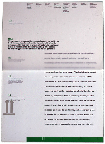
Cover and sideways reading spread from the third Octavo. The editorial begins on the overlaid tracing paper inside cover and continues beneath. Editors for the first six issues: Simon Johnston, Mark Holt, Michael Burke, Hamish Muir.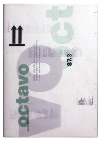
Few British graphic design courses of the late 1970s or 1980s covered Swiss or Modernist typography, resulting in a generation that knew little of Piet Zwart or Jan Tschichold, with horizons that stretched no farther than the British coast. Johnston, Holt and Muir had each come to graphic design by unconventional routes. Johnston and Muir had been at art school in Bath. There, Muir saw some posters designed by Weingart. ‘They just stopped me in my tracks,’ he says. ‘They seemed to have landed from some planet – but immediately I understood what they were about.’ His tutor encouraged him to apply to Basel, where he spent a year in Weingart’s department, a route that Johnston also took. Holt did a broad-based design course in Newcastle, where, he says, he learned little about typography. Then he moved to San Francisco. ‘There was this Los Angeles new wave thing that was riding on the back of Swiss typography, so I saw much more of it around and realised that it interested me,’ he says. ‘But I didn’t have any formal training.’
Johnston (who left 8vo in late 1988 and then went to America, where he runs the design office Praxis) went to Basel at the suggestion of Benno Zehnder at Bath. ‘The Weiterbildung’s formal exercises were done in such depth and rigour that it was like learning a language that you thought you knew, but realised, through these exercises, that you didn’t really know it,’ recalls Johnston. ‘There was Armin Hofmann for color and composition, Wolfgang Weingart for typography, André Gürtler for letterform design, Kurt Hauert for drawing, Max Schmid for symbol and logo design. All masters.
‘Learning through doing, through repetition, doesn’t sound sexy but it works. In my teaching I like to use the language analogy, of learning design and typography in the manner of learning another language, with its own grammar, syntax and vocabulary. The more fluent you are in the formal language of design and typography, the more able you are to make it say what you want it to say. This was the key to the education in Basel. You can have the best concept in the world, but without sophisticated formal skills to express that concept, it will fall flat on its face. It was deep long-term training that stays with you, rather than shallow quick results-oriented projects.’
Spread and cover from fourth issue of Octavo (87.4) which is entirely taken up with Wolfgang Weingart’s celebrated illustrated lecture ‘How can one make Swiss typography’ (1972). Cover has all cover lines and rules are reversed out of grey on the tracing paper outer (with the ‘masthead’ and number printed in black), leaving the solitary lowercase ‘octavo’ printed in black on plain white board cover underneath.
It was a shared feeling of isolation that motivated Johnston and Holt – both then working at the Conran design studio in London – to decide to publish Octavo. ‘I think we all felt some kind of empathy with European design and felt that in this country typography was not really considered as a way of solving graphic design problems,’ says Muir, who was invited to join while they were working on the first issue. ‘It was either ideas- or image-based. So there seemed to be a huge vacuum. There was a place for a serious – or even a mad or warped view – of looking at typography and trying to use it as a central core in graphic design.’ Michael Burke, who had a wide circle of contacts with possible writers, joined as an editor.
After attempting to interest a mainstream publisher to support the venture, Johnston and Holt decided to just go ahead and publish it themselves. ‘We secured agreements from the typesetter and printer to delay our payment to them for six months until we got some revenue back from sales of the first issue,’ says Johnston.
The first Octavo, published in 1986, established a format that was kept for the subsequent six issues. It was a4, with sixteen pages (a reference to its title), a cover and tracing-paper dust jacket. Issue one was printed in three colours – the traditional printer’s black and red, and a grey – and varnished. The idea that the design of a magazine about typography might reflect its content should not have been radical; but in the UK at that time it was.
As an object, the first Octavo was coolly seductive, using minimum materials to maximum effect, using structure and constraint to communicate. In retrospect, Muir and Holt believe they were too much in awe of the notion of ‘a typographic journal’ as a great, learned thing. This seriousness, and the assumption that only a few designers are interested in typography, dates Octavo more than its design. The editorial for issue one, for instance, reads like a rallying cry: ‘Although Octavo 86.1 features mostly English work, later issues will be more international in flavour (it would be difficult to complete eight issues of a publication with examples of good English typography).’
The reaction of the magazine’s audience depended on whether or not they knew about the Swiss tradition. The typographer Kelvyn Smith was then studying fine art and knew nothing about typographic history. ‘I saw this magazine and it turned things upside down,’ he says. ‘I suddenly saw how you could use words as image.’
It was this revelation, he says, that drew him away from fine art and towards type. Those who knew about the Swiss tradition found Octavo exciting in a different way.
‘I think it was the first example of something in this country using the spirit of modern typography,’ says magazine designer Simon Esterson. Octavo spans the time when design moved from typesetters and paste-ups to Apple Macs and digital technology. The final issue, on the impact and importance of digital media, is on CD-ROM (see Reviews, Eye no. 9 vol. 3). ‘Looking back, the timing was so important,’ says Muir. ‘Technology wasn’t accessible to graphic designers, so you still had to rely on typesetters, repro people, printers. You would specify things, and you would get them back. And then you’d correct them, and then you’d get them back again. It was a huge mountain to climb.’
Spread from the sixth issue of Octavo (1988), the issue has the theme of typography in the environment.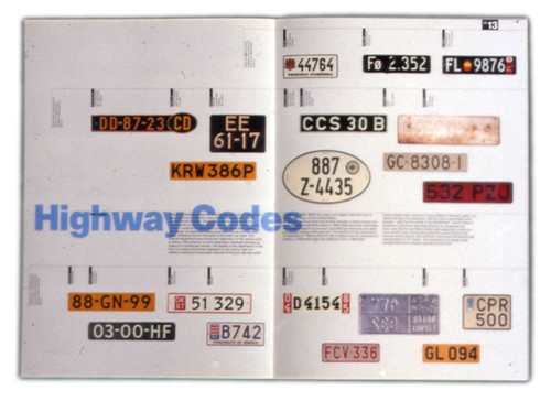
There is a marked difference between the first four issues and the next three, which have an exuberance that seems to be inspired by the realisation of what was becoming possible. ‘Repro was getting better, printing technology was getting better – all these things fuelled the ideas … about how the next issue could look,’ says Holt.
Although the later issues of Octavo are more expressive in their use of type and colour, there is a strong sense of structure throughout. The positioning of type is often unexpected but never gratuitous (though Ken Garland criticised the ‘footling’ typography of ‘Type and Image’, the Bridget Wilkins essay in issue seven). The editorial in issue three (87.3) sets out their views on structure: ‘Order is fundamental to understanding. The ability to exploit typographic structure to its full potential requires both a sense of formal spatial relationships – proportion, scale, optical balance – as well as a knowledge of the microstructure inherent in letterforms…’
While it is undoubtedly true that much of the radicalism of Octavo was to do with the context in which it was published – a current of Modernism in an ocean of tepid English whimsy – it is the way in which the designers pushed both the technology and their self-imposed structures to the limit that prevents their work from being pastiche, and continues to distinguish their work today. As the typographer David James puts it: ‘There is a lot of ‘Swiss style’ around but none of it has the form and function of Octavo, it doesn’t have the intellectual element that their work had.’
8vo’s fascination with structure, technology and communication was to lead to an unlikely turn in its fortunes at the end of the 1980s. An American Express executive visiting London happened to see a short item about the designers on a television arts programme. Within two days he was in their studio inviting them to come up with ideas for an introduction pack for new members. This led to the redesign of the company’s antiquated billing system, making the bills more user-focused, and getting to grips with the mainframe technology that produced them. In 1999 8vo was asked to redesign the Amex card itself. The idea that such a large corporation would allow its iconic card to be redesigned by three blokes in a tiny studio was, perhaps, too good to be true; although 8vo completed the project, it was eventually sidelined.
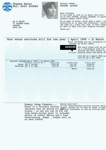
Since the early 1990s a string of other companies, such as Thames Water and Orange, have asked 8vo to look at their billing systems. Muir and Holt seem to enjoy the intellectual challenge of rationalising these complex systems. The studio has rarely comprised more than four people, so they rarely delegate such work to juniors. ‘We are doers,’ says Holt. ‘We like doing stuff. It has always been a small office and it has always been very hands-on.’ Nevertheless, it is the sort of nuts-and-bolts design that few small studios would be interested in taking on.
Thames Water statement, 1998. Although initially briefed to redesign the bill, 8vo ended up analysing and restructuring all the company’s mainframe-generated billing system. Design: 8vo (Mark Holt, Hamish Muir, Malcolm Southward). Thames is now able to target appropriate information to different customers, whether business or domestic, metered or unmetered, the design element of the project ended up being a small part of the whole project.
These corporate projects have clearly given 8vo an unusual degree of financial stability. Muir and Holt claim that Octavo broke even in the end. Nevertheless, well-paid corporate projects helped keep them afloat during the Octavo years and have given them the freedom to do creative projects for organisations such as Factory Records, the independent music label, in the late 1980s and early 1990s, and for Flux, an annual Scottish music festival in the late 1990s.
Factory Records was notoriously disorganised, leaving its designers to do pretty much what they wanted. ‘Getting information out of them – like the names of the tracks – was like getting blood out of a stone,’ says Muir. Given the apparent luxury of complete creative freedom, 8vo’s response was to set themselves a very tight brief of their own making. ‘It’s quite difficult to find a starting point when you could start anywhere,’ says Muir. ‘So actually using the production process, and trying to deconstruct it, saying, “We’ve never done this, so why don’t we do it and see how it shapes the project”, can narrow the brief and make it easier. Designers hate open briefs, they want things they can kick against, or rules they can break or extend or whatever.’
Typical of this approach was the 1987 sleeve of Durutti Column’s The Guitar and Other Machines for the Factory Records label. The image, including the type, was achieved entirely in-camera, the lettering and photographs having been stuck to layers of glass and then shot in one go – a technical challenge that they set themselves.
8vo’s approach has remained pretty much the same since 1985, with changes tending to reflect developments in technology far more than changes in the designers’ thinking. It’s not that they don’t experiment, more that they do so within parameters that they set for themselves. It was this, says Wim Crouwel, that made the work he commissioned from them for the Museum Boymans-van Beuningen successful – it was innovative, but within parameters that ensured it was acceptable to all of the museum’s wide audience. From 1989 until 1993, 8vo designed all the museum’s exhibition posters and catalogues, commissioned by individual departments each with their own differing agendas and budgets. Crouwel’s aim was that each publication had its own identity, while somehow ensuring that they were recognisable as coming from the museum. His only stipulation was that the designers must use Futura. The result is an impressive body of work in which a single typeface is used with a mixture of sobriety and imagination. ‘They weren’t afraid to use the heavier, extra bold type. They are not afraid to go to the limits with page design,’ he says. ‘In a restricted way they were experimental.’
Flyers for the Flux music festival, a fringe event that coincided with the Edinburgh International Festival, 1997-99. Text was flowed in to the pre-designed structure at the last minute.
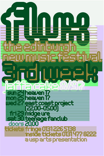
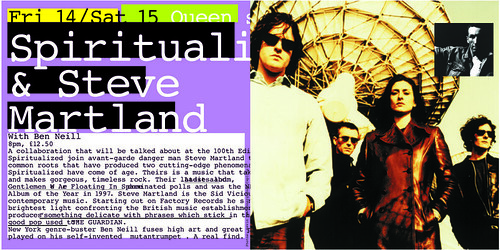
Their work for the Flux music festival is a more recent example of using the production process to give shape to their work. They knew that the posters announcing the line-up of bands would be text-heavy, and that the copy would arrive at the last minute. Their solution was to use these factors as the starting point for the design, using the copy as the image, structuring it by setting up a template into which the text could be run. Consequently, the final appearance of each poster depended on whatever text they received. ‘It’s something that has interested us more and more in recent years,’ says Holt. ‘Creating things that design themselves. So you come up with the engine and then you flow in the text. And whatever it is comes out.’
Alex Poots, organiser of Flux, had been impressed by the intelligence of 8vo’s approach to presenting contemporary music for Factory. ‘They seemed to be comfortable about not reflecting anything from the past, comfortable about being new,’ he says. At first glance the fabulous colours and in-your-face boldness of the Flux posters makes them seem utterly at odds with the utility bills that occupy so much of 8vo’s time. Structurally, however, they are similar: carefully thought-out systems into which chunks of text can be poured. ‘It’s the same as designing a gas bill,’ says Muir, ‘because you are designing an information system, and this one [Flux] happens to be expressed in a slightly different and more colourful way.’
Muir and Holt seem happy to avoid the limelight, allowing Malcolm Southward (who joined in the mid-1990s) to deal with clients and the outside world, and not bothering with the usual round of lectures, books and punditry that keep many established designers’ names in circulation. Corporate clients seek them out for their ability to analyse, structure and communicate complex information – but may not always appreciate the quality of the typography that comes with the thinking. Small arts organisations seek them out because of a near-legendary reputation for typography but may not always appreciate the intelligent analysis that underpins it.
‘It is only about ordering information,’ says Muir. ‘So if it’s a nightclub audience you do it one way, and if it’s Thames Water you do it in another, but you still have fun. It’s about language, it’s about communication, it’s about presenting information.’
Julia Thrift, design writer, London
First published in Eye no. 37 vol. 10, 2000
Eye is the world’s most beautiful and collectable graphic design journal, published quarterly for professional designers, students and anyone interested in critical, informed writing about graphic design and visual culture. It is available from all good design bookshops and online at the Eye shop, where you can buy subscriptions and single issues.

