Autumn 2010
A nose for type
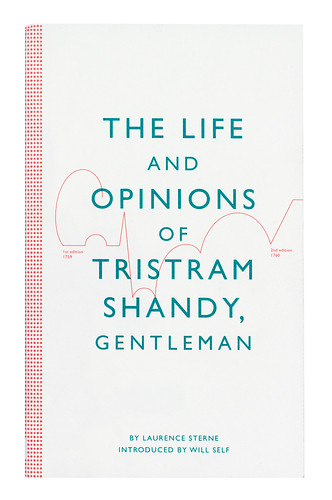
A new publisher of ‘visual writing’ launches with this typographic reboot of an eighteenth-century classic.
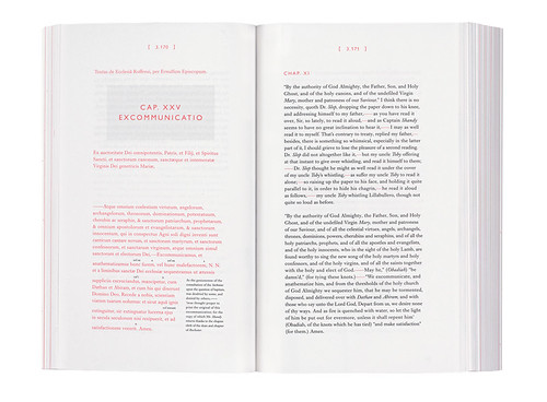
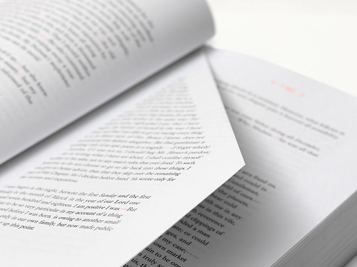
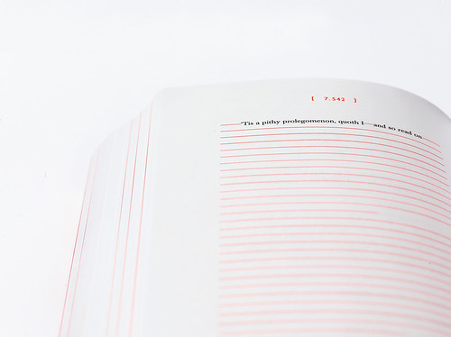
The first book from new publishing house Visual Editions is a chunky edition of Laurence Sterne’s The Life and Opinions of Tristram Shandy, Gentleman, designed by APFEL (A Practice For Everyday Life). This is a trade paperback on dazzling white stock with some of the original’s wayward punctuation in a garish fluorescent ink. The notorious ‘black page’ is made by overprinting all the text to that point; a diagonally folded page, in APFEL’s words ‘suggests that only the curious and inquisitive reader should continue after this point – or else the door is shut’; and more ‘pink orange’ ink is splashed out for the section dividers – the 684-page novel was originally published in nine pocket-sized volumes between 1759-67.
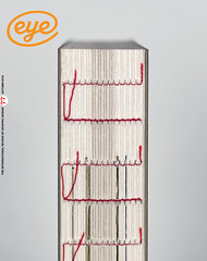
Above: Cover from the new Visual Editions version of Sterne's novel. Design: APFEL (A Practice for Everyday Life), 2010.
One of the great comic works of English literature, Shandy has been baffling and delighting readers since its first publication. It dates from a time, as Will Self points out in the newly commissioned intro, when the form of the book was still in flux – ‘protean and shape-shifting: now a parchment scroll or illuminated vellum, then a serial part-work’.
Anna Gerber and Britt Iverson founded Visual Editions to publish what they call ‘literary writing that uses visual tools’, books that could also be beautiful objects. For this goal, Sterne’s classic was ideal.
‘I tried to read the book as a teenager,’ says APFEL’s Emma Thomas, ‘but found it hard work. Then a friend gave me it as a present and I realised that this was an important book – especially for graphic designers – and funny!’
Thomas continues: ‘With Shandy, the visual details are not decorative or extraneous, rather they are part of the text itself, so it was a good choice for the first book published by Visual Editions.
‘You can see from the first edition at the British Library that Sterne oversaw the printing and directed the interventions himself, yet these elements (and his maverick spirit) were diluted in subsequent editions.
‘The original Shandy subverts the print techniques that would have been available to Sterne at the time to illustrate various points in the story. We highlighted each intervention he made, from the dashes and asterisks (which usually denote words that Sterne can’t bring himself to write), to our new version of the marbled page.’
Gerber and Iverson encouraged APFEL to both ‘exaggerate and celebrate’ the visual elements in the original and to introduce new elements, ‘as long as they didn’t seem gimmicky or decorative and stayed faithful to its spirit.’
Above: folded page from The Life and Opinions of Tristram Shandy, Gentleman by Laurence Sterne, published by Visual Editions, 2010. Design: Emma Thomas, APFEL.
New quirks, in addition to the folded page, include ‘spot varnish for perspiration, and perforated pages to show the missing chapter.’
Gerber says: ‘It was important to have a high level of production while keeping the price affordable, distinguishing us from “artist’s books”. The first printing had a few glitches. The ink, especially the fluorescent, didn’t sit well on the paper, so we asked the [Chinese] printer to reprint those pages.’
Forthcoming titles from Visual Editions include Jonathan Safran Foer’s die-cut Tree of Codes, designed by Sara De Bondt, and Marc Saporta’s Composition No.1, with Universal Everything’s Matt Pyke – his first book design.
First published in Eye no. 77 vol. 20.
Eye is the world’s most beautiful and collectable graphic design journal, published quarterly for professional designers, students and anyone interested in critical, informed writing about graphic design and visual culture. It is available from all good design bookshops and online at the Eye shop, where you can buy subscriptions, back issues and single copies of the latest issue. You can also browse visual samples of recent issues at Eye before You Buy.

