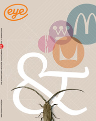
Spring 2008
A2’s type design

A2’s bespoke type design is mainly the responsibility of Henrik Kubel, though every typeface is developed and approved by both partners. Kubel is self-taught, making his first typefaces while studying at Denmark’s Design School from 1992-97. Though he had drawn letters since he was twelve, it was the discovery of Fontographer that sparked his passion for type design. ‘At that time there were no schools that were teaching type design,’ says Kubel. ‘Now we have Reading, and the courses in Holland. But we were young, and embracing everything! It was a way of claiming your identity.’
His immersion in computer design led him to stop drawing by hand for a while but he regained his drawing skills back while at the Royal College in 1998. ‘The tools that every type designer has now are just amazing. But you can have great tools and still not be a good designer.’
For Kubel, drawing type is personal work, and he gets satisfaction from seeing its development, the way it gets better over time. ‘It’s such hard work that if there were nothing to gain I wouldn’t do it. If you want to draw type, you have to do it on your own, in your spare time, because no-one’s going to pay you for it – it’s moonlighting. And it is so time-consuming, that if you have five minutes spare you have to use it on drawing type.’
Type is fundamental to A2’s design practice – Kubel points out that you need it right from the initial concept. ‘When you set an essay, you need letters, you need type. It enables us to be very precise.’
A2’s vocabulary of forms is broad, from elegant or quirky text faces, to flamboyant display. Kubel appreciates his freedoms compared to that of a full time type designer, who must produce fifteen weights when the market demands it. Kubel and Williams always know exactly what each typeface is for.
‘We do what we have to do,’ says Kubel, ‘and these days we seem to be doing Eastern European characters for every single type face. The EU’s got bigger, and a lot of artists come from those countries, and suddenly names are appearing with diacriticals, so we need them in our character sets.’
Both feel obliged to point out what A2 is not: ‘If we’re cast as a type foundry, that’s our design business gone!’ However Kubel does intend eventually to release their typefaces on the commercial market: ‘They will be released. But then we will have to suit the market – x amount of weights before you release a typeface – and that takes time again.’
Time is the enemy, and for the moment, the studio’s regular workload is enough. ‘It is amazing what has happened within the past couple of years,’ says Kubel. ‘I’ve stepped up my hours of working on type in my spare time – not that I have any!’
Kubel and Williams relish the freedom and control in designing type for nearly every project. ‘Not all jobs are amazing jobs, but you can turn them into something that’s special by adding your own bit,’ says Kubel. ‘Sometimes, in any commercial job, the compromises are many, but what’s usually left is the type.’
First published in Eye no. 67 vol. 18 2008
Eye is the world’s most beautiful and collectable graphic design journal, published quarterly for professional designers, students and anyone interested in critical, informed writing about graphic design and visual culture. It is available from all good design bookshops and online at the Eye shop, where you can buy subscriptions, back issues and single copies of the latest issue. You can also browse visual samples of recent issues at Eye before You Buy.
