Summer 2010
All her own invention
Graphic design’s recent concerns have for decades been at the heart of Laurie Anderson’s practice

New Yorker Laurie Anderson is routinely termed a performance artist, though her work is quite distinct from that of others in the field. Thanks in part to a UK pop hit (‘O Superman’) in the post-punk era, which led to a recording contract with Warner Bros, she has a level of visibility and commercial viability that has sustained a successful career for more than three decades. And current design practice, which increasingly integrates sound, speech, music, video, staging and performance with images and text, has much in common and plenty to learn from a body of musical performance work that includes installations, booklets, diagrams and inventions.
‘I consider myself as much of a visual artist as a musician, so I have a lot to do,’ she says, while visiting London for the touring Delusion show at the Barbican Theatre in April 2010. ‘I do the animations for shows and do the visual design. I shoot a lot of it myself – it’s what I do as an artist.’
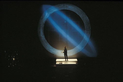
Much of Anderson’s work derives from her skill in storytelling, talking in a darkened room – whether with slides and an overhead projector or the most sophisticated HD rig. The dramatic visual power of a single speaker, enhanced by lighting and simple props (glasses, violin, phone) is a vital aspect of her work, and a distant antecedent of celebrity designer presentations – think Sagmeister or Kidd. As a young adult Anderson listened to talk radio more than music, and when she studied sculpture with Carl Andre and Sol LeWitt at New York’s School of Visual Arts, she preferred the talk to the actual (highly minimal) artworks. She became part of the downtown milieu that included LeWitt, Steve Reich and Philip Glass in the 1970s, when the avant-garde arts and music provided much mutual support (Minimalist music, ignored by concert halls, was performed in galleries).
The conceptual dimension of her early work has renewed relevance in the current era of code-based art and applications. We spent the first ten minutes of the interview for this article discussing the merits of her favourite iPhone apps, including Smule’s Ocarina (designed in part by Perry Cook of the Princeton Laptop Orchestra). Digital artist Casey Reas, in his talk at the V&A’s ‘Decoding Design’ conference in February 2010, spoke of the influence of ‘systems’ art and music – including composers such as Steve Reich – in the work he made using Processing. Just as Reas’s complex pieces begin with a sentence of text that describes a set of relationships, Anderson’s most iconic works often began with a set of simple instructions and a diagram.
The tape bow violin (devised with Bob Bielecki), in which the bow’s horsehairs are replaced by magnetic tape and a tape head mounted on the bridge, is one example: the idea becomes an object, which is also a prop, which requires a staged gesture (Anderson’s) to realise the idea as an audiovisual performance. It is both artwork and program, since the sound depends entirely on the content of the tape.
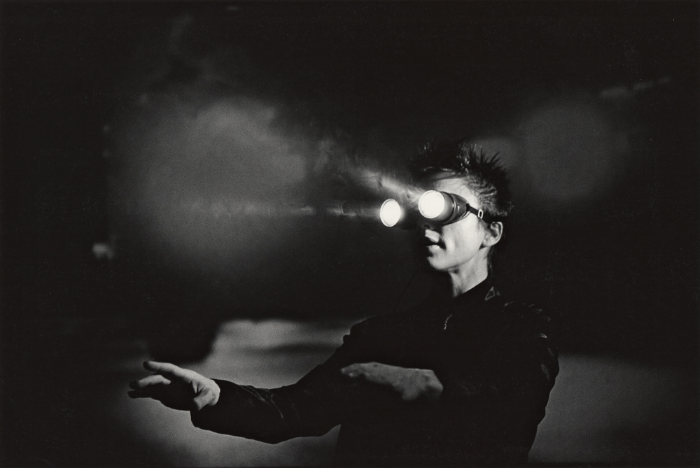
The mouth light, also used in United States, Anderson’s landmark ‘opera’ from the 1980s, is another example: a device that sets the scene for a performance, creating visuals that are dramatic, both in motion and stills – see Lynne Goldsmith’s portrait of Anderson with light between her lips.
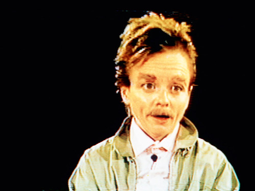
Such devices remind one of John Cage’s inventions and appropriations, such as the prepared piano and deconstructed phonograph cartridges. Anderson’s use and abuse of the Eventide Harmonizer, a rack-mounted electronic unit that changes pitch in real-time, demonstrates her process-oriented approach to making work, with the bonus that it created a new, male, voice she could play with, satirising masculine attitudes and postures of authority.
She created a series of videos using this male clone character for US public television in the late 1980s. He has now evolved to the point where he has a Facebook account. And a name, Fenway Bergamot, bestowed upon him by Anderson’s husband, songwriter and singer Lou Reed. It is Fenway’s image, with a graphic moustache and enhanced eyebrow, that fills the cover of Homeland (Nonesuch), her first studio album for ten years. ‘I do my own make-up,’ says Anderson. ‘I just slapped that eyebrow on in a second and thought: “That looks pretty good!”’
Anderson’s work is always about something more than mere self-expression. The subject matter ranges wide from the apocalyptic to the trivial, from the political to the personal. She responds to current events in the manner of a journalist or comedian: during the London run of Delusion she rewrote a story that linked her Nordic ancestry to Iceland to refer to the cloud of volcanic ash from Eyjafjallajökull.
When she first performed ‘Only an Expert’ in 2007, it dealt with weapons of mass destruction; the version featured in the Homeland album adds a section about the banking crisis of 2008:
Now sometimes experts lend you money.
Sometimes they lend you lots of money …
Sometimes other experts say, just because all the markets crashed doesn’t mean it’s necessarily a bad thing …
Just because your friends are fired and your family’s broke and we didn’t see it coming doesn’t mean that we were wrong.’
This piece, perhaps her most infectiously catchy track since ‘Language Is a Virus’ is a highlight of Homeland. Despite welcoming the world of apps, and allowing her Fenway avatar to dive into the world of Web 2.0, Anderson has reservations about computers and televisions. ‘I spend so much of my time looking at rectangles like everyone else, thinking that you can stuff the world into that little area. And even surfing around, thinking “oh I’m tapped in” when you’re tapped into some lousy graphics for the most part.’
Though she is regarded in some quarters as a video pioneer, ‘it didn’t look good enough,’ she decided. ‘It was nice and flexible, nice and handy but it just wasn’t beautiful. All this stuff I’ve used in Delusion was shot in a very filmic way. It’s very soft-edged, it’s not this brittle, video stuff.’
Several recent shows have incorporated her writing and drawing as chalkboard animations: ‘I could have done them on my Wacom tablet but you’re gonna see the ragged edges, you’re gonna see the digital stuff. Instead I did the drawings on a chalkboard, with chalk and shot it with a fancy Fuji Canon camera. ’Cos you can feel the dust.’ The tablet, which she uses for everything, is a key to another interest, the way that touchscreens affect interactive media.
‘I think haptics is going to develop into an artform,’ she says. ‘The ability to simulate touch is something a lot of people are working on right now. You can have a drawing tablet … it feels like you’re drawing in clay, you’re incising or it feels like you’re skidding across ice. That will change the way your hand works utterly and it will change the way other people can experience your work as a graphic artist.’
First published in Eye no. 76 vol. 19.
