Autumn 1994
Theatre of dreams
Andrzej Klimowski is obsessed with eyes, faces, hands, angels and devils. He is one of Britain’s most haunting image-makers

As the history of graphic design repeatedly demonstrates, the émigré occupies a special position in art and design. Liberated, voluntarily or not, from the constraints of their original culture and uninhibited by the conventions of their new home, émigrés are unusually free to innovate. The émigré artist, almost by definition, is expected to travel with a suitcase full of challenging new ideas.
Born in 1949 in London of Polish émigré parents, Andrzej Klimowski belongs to an even rarer breed. In British design at least he is probably one of a kind. For Klimowski is a three-times émigré, an émigré in reverse. Searching for possibilities he felt that British culture could not provide, he made his way as a student to Warsaw, where he rapidly built a career for himself as one of the leading young Polish poster artists of the 1970s. Then, in 1980, just before the imposition of martial law and at the height of his success, he saw what seemed to be a well-mapped future opening up ahead of him, took fright at the certainty of it all (‘when you’ve passed 30 I think biologically and sociologically it’s the last moment to change’), began to worry about the obligations to the Polish state that a permanent card of residence might entail, and decided to return with his family to Britain.
Klimowski’s career since then has had its fair share of ups and downs. Like many an émigré he had to start all over again – this time, frustratingly, in the country in which he had grown up. Unable to rely on commissions alone, he was obliged to spend much of the 1980s teaching (he is still a part-time tutor at the Royal College of Art). Moreover, as Klimowski was slowly to discover, the rules of engagement had changed. In Poland he had enjoyed the status of grafik or graphic artist, a professional description on a par with doctor or architect, supported by the apparatus of understanding clients, appreciative public and a benevolent state. In Britain such a role might somehow be achievable, but it could not be taken for granted because it was not built into the system. The career choices, then as now, were graphic designer or illustrator, and rarely was it possible to be both.
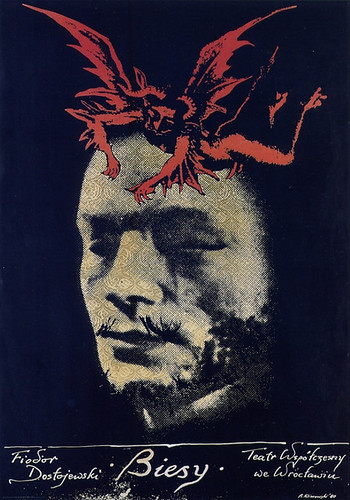
Poster for a theatrical adaptation of Dostoyevsky’s The Possessed, 1980. The novelist compares the terrorists in his political melodrama to devils.
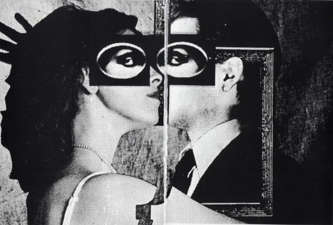
Top: Synapse, 1983, a screenprint double-portrait of Klimowski and his wife Danusia Schejbal. Personal pieces such as this bear a strong thematic relationship to Klimowski’s commercial commissions and the same images – photographic and found – recur in both kinds of work.
At least part of the fascination of Klimowski’s career lies in the way he has struggled to reconcile himself to these changes while remaining true to the essential core of his vision. It is clear, looking at 18 years of Polish and British work, that ‘graphic artist’ is the only fully adequate way of describing Klimowski, even though he is now mainly employed as an illustrator and sometimes dabbles in typography and design. He is an artist whose medium is the mass-produced, printed, graphic image. The dark theatre of his later Polish posters is just as apparent on the much smaller stage of his 1980s and 1990s book covers. Klimowski doesn’t have a manner – surface in the painterly sense has never particularly mattered to him – so much as a mental library of obsessional images to which he must endlessly return: eyes, faces, hands, the naked torso, angels and demons, snakes, flames, pens, pencils and cameras. The strongest and most memorable Klimowskis are always the most personal and least compromised. The best commissions are those that come in series. The most acute commissioners – Pentagram for literary publisher Faber and Faber; The Guardian newspaper – are those who know when to leave well alone.
Klimowski’s parents came to England after the Second World War. His father, a career officer in the Polish army, was a member of the resistance who fought in the Warsaw uprising. Klimowski’s first language was Polish; he did not learn English until he was five and his accent still bears a trace of the latecomer. His first visit to Poland with family friends at the age of 11 revealed an unsuspected world of steam trains, lazy month-long summer holidays and fine living on a shoestring. An elegantly attired uncle with a shaven head showed him around. ‘When we went in the 1970s to live there,’ he remembers, ‘Poland was like the 1950s in England. Even the cars were rounded and slightly old-fashioned. You had wood panelling and chrome lights and radios with valves.’ This sense of pleasurable dislocation, of being out-of-time and adrift in a world of archetypes, has become one of the defining characteristics of his work.
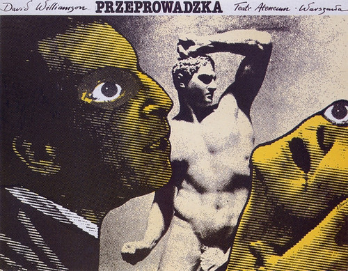
Poster for The Removalists, a study of male aggression by Australian playwright David Williamson, 1981. Following Klimovski’s habit, information is pushed to the edge, giving maximum emphasis to the image.
From 1968 to 1973, Klimowski studied sculpture, painting and graphics at St. Martin’s School of Art. He did not plan to become a graphic artist, but he was drawn to the posters he saw in the jazz clubs on his trips to Poland. His interests shifted towards photography and European film-makers such as Jean-Pierre Melville, Chris Marker and the Polish director Jerzy Skolimowski. In his final year at St. Martin’s, as a post-graduate, he made a 16mm short, 19 bis. Dreamstrasse (a single copy survives in a Warsaw aunt’s cellar). Earlier, he helped to make a documentary for Polish television about photocollagist Roman Cieslewicz, who was to become an influence on his own early work.
In the course of this research, Klimowski visited Henryk Tomaszewski, a professor of graphics at the Warsaw Academy, and showed him his portfolio. Tomaszewski offered him a place and in 1973, with a British Council grant, Klimowski began his studies. A brilliant grafik in his own right (see Klimowski’s affectionate profile in Eye 4), Tomaszewski was a demanding, autocratic but gifted teacher dedicated to the elimination of all ambiguity from a student’s work. ‘He could cut your stuff up completely with a pair of scissors and tell you to give up art and that you were hopeless and crap,’ says Klimowski. ‘In one year I did just four posters. If he liked something, he said, “right, that’s it” and you had to do the poster the same size as it would be printed. I did one poster for him which he loved and after all these bollockings he gave me a great kiss.’
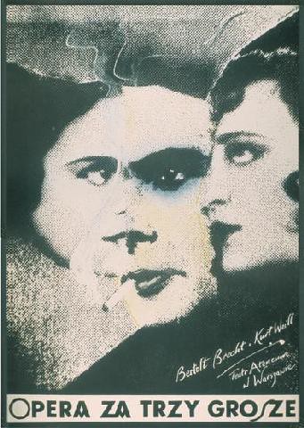
Poster for Brecht and Weill’s Threepenny Opera, 1980. The cigarette packet-sized original, a collage made from film and cabaret images in old Polish magazines, was rephotographed on a course photographic screen and worked with pastel and ink.
Klimowski began working professionally while still a student at the academy. With a letter of recommendation to the ministry of culture from the irascible Tomaszewski (‘it was almost a pleasure teaching him’) he was able to join the artists’ union. He designed books and worked for the satirical magazine Szpilki (‘Pins’), a sort of Polish Private Eye. In 1974 he married Danusia Schejbal, also a child of émigré parents, and she joined him at the academy to study set design. Klimowski asked to stay on for another year and spent much of the time working on stop-frame animations.
In the mid-1970s, after many fruitless visits to the central film distributors’ building, where graphic artists gathered for screenings, Klimowski was assigned a poster for Costa-Gavras’ wartime melodrama about the Vichy government, Special Section. This was followed by posters for Polanski’s Chinatown and Altman’s Nashville (1976), which won him a bonus payment, a prize from the Hollywood Reporter and Polish newspaper coverage. ‘Suddenly I got masses of posters and I was one of these big poster designers. It was a big thing for a graphic artist because everybody saw them.’
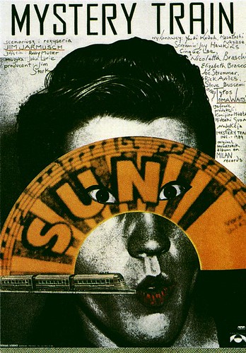
Poster for the Polish release of Jim Jarmusch’s film Mystery Train, 1991. The American director is popular in Poland and Klimowski, a Jarmusch admirer, has designed five of his posters. In the 1990s, the once vigorous tradition of the Polish film poster is in sharp decline. Hollywood movies come with standard designs and only art-house films still receive local interpretation.
It was the theatre poster, however, that was to provide Klimowski with his ideal canvas. Theatre posters had smaller editions of 1000-2000 at most compared with a run of perhaps 13,000 for a nationally distributed film poster. They were better printed on higher-quality paper, often to a larger format, and by the 1970s tended to attract the most accomplished artists. Polish film posters carried little enough information; theatre posters gave away even less: only title, playwright and theatre. For Klimowski, there was an even more fundamental difference: ‘Films have their own visual look and iconography, which is part of the director’s vision. You could find a metaphor for something, a symbol which was nothing to do with any image from the film, but on the whole you had to adhere to that vision, or so I thought. With the theatre, all you were given was the manuscript, or the published play, and it didn’t matter what the director was going to do with it because the poster would be printed way ahead of rehearsals. So you could give your own interpretation.’
With his 1977 poster for the horror film The Omen, Klimowski began to find his own intensely dramatic and anachronistically Catholic iconography: a winged demon is substituted for young Damien’s head. Similar substitutions occur in theatre posters for Schönberg’s unfinished opera Moses and Aaron (a dragon) and Polish playwright Tadeusz Rózewicz’s Birth Rate (Przyrost Naturalny) – an angel. ‘I like that melodramatic scenario of good fighting evil,’ he says. ‘That excites me a lot.’ Around the same time he began to explore another lasting visual theme. Zooming in cinematically on the heads of his protagonists, he mimicked that most elemental of film shots, the full-face close-up, and used the eye as a piercing transmitter of emotion. In a poster for The Removalists (Przeprowadzka) by David Williamson eyes bulge with the pressure of male rage and female fear. For Brecht and Weill’s Threepenny Opera, eyes from three separate faces fuse to form the grainy features of a composite head.
‘I was interested in an image without surface,’ explains Klimowski, ‘an illusion, which is like the projected image in the movies, or a printed image, not fine print like lithography or etching, but offset litho for the masses.’ Photocollage allowed him to cut into reality, sometimes crudely so the cut-lines show, manipulate it, and reassemble it with a degree of verisimilitude – ‘a deposit of the real world’ – that the paintbrushes preferred by his fellow Polish poster artists could not achieve. Montages made from his own photographs and other elements were transferred to lith film, the film image was traced on to paper, colour (crayon, paint or pastel) and other textures were applied, then the two layers were taped together so the colour shone through from inside.
The Farewell Party, 1984. Klimowski is strongly identified with the fiction of Milan Kundera and in the 1990s he was asked by Faber and Faber art directors Pentagram to reinterpret four titles originally illustrated for Penguin.
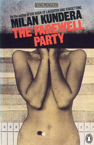
Klimowski continued to use much the same technique after his return to Britain. Later, he switched to the colour copier with some loss of graphic force. He began with posters for the Royal Court Theatre and independent film distributor Artificial Eye, but England has a limited taste for poster art, with few outlets, and these quickly tailed off. It was his series of four images for books by Czech author Milan Kundera, quite unlike other British book covers of the period (1983-85), that first began to impress his vision on a wider consciousness. ‘To read Kundera without a Klimowski cover is to read a different book,’ British art critic Andrew Brighton wrote recently. ‘The images invade the text. They share the syntax of the novels, the connection and relation of disparate elements – events, things and desires, the syntax of montage.’ The Kundera covers also introduced British readers to a figure who has had a central role in Klimowski’s art from the beginning: Danusia, his wife.
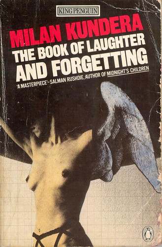
Questioned about his use of Schejbal’s naked or partially clad image, Klimowski always seems slightly perplexed. He appeared genuinely taken aback when, following a lecture, a woman design history student asked him whether he did not think it was exploiting his wife (and children) by showing them in his work. He did not. Partly, he says, it is a matter of expediency: models are expensive and Schejbal, by training and temperament, has a strong sense of theatre. It is also a public and very un-English celebration of desire. But irrespective of whom the images show, they have also been criticised for their content. In an essay on what she identifies as Milan Kundera’s misogyny, British feminist Joan Smith notes the concealed or missing faces, the ‘female muteness’ of these cover designs (she did not mention that a man’s face – Klimowski’s as it happens – is treated in the same way). ‘These are clever images,’ writes Smith, ‘grainy, slightly perplexing (why has the woman on the cover of The Book of Laughter and Forgetting been given wings in place of her left arm?), and therefore conveying the message that the subject matter of the books is the intellectually acceptable one of sexuality rather than common-or-garden sex.’
Smith’s line of attack points up one of the difficulties faced by an artist trying to work within a commercial medium with priorities of its own. Smith does not name Klimowski, or speculate about his intentions, preferring to talk about the publishers’ agency in bringing these images to the commercial domain (‘the publisher chose a female torso too’; ‘no wonder Kundera’s publishers flaunt [breasts] on his covers’). This might imply, wrongly, that the publishers told Klimowski what to put on the covers, but it comes to the same thing. They chose a certain kind of artist and having received his images they published them. The problem for Klimowski is that the meaning these images have within the context of his developing oeuvre, which is invisible to the casual viewer, is not necessarily the meaning they will have when encountered individually on the books.
The Book of Laughter and Forgetting, 1983.
A larger view, for those prepared to take it, suggests that Klimowski’s interest in themes of possession and domination is much less one-sided than Smith’s analysis implies. The facelessness, Smith’s ‘muteness’, may be less a matter of denying his protagonists speech than of rendering them symbolic, general rather than particular. ‘Sometimes a face is too specifically of an individual,’ he says, ‘so I have put something in front of it – a flying pearl, a flame, a hand – so that we know it refers to a person, but not to a specific person.’ Most of these images are violent only in verbal description: the ‘Danusias’ who confront these intrusive, disembodied male hands are sensual, self-possessed, untroubled. ‘In a couple,’ Klimowski once told me, ‘I am interested in who is the stronger of the two.’ And this is simply to acknowledge a fundamental truth about human relationships; it isn’t to say that Klimowski believes either sex will be, or should be, always the stronger, and it applies equally to same-sex relationships of whatever kind. In a 1983 screenprint self-portrait of Andrzej and Danusia, which may be a key image in the evolution of this private drama, it is her presence that dominates.
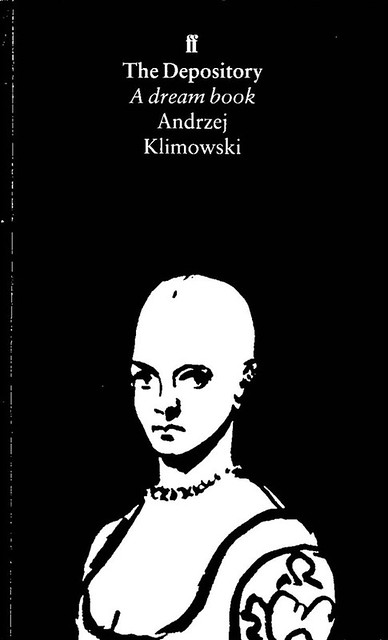
Such continuity of theme and image suggests narrative connection, and for the last few years Klimowski has spoken about making this explicit. In 1980 he completed the short film Dead Shadow and he might have made others had he not returned to Britain. He has written a number of unfilmed screenplays with Schejbal – in one a sphinx turns into a woman and a man becomes an obelisk and shatters. But the book, at this point, presets the most promising arena for his vision. In September, Faber and Faber, which has consistently understood and supported his work, is publishing The Depository: A Dream Book, a wordless novel in the tradition of Ernst and Masereel, composed of 250 brush and ink drawings and described by Klimowski as ‘a contemporary silent movie’. It is an intriguing but flawed book, which bears signs of haste in execution, but a brave and original venture in a country with little tradition for such publishing. Set in a mysterious Modernist city, Klimowski’s strange tale of a dreaming artist, an abduction, a sinister collector and flying spirits with book-leaf wings suggests a significant new chapter has opened for this unusually literary graphic artist.
Klimowski’s more recent experiments with linocuts led to The Depository, a wordless novel executed in brush and ink for Faber, 1994.
Rick Poynor, Eye editor, London
First published in Eye no. 14 vol. 4, 1994
Eye is the world’s most beautiful and collectable graphic design journal, published quarterly for professional designers, students and anyone interested in critical, informed writing about graphic design and visual culture. It is available from all good design bookshops and online at the Eye shop, where you can buy subscriptions and single issues.

