Summer 2014
Another frame for the news
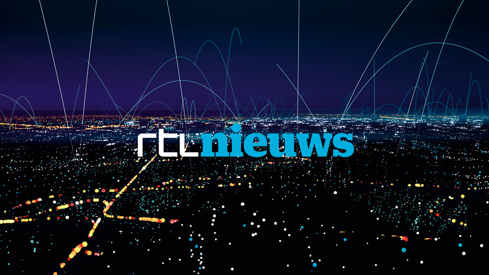
The redesign of RTL Nieuws makes a radical break with the conventions of television news graphics, crossing the now fluid boundaries between broadcast and online.

Twenty years ago, Chris Morris’s TV news satire The Day Today presented a demented vision of a news and current affairs show, fronted by menacing news anchors, full of bizarre headlines (‘Branson’s Clockwork Dog Crosses Atlantic Floor’) and nonsensical business reports (‘Trading remained succulent’). Its opening titles were a parade of spinning CGI globes in baffling colour schemes that came hurtling towards the screen one after the other, then transformed into wireframe footballs and spherical coins and flags.
Yet in the two decades since it was first broadcast, most of the visual tropes employed by news shows have remained unchanged. The dizzying computer animations, translucent images and gliding photographs persist. TV news has, if anything, followed The Day Today’s example, and bad information design has transformed the news into overcomplicated, baffling nonsense.
Mark Porter believes a change is long overdue. ‘When you start looking at news with a design eye, you realise that … it all looks the same. It’s as though designers are still in love with early broadcast news software like the Quantel Paintbox. That came out in 1981,’ he says. Together with Dylan Griffith (ex-S4C and MTV, now with Amsterdam-based design studio Smörgåsbord), Porter, formerly creative director of The Guardian, has just overseen a media-wide rebrand of all news output from heavyweight Dutch commercial broadcaster RTL. It marks a big change in the aesthetics of the newsroom. ‘We’re trying to get away from traditions and conventions, and move on from the tired clichés of broadcast news,’ says Griffith.
Their rebrand sees RTL Nieuws adopt a bright, graphic style – all clean lines, hard edges and flat blocks of colour, which will work on RTL’s website and app as well as they do on television.
‘Television broadcasters no longer have a monopoly on information,’ says Porter. ‘The design was partly influenced by the kind of clear, uncluttered interfaces we currently use on handheld devices – the iOS7, Windows Metro look.’
‘We’ve been working on this for eighteen months,’ adds Griffith, ‘and coincidentally devised a graphic language that was pretty similar to iOS7 before iOS7 was actually launched.’
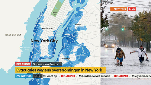
RTL’s data journalism prioritises simplicity, using colour schemes tailored to specific news stories.
Top: The new look of RTL Nieuws. Creative Direction: Dylan Griffith and Mark Porter, 2014.
Less of a coincidence, perhaps, than part of a wider move away from the long dominance of skeuomorphism in information design. Porter agrees. ‘It’s happened right across design – Google, Microsoft, YouTube – these logos are all moving away from bevelled edges, shines and shadows.’
There isn’t a colour gradient in sight. The city maps, the new weather forecast screen (complete with new symbols) and even the banners detailing the names of correspondents and breaking news headlines are opaque and uncomplicated.
The approach has an honesty and a clarity also inherent in the motif that Porter and Griffith have used as a centrepiece. The news studio is bordered by a huge free-standing, curved black frame, as is the large screen behind the newsdesk for displaying information. The letters ‘RTL’ are formed from the architecture of this frame logo, rendered in a typeface inspired by Wim Crouwel’s celebrated New Alphabet. The house font is also new, a bespoke version of Graphik by Commercial Type’s Christian Schwartz (see Eye 82).
‘The frame is certainly the heart of the identity’, explains Porter. ‘The frame is really an acknowledgement of the fact that the news isn’t just people looking at a TV; it comes from our phones, or computers, or tablets. What all these formats have in common is that they give us a vision of reality that’s bordered by a frame.’ It also fits with the way RTL sees its journalistic mission – as Porter puts it, ‘to not tell you everything that’s going on in the world, but rather to present it framed and with context, to make sense out of it.’
Audiences deserve design
Many news broadcasters have anchors standing to deliver reports, introducing a succession of green-screened images and bullet points in computer-generated non-spaces. RTL’s new main screen is framed and contained. ‘These big screens’, says Griffith, ‘all the networks have them. But the way they are used is awful, with images fading into one another and big type with blurry shadows.’ The frame makes the key elements of the news stories explicit without the cheesy CGI pretence.
This dedication to a bold new design represented a huge technical challenge for RTL. Changing the fundamental framework of live broadcast TV is an enormous undertaking. It meant new hardware, equipment and training … and open minds. ‘The in-house guys at the channel are brilliant,’ says Porter. ‘The level of design awareness in the Netherlands is probably higher than just about anywhere else. They are surrounded by excellent modern design in the public domain, and they understand its value.’
The rebrand extends to editorial content, with establishing shots replaced by bright animations and sharp vector icons. These icons have varying degrees of complexity, but are all designed to be dynamic, to work on different scales and across all platforms. ‘To do something bold, modernist and functional with broadcast TV felt really exciting and refreshing,’ Porter says. Griffith elaborates: ‘That’s what we’ve tried to achieve with the icons. Like anything that looks simple, it’s actually very complicated. Everything follows a set of strict rules we set ourselves.’
As with all the best information design, the new look for news balances clarity with inventiveness. ‘Things are complicated enough already,’ says Porter. ‘Audiences deserve proper design.’ Perhaps The Day Today is at last outdated. The shiny globes are nowhere to be seen. Once again the world – at least according to RTL Nieuws – is triumphantly flat.
Creative direction: Dylan Griffith / Smörgåsbord & Mark Porter Associates
Art direction & motion design: John Beckers
Animation: Universal Everything
Studio design: Pièce Montée
Audio design: SMP Amsterdam
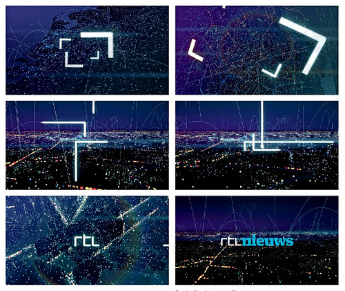
The frame motif is about focusing on specific details. The title sequence zooms in from a global perspective to a personal one, as streets, buildings and cars emerge from a digital urban environment. The colours change from oranges and yellows for the morning news, to a dark blue for the evening bulletin.
Tom Harrad, writer, London
First published in Eye no. 88 vol. 22 2014
Eye is the world’s most beautiful and collectable graphic design journal, published quarterly for professional designers, students and anyone interested in critical, informed writing about graphic design and visual culture. It is available from all good design bookshops and online at the Eye shop, where you can buy subscriptions and single issues. You can see what Eye 88 looks like at Eye before you buy on Vimeo.

