Autumn 2019
Art and ambiguity

The identity for Venice Biennale Arte 2019, designed by Melanie Mues, distorts type across a colourful three-dimensional grid

Last year, Melanie Mues was approached by curator Ralph Rugoff to design the identity for the Venice Biennale Arte 2019. This was the biggest commission she had taken on since founding her studio in 2001. Her practice Mues Design is a one-person shop, in a former fish bar in East London. The German-born designer is known for her work with publishers (Archive of Modern Conflict, Rizzoli, Phaidon), galleries (Tate, V&A) and photographers such as Tim Walker (see page 81) and Stephen Gill (see Eye 77).
The brief for the Biennale identity centred upon Rugoff’s choice of title, the notorious ‘curse’ ‘May You Live In Interesting Times’. The entire Biennale exhibition, in Rugoff’s proposition, was to be focused ‘around the idea of art’s capacity to … embrace seemingly incompatible ideas, and to challenge us to juggle multiple perspectives.’
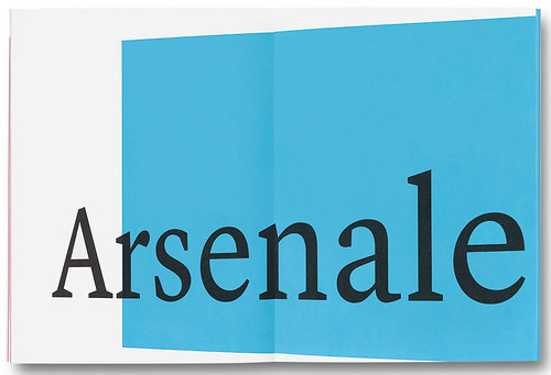
Short guide divider spread.
Top. Identity design by Melanie Mues for the Venice Biennale Arte 2019 shown on the two-volume catalogue against the city’s blue vistas. Main photograph by Jacopo Salvi.

Mues’s core idea was to set the title in a black serif typeface and distort it using the Perspective Grid tool in Illustrator. The distorted type crosses intersecting virtual planes in colours reminiscent of Venice’s streets, skies and waterways. The effect suggests overprinting and dangling mobiles, except that where the planes cross, they sometimes produce an unexpected colour.
Biennale badge.

For the words, Mues chose Commercial Type’s serif typeface Lyon Display, designed by Kai Bernau. She explains that Lyon makes passing reference to newspaper type, and to ‘default’ fonts such as Times New Roman, yet it is robust enough to withstand the distortions necessary for her identity to work across multiple platforms, whether screens or substrates. ‘I created a three-dimensional grid whose projecting plane and receding plane I liked,’ says Mues. ‘This became the blueprint on which all perspective type elements were drawn, so that they would be all on the same plane.’
Poster at the entrance of the Arsenale. Photograph: Philipp Ebeling.

Mues used the same type treatment for the full list of participants, which included artists such as Ryoji Ikeda, Zanele Muholi, Lee Bul and Slavs and Tatars. The Lyon type (used in the Medium display weight) had to work on small items such as badges, magnets and a coffee cup, as well as on giant displays in the streets and on building exteriors in Venice itself, where the banners and posters are now ubiquitous.
Rugoff’s use of the phrase ‘May You Live In Interesting Times’ deliberately references several concerns within contemporary culture and politics. Its celebration of art’s necessary ambiguities is contrasted with disturbing, present-day trends such as the onslaught of ‘fake news’, attacks on journalists and multiple challenges to democracy worldwide. Rugoff has written that the positive aspects of art’s ‘play between certainty and uncertainty stands in stark contrast to the narrowing bandwidths of our political discourse.’
Mues’s identity remains robust when held against the beauty of Venice, and its many iterations– large or small, battered
or newly printed – are easily spotted when shared via social media. Photographs by Philipp Ebeling.


The division of the Biennale into two parallel exhibitions is intended to emphasise the diversity and complexity of current art practice. But in Rugoff’s curation, the coexistence of hefty statements with more trivial artefacts is a strength of the art world presented by the Biennale, which Mues’s identity design frames with a light touch. ‘Many of the most interesting artists don’t limit themselves to one way of thinking / seeing / making,’ writes Rugoff.
Mues says that the idea for the identity ‘came from Rugoff’s curatorial approach of the two propositions, the multiple truths of words and the trajectory and passing of time.’ She also says that the title’s ‘futuristic connotations’ made her think of the angled perspective of Dan Perri’s scrolling Star Wars film titles. The use of colour throughout the Biennale identity emphasises the three-dimensional effect. ‘I worked a lot on visual perception in regard to colours,’ says Mues. ‘Which colour appears to be closer to the eye, which colour drags you in.’
Melanie Mues’s ‘three-dimensional’ identity for Venice’s Biennale Arte 2019 is a set of variations in which the changing inter-relationships of colour, angled planes and elegantly distorted type create an evolving system. Photograph by Philipp Ebeling.

Sometimes the intersection of two planes produces the colour you expect. At others it defies physics. Rugoff asked for very few changes in Mues’s designs, other than to request darker colours for the exhibition design, in particular the dramatic entrance at the Arsenale, where visitors are greeted by Double Elvis, a huge work by George Condo. Once Rugoff signed off the identity in November 2018, Mues was able to meet the editorial team in Venice and get on with the extensive list of items to design. She delivered artwork for signs, banners and other artefacts such as pencils and a Swatch watch in early 2019, working closely with assistant Kei Ishimaru, editor Mary Richards and the production team in Venice. The catalogues were delivered in April for the opening on 11 May. The Biennale continues until 24 November 2019.
Biennale short guide on location. Curator Ralph Rugoff chose ‘May You Live In Interesting Times’ as the title to reflect anxieties about ‘fake news’. The phrase is said to be an ‘ancient Chinese curse’, but this is ‘fake history’. Though cited in speeches and correspondence by politicians Joseph Chamberlain (1836-1914) and his son Austen Chamberlain (1863-1937), there is no evidence that it originated in China. Photograph by Philipp Ebeling.

Reflecting on the design, Mues says: ‘This layered construction of colour and type is multidirectional by intent and plays a visual game with the eye as it tries to settle on which perspective to read. Are the elements receding into the past, or projecting into the future? They interact in a way that makes one a little uneasy and disoriented, yet intrigued.’
John L. Walters, editor of Eye, London
First published in Eye no. 99 vol. 25, 2019
Eye is the world’s most beautiful and collectable graphic design journal, published quarterly for professional designers, students and anyone interested in critical, informed writing about graphic design and visual culture. It is available from all good design bookshops and online at the Eye shop, where you can buy subscriptions and single issues.

