Autumn 2009
Art and art direction – Daniel Eatock
Daniel Eatock’s approach to photography provides a provocative link between conceptual art and an objective, ‘vernacular’ approach to snapshot culture.

Propped up against the wall of Daniel Eatock’s London studio is a loose box frame full of pictures of his Brazilian girlfriend Flavia. ‘This is every photograph we have of her before I got a digital camera,’ he explains in his quiet Lancashire accent. ‘You can shake it and different ones come to the front.’ The pics arrange and rearrange themselves in higgledy-piggledy fashion, free to move around within the frame as you shake, invert or otherwise agitate the box.
The idea of the container as art is present in several of Eatock’s projects, from the Timecapstool, with its narrow slot for ephemera, to Indexibit, the web application designed (with Jeffery Vaska) to ‘build and maintain an archetypal, invisible website format’ and used by thousands since it was made freely available in 2004.
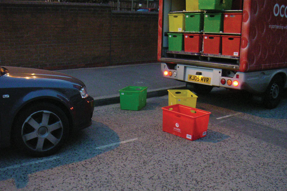
Stop, Wait and Go.
Such an approach, a hybrid of art practice, personal problem-solving and generosity, are typical of Eatock – not so much a designer as an artist whose practice is rooted in graphics.
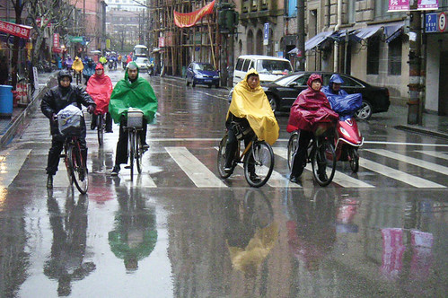
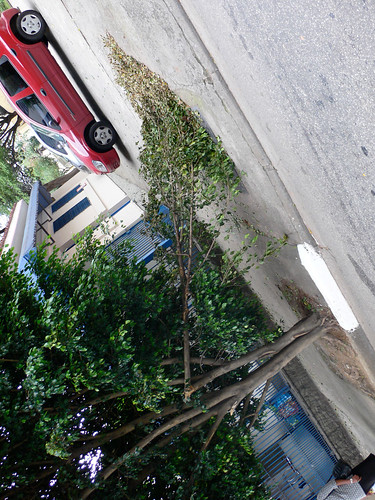
Since 2001, Eatock has produced a regular ‘Picture of the week’, a snapshot that he posts on his website eatock.com. In addition to the weekly snaps there are more sporadic projects: pictures of car batteries, vandalised trees, pigeons and ‘Stop, Wait and Go’ pictures, with their random comings-together of red, amber and green.
And ‘Thank you pictures’, where others contribute Eatock-like pictures of their own.
The photographs have wit, poetry, visual delight – and conceptual rigour, which permeates all his work: ‘Ideas are more important than aesthetics.’
He admits that he gets bored with the discipline of posting a picture each week. ‘You have to work though that boredom,’ he says. ‘It’s only just beginning. This project will be more interesting in twenty years.’
Eatock has always used the same pocket camera; when it broke, he replaced it with the same model. ‘I’ve learnt to get the camera out of the case, switch it on, pull the lens cap off and then press the button and capture the subject really quickly, like a cowboy shooting his gun.’
Other examples of Eatock’s photographic work include large-format pictures where he collaborates with a photographer friend, like the ‘sculpture’ of a pair of trainers hanging from a washing line included in his book Imprint (Princeton Architectural Press, 2008). ‘I’ve never been interested in photography, but I’m interested in art that uses photography,’ he says, mentioning Richard Prince and Wolfgang Tillmans as examples.
Vandalised trees: Eatock rotates the camera to give the trees ‘a new reality’.
This aspect of Eatock’s work might appear to give him an affinity with advertising. Before founding his solo practice, he was design director at ad agency Boy Meets Girl. His earlier work (as founder of Foundation 33) for Channel Four, including the Big Brother identity and his Warhol billboards (also C4) can seem, superficially, like ad school object lessons in ideas-driven marketing.
Eatock bridles at the thought. ‘I see myself a million miles from advertising,’ he says. ‘I think advertising is simplistic. It’s a form of persuasion which is really ugly.
‘I have nothing good to say about advertising. I can’t think of an interesting idea that’s come from that route. Or something with value. It might be funny, the first time you see it – “ah, that’s clever”. But then it just kind of diminishes, and it doesn’t feel as though anything is left – just this transient, silly thing that’s here one minute and gone the next.’
But surely advertising people are prepared to deal with concepts? Eatock disagrees. ‘The concepts are so blunt and one-dimensional. That’s the tradition, isn’t it, the “big idea”. But it’s not a big idea, it’s a stupid idea that you can say in a single sentence that there’s nothing beyond.
‘Graphic design is more complex. When I was making design, I strived for kind of a concept or a frame that guides what the result could be. And I tried to reduce it, as much as I could, to this singular thing.’
Eatock’s next project, devised for photography students at Appalachian State University (and on his website), is Switched Off Photographs. This aims for another singularity: a picture of a light bulb at the precise instant it’s turned off. You can’t get much closer to photography’s fundamentals: light, darkness and the shutter’s click.
First published in Eye no. 73 vol. 19 2009
Eye is the world’s most beautiful and collectable graphic design journal, published quarterly for professional designers, students and anyone interested in critical, informed writing about graphic design and visual culture. It is available from all good design bookshops and online at the Eye shop, where you can buy subscriptions, back issues and single copies of the latest issue.

