Spring 2004
Back into battle
Nicholas Blechman
George Hardie
Christoph Niemann
Michael Bierut
Joost Swarte
Paul Sahre
Henning Wagenbreth
R. O. Blechman
Chip Kidd
Nicholas Blechman’s ’zine is a barbed response to contemporary US politics

It stares out from the bookshelves: a many-tentacled gas mask with the massive word ‘Empire’ looming behind it. Turn over the book and the mask is a skull, its mouth emitting a stream of other, smaller skulls. This simple graphic sleight of hand wraps around 168 pages of fierce political image-making, from an international group of designers, illustrators and writers, in a perfect-bound ’zine otherwise known as Nozone no. 9, ‘Empire’, edited and designed by Nicholas Blechman. ‘Empire’ is Blechman’s response to the world as it stands from New York City. Contributors ranging from Art Chantry to Stefan Sagmeister, from Ed Sorel to Michael Bierut, contributed graphic takes on the topic of ‘empire’. The result, besides solid, often cathartic, political criticism and satire, is a glance at what today’s designers and illustrators can do outside the bounds of commercial gigs.
Nozone has long given designers, artists and cartoonists a forum in which to vent their feelings and ideas. One could say that Blechman, now 36, was born to it. His father, R. O. Blechman, is an acclaimed illustrator, animator, cartoonist and designer, as well as the man behind animation studio The Ink Tank. Nicholas was raised in a liberal household, and exposed to excellent and, by American standards, obscure illustrators such as Roland Topor and Jean-Michel Folon, who he refers to as ‘the heroes of my childhood’. Good heroes for a rising politico, as both produced visceral, articulate work – and in Topor’s case frankly liberal work as well. The elder Blechman would also bring home the various publications that arrived at his office, often fobbing them off on Nicholas. One of these was raw. He was soon hooked, entranced by the ethics of DIY self-publishing, comics, politics, RAW, and the political comics ’zine World War 3. Blechman started Nozone in 1990 as a winter term project during his senior year at Oberlin, a small liberal arts college in Ohio, and a campus known for its student activism.
In his postgraduate years, Blechman, as an illustrator and designer, freelanced and worked for his father, while publishing Nozone nearly once a year under the moniker Knickerbocker (the term for a ‘true-blood’ New Yorker dating back to the Dutch settlers of the land). His first issue was based on work around environmental issues, and featured work by the then-fledgling illustrators David Goldin and Santiago Cohen, as well as Ed Sorel, an old friend of his father’s. The inside covers carried a manifesto that ended with: ‘RAW says it is safe for adults to read comics. Nozone says it is safe to inhale them. Breathe deeply.’
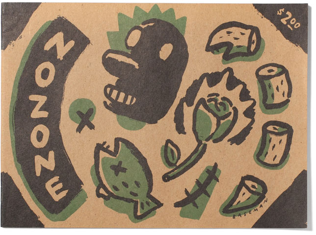
Covers of Nozone, edited by Nicholas Blechman.
Issue no. 1, ‘Pollution’, 1990, which includes comic strips, grainy photocopied photomontages, spoof ads and the lyrics to Tom Lehrer’s prescient song ‘Pollution’ hand-lettered and illustrated by Blechman himself.
Top: Issue no. 2, ‘The idea of Nature’, 1991, ‘printed on 100% unrecycled paper’. One page calls for a ‘Nature Strike’ – for all plants to stop growing from 1991-98.
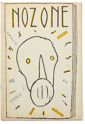
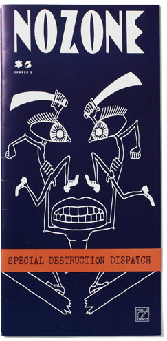
Following RAW’s example, Blechman began experimenting with the format of Nozone immediately: issue no. 2 was horizontal, boasted a Gary Baseman cover and work by Topor and Folon (also friends of the family); issue no. 3 was extremely tall and thin, with an arresting Joost Swarte cover image. Issue no. 4’s cover was die cut; no. 5, ‘Poverty Comix’, was an oversized magazine; and no. 6, with the theme of ‘Crime’, was a pulpy digest-sized paperback with work by Chip Kidd and Peter Kuper. Issue no. 7, ‘Extremism’, resembled an art magazine with a distressed twist. The ‘Work’ issue, no. 8, came wrapped in a belly band disguised as an inter-office memo sheet.
By this time, however, Blechman, then 30, had been nabbed by Steven Heller – mostly on the basis of Nozone – to be the art director of the New York Times Op-Ed page. It was his first full-time job. Blechman had guest art-directed the page, but when he got the phone call he was utterly shocked. Up from the relative underground of political art, he was suddenly art-directing a massive national forum. He was also totally swamped, so his friend Paul Sahre guest-designed issue 8 in 1998. After that, Nozone took a break.
In its absence, Blechman applied some of the lessons he had learned to a more mainstream outlet. He knew what designers and illustrators were capable of politically, and with that in mind he began ‘Op-Art’, a regular forum in the Times in which designers and illustrators, such as Tibor Kalman and Jules Feiffer, would provide both the image and the content of a piece instead of merely illustrating a text.
‘Deadly Alliance’, Blechman’s own cover design for issue no. 9, ‘Empire’, 2004, a 168-page paperback book published by Princeton Architectural Press.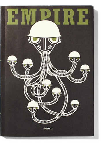
Blechman feels that ‘designers are in the business of communication. They have a responsibility to content, and to think about what they are saying and if it is enriching our lives. I don’t judge others. It’s a personal prerogative of mine, and I think it would be a wasted opportunity if I didn’t use my skills to do something that explains the world in which we live, or make something that at least plants a seed of questioning in people’s minds.’ The New York Times, he says, ‘was just a less punk-rock version of what I was already doing in Nozone.’
In 1999, Blechman, Sahre, and illustrator Christoph Niemann (a frequent collaborator) took the stage for Fresh Dialogue, the AIGA’s annual young designer showcase. The book of the event, published in 2000, remains a steady seller, and an important record of three socially conscious designers, just as they’d hit their stride. Blechman left the Times later that year and began his own studio, Knickerbocker Design. He has since been active in the NY design community, initiating (with Niemann) the DRAW series of illustration events staged by the AIGA, and in practice and pedagogy trying to build bridges between illustration and design. The two co-exist happily in Nozone, and, he feels, should do so everywhere.
For a while Nicholas had laughed off questions about another Nozone. He’d had enough of self-publishing – dealing with distributors, being broke – and the constant strain of doing business was overpowering the fun of actually producing the magazine. But, as he describes it, ‘Empire’ happened because ‘I had no choice. I was so depressed by the political situation. At times like that you have to express it somehow, and that’s how issue no. 9 was born, on a bar stool in Brooklyn, as the US was about to invade Afghanistan.’ Luckily, Princeton Architectural Press [PAP] picked up the project quickly and has printed 10,000 copies of the first edition. Every publisher, Blechman says, ‘has their “Empire” book, and PAP has marketed it as a big anarchic statement, playing into anti-Americanism all the way to the bank.’
PAP allowed Blechman complete control, and he has assiduously retained the freewheeling, rough-hewn production and design aesthetics, while increasing the amount of content – making this former ’zine into a ‘big fat catalogue, a catch-all of responses to the times’. ‘Empire’ is a strong statement, and true to its nature, offers a wide array of statements. Henning Wagenbreth’s 23-page, full-colour picture story about Napoleon is a masterpiece; George Hardie’s single-image illustration of the clash of civilisations is a model of elegantly articulate and efficient illustration. Blechman the elder contributed a ruefully witty take on the topic with a tale about a bakery; while Christoph Niemann’s concise takes on flags and statistics on the inside covers is a jolt even before the reader has entered the book. ‘Empire’ is by its nature incomplete, and thus, Blechman seems to say, wide open for participation: Nozone informs and inspires. For him, the imperative is to just do something … anything. And it is that impulse that ensures the book represents an array of feelings and modes of expression that would otherwise go unseen. Without wishing too much global domination on him, one hopes that Nozone is back to stay this time. It’s been missed.
Issue no. 3, ‘Special Destruction Dispatch’, 1992. Cover by Joost Swarte.
Dan Nadel, writer, Ganzfeld editor, New York
Eye is the world’s most beautiful and collectable graphic design journal, published for professional designers, students and anyone interested in critical, informed writing about graphic design and visual culture. It is available from all good design bookshops and online at the Eye shop, where you can buy subscriptions and single issues.

