Winter 2009
Before and after East met West

Much of a city’s history is written in its street signs. Berlin-born Verena Gerlach has turned their shapes and stories into typefaces

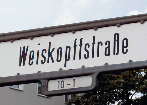
The typography of Berlin’s street signs has changed with the city. Before 1905, the street signs did not follow a strict design – most were blue metal plates hand-painted with white letters and placed obscurely on the corners of buildings. Signage became standardised in the 1920s, but as the city divided after the war, so did the street signs. And after reunification, differences between East and West started to blur. Type designer Verena Gerlach has made a close study of the lettering in Berlin’s street signs, and used them as the starting point for many of her typefaces, including Karbid and FF City Street Types (see overleaf).
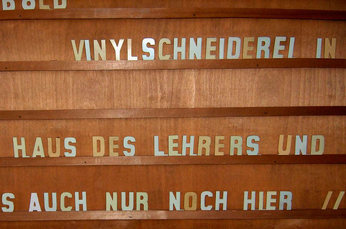
‘I’m in the lucky situation to have witnessed the fall of the Berlin Wall in November 1989 and the happiness of the following years’, says Gerlach. ‘To preserve the impressions and the excitement of this time in this city with its story, I collected a lot of visual material.’ Her desire to capture the city’s typographic history started with photographing old shop lettering in 1991, matching distinctive character shapes with examples in old type specimen book. The results of this research process can be seen in FF Karbid (1999), a typeface through which (in Gerlach’s words) ‘the old lettering lives again’.
Gerlach’s FF City Street Types project began in 2000, as she turned to Berlin’s two postwar street sign systems: ‘Instead of researching the technical drawings that might be hidden in some city archive, we preferred to refer to the signs themselves, using the actual lettering rather than some engineer’s idealised version of it’.
Since the founding of ‘Greater Berlin’ in 1920, a variation of Erbar Grotesk (by Jakob Erbar, 1926) had been use for the street signs. At the time, this sans serif marked a huge improvement in legibility and was designed, in Gerlach’s words, to ‘give the gloomy city a contemporary appearance’. Distinctive characters include the ‘fz’ and ‘tz’ ligatures, and the ‘y’ which uses a capital shape for the lowercase form.
This street typeface remained in use in West Berlin after the 1949 division of Germany, but the GDR’s economy of scarcity called for a new means of (typeface) production in the East. Gerlach explains the birth of this new-look sign: ‘The sign itself was made of plastic: a sandwich with a white shell and a black core. The letters were drilled in by a mill cutter, or router. This is the reason for its technical design: a typical engineer’s constructed alphabet along the lines of DIN Engschrift.’
The design continued to change according to technical necessity: depending on whether one or two heads were used for the mill cut, the letter-ends varied between straight and rounded. Early examples of the typeface have ‘an almost infinite number of variants of both alphabets’, with huge differences in character width and letter-spacing. The typeface is narrower than its Western counterpart, but Gerlach thinks this might be down to GDR pragmatism rather than style: street names tended to be longer in the East, celebrating Communist heroes with both first names and surnames as well as the appendix ‘Strasse’ or ‘Platz’. Her research has yielded three typefaces: Berlin East Original, Berlin East Rounded and Berlin West Original, with sub-families in Regular, Medium and Bold.
But what about Berlin today? After reunification, many East Berlin streets were renamed, ousting the socialist hero names: Klement-Gottwald-Allee reverted to Berliner Allee, for example. But Gerlach notes that the street signs have not been reunified: each city district follows a different system, as it did in 1905. Her work continues with Karbid Reloaded. ‘Twenty years after the wall came down, and ten years after the release of FF Karbid, the city looks so different and more modern now. It’s time for a new Karbid.’
First published in Eye no. 74 vol. 19.
Eye is the world’s most beautiful and collectable graphic design journal, published quarterly for professional designers, students and anyone interested in critical, informed writing about graphic design and visual culture. It is available from all good design bookshops and online at the Eye shop, where you can buy subscriptions, back issues and single copies of the latest issue.


