Autumn 2009
Better than the real thing?

Facsimiles give scholars and students the chance to enjoy, understand and literally get to grips with the physical nature of printed design classics.

To truly appreciate – and savour – historic design objects, one must understand nuances of form and structure. This derives from scrutiny. Yet many of these relics from the late nineteenth and early twentieth centuries are so fragile that turning their pages can be risky, and librarians and curators are justifiably reluctant to let even the most serious scholar finger them. Yet hands-on contact with artefacts such as these can influence how a design scholar views a body of work or inspire a graphic designer in his craft.
But there is an alternative. Duplications of originals can be almost as good as the real thing. And don’t let any stuffy bibliophile tell you otherwise. Facsimiles are more practical research tools for historians and connoisseurs. Indeed, many limited-edition facsimiles (and they are almost always published in limited quantities) are often as valuable as those precious originals.
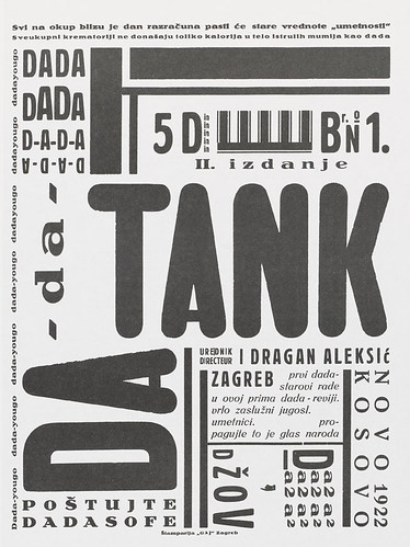
Tank (1922) was published in two and a half issues. This is the first one.
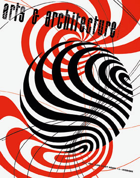
Top: an individual portfolio from Taschen’s Arts & Architecture facsimile that covers a ten-year period from 1945 to 1954.

Futurism, new-minted
Known as the libro bullonato because it was bound with industrial bolts, Depero Futurista was a catalogue of paintings, advertisements and typography by Fortunato Depero, originally published in 1927 by Dinamo-Azari in Milan. In 1987 Studio Edizioni per Scelte (SPES) in Florence pristinely recreated this masterpiece of late Futurist typographic adventurism as part of its extensive series of Futurist books and manifestos. Each page is a precise echo of the original, retouched to give a mint appearance (since publication, the paper has turned yellow with age, giving it an even more authentic patina). The original, of which fewer than 1000 copies were published, is now valued at as much as $30,000 and is often too delicate to handle. The facsimile, in contrast, can be handled without concern for wear and tear.
The Depero Futurista facsimile was relatively expensive because of all the handwork that went into ensuring its verisimilitude. Indeed most facsimile publishers pride themselves on how close they come to making flawless copies.
In the late 1950s East Germany’s state-run Zentralantiquariat began publishing and distributing facsimiles of key avant-garde books and journals, many of which had been labelled degenerate by the Nazis. Among the most valued were publications issued through the leftwing Malik Verlag. Original Malik books and periodicals were not always flawlessly printed, but even capturing the fundamental flaws is important to ensure an overall gestalt. Facsimiles of the 1925 Kleine Malik Bücherei (Little Malik Library) – an inexpensive line, targeted at the masses, that includes essential texts by leftist authors, and graphics and covers by George Grosz and John Heartfield – are now the main sources for many scholars of art, design and politics during the Weimar period.
In the early 1960s, another East German publisher, Edition Leipzig, launched an even more extensive facsimile programme, which was to prove a boon for scholars denied access to original documents.
Although facsimiles should not be confused with originals, they do provide a unique virtual experience. In recent years facsimiles have brought back to life publications such as The San Francisco Oracle, 1966-68 (Regent Press, 1991) and Andy Warhol’s Interview from the 1970s (Steidl / Edition 7L, 2004). Hundreds of other documentary materials that would otherwise be too costly to preserve have been made available through facsimiles (see a selected bibliography on the next spread). And, while often expensive to produce, facsimiles are high on the agenda of publishers with historical focus.
Recent facsimiles include two significant periodicals: the first ten years of Arts & Architecture (1945-54), the progressive design magazine that helped put California Modernism on the map; and Zenit (1921-26), the journal of the Yugoslav avant-garde movement known as Zenitism. Both sets hold to ambitious production standards.
California Modern
Few facsimiles are as elaborate as the first volume of Arts & Architecture (Taschen Books, 2008). A long-time admirer of California Modern, publisher Benedikt Taschen had coveted the complete run of this influential wellspring for a small but dynamic group of modern designers in California after the Second World War. In its pages, edited by John D. Entenza, with covers designed by the likes of Saul Bass, György Kepes, Alvin Lustig and Herbert Matter, the celebrated ‘Case Study House Program’ was launched and the progressive California style was born.
Although an earlier volume, Arts & Architecture: The Entenza Years, edited by Barbara Goldstein and Esther McCoy (MIT Press, 1990), anthologised some of the best articles from the magazine, the small reproductions of pages did little to underscore the design. Conversely, the 118 issues that Taschen has published – in ten boxes, with an essay by David F. Travers, editor and publisher of the magazine from 1963 until its demise in 1967 – resurrects the publication in all its glory. It is the supreme act of preservation. A second volume, containing the remaining issues, is now in preparation.
Facsimiles are obviously not the poor man’s design artefacts – far from it. Like re-strikes of Rembrandt or Goya etchings, the best design facsimiles are so faithful to the original they have their own artistic integrity.
Zenit and DaDa
Ranko Horetzky, a designer in Zagreb, Croatia, is the publisher of the boxed collection of Zenit (originally edited by Ljubomir Micić, 1895-1971). It took Horetzky 2000 working hours and more than two years to prepare the edition. Many of the originals were in such bad condition that he had to scan each page separately, to be able to make a complete ‘reconstruction’ – ‘My previous experience with printing posters and graphics in silkscreen helped me a lot,’ he told me.
The hardest part, he said, was finding paper similar to the original stock from the 1920s. ‘From the beginning I had an idea to make the reprints with the highest possible quality; tactile and visual, free of patina and marks of time and / or use.’ The original Zenit issues mostly came from the Museum of Contemporary Art in Zagreb. Others, from private collections in Belgrade and Ljubljana, were more difficult to procure, which was the main reason for producing this edition: Horetzky wanted to make them all available to scholars and designers who have had no opportunity to touch the orginals.
‘I was much more interested in the visual than in the literal aspect of the content,’ he says, ‘as well as the connections and influences between the domestic and international avant-garde scene. I also wanted to present not only Zenit but other magazines from that period published by people who worked on Zenit.’ In addition to the complete run of Zenit, the set also includes pristine facsimiles of the rare Croatian journals DaDa and Tank.
The best facsimiles are produced by master printers, who capture every nuanced detail of the original, from the coverage of ink to the paper texture. A photographic reproduction records a particular version of the document – imperfections and all – but a facsimile preserves the essence of the original, as though it just came off the press.
Selected facsimiles:
Hannes Meyer: Architekt, 1889-1954
Verlag Lars Müller, Baden, Switzerland, 1990
In addition to architecture, Meyer – the second director of the Bauhaus – also practised graphic design. This boxed portfolio includes individual copies of publications and other printed matter, including Die Neue Welt, ABC Beiträge, Bauhaus and Gesellschaft.
Manifesti, Proclami, Interventi e Documenti Teorici del Futurismo,
1909–1944
SPES, Florence, 1980
More than 100 individual documents, from booklets to newspapers, are filed in four portfolio boxes, according to the year each was published. This tour de force of Studio per Edizioni Scelte’s Futurist archive provides access to the majority of publications edited, contributed to, and inspired by F. T. Marinetti and his typographically daring circle.
Kunstism, 1914-1924
Arno Press, New York, 1968
This famous anthology of Modern art and artists, designed by El Lissitzky, is not the finest facsimile – the type is not always as crisp as it might be – but is still of more use to the scholar than basic reproductions. Before going out of business in the 1970s, Arno Press was known for its large backlist of historical reprints.
Max Burchartz: Typografische Arbeiter, 1924-1931
Verlag Lars Müller, 1993
Lars Müller is no stranger to fine quality facsimile publishing. This collection of ephemera by one of the leaders of the ‘New Typography’ is a trove of ephemera, from publications to brochures.
Dada Zeitschriften, 1915–1920
Edition Nautilus, Hamburg, 1987
Futurism was the leading producer of designed ephemera, but Dada was close on its heels when it came to issuing periodicals and manifestos. This portfolio (above) includes the major publications from the Berlin Dada movement, including those by Raoul Haussmann, John Heartfield and George Grosz.
Blast 1-3, 1914-15
Black Sparrow Press, San Francisco, 1997
Wyndham Lewis’s Vorticist magazine is a model of typographical exuberance. This three-volume edition, with its fading pages, is virtually identical with the original printing.
Die Pleite, 1919-1922
Verlag der Buchhandlung Walther König, Köln, 1982
Published by the Malik Verlag, art-directed by John Heartfield and illustrated by George Grosz, this politically Communist publication was a thorn in the side of the Weimar government, which outlawed its distribution. The facsimile is printed on similar cheap pulp to the original (and has changed colour with age) but is a sturdier paper stock.
Ars Typographica, 1918–1934
Greenwood Reprint Corporation, Westport, Conn., 1970
This American typographical journal, edited in the early years by Frederic W. Goudy and Douglas C. McMurtrie for the Marchbanks Press, is more reprint than a precise facsimile; nonetheless it is an invaluable resource for anyone studying the early years of American typography and type design.
Neue Jugend, 1916-1917
Zentralantiquariat der DDR, Leipzig, 1982
The early issues of this small-format magazine published by the Malik Verlag were not typographically ambitious. but are nonetheless useful to have in facsimile. The two broadsheet iterations published in 1917 and designed by Heartfield were more in sync with Futurist and Dada typography, and quite impressive in this (slightly smaller than the original) format.
Les Livres Futuristes Russes
Librairie La Hune, Paris, 1993
Russian Futurist artists created wildly colourful illustrated books that
wed Futurism with Expressionism. This boxed portfolio offers a sampling of the principal works of this movement.
Der Gegner
Das Arsenal, Berlin, 1979
Following the demise of Die Pleite, this was one of the most radically oppositional periodicals of the Weimar period. Although not as visually or typographically progressive as others of this period, this facsimile shows the evolution from typographic pyrotechnics to a more functionally conservative layout.
About 2 Squares
El Lissitzky, 1922
Artists Bookworks, East Sussex, England, 1990
Few avant-garde books are as famous as Lissitzky’s Suprematist tale for children, first published by De Stijl in Holland, but while pages have been reproduced in almost all design histories, seeing the sequencing of the images is essential to appreciating the work. Various facsimiles have been published, some with English translations.
For the Voice, 1923
Jaap Reitman,
New York, 1973
This classic Modern artefact written by Vladmir Mayakovsky and designed by El Lissitzky marked a revolution in book-making. Lissitkzy introduced tabs with icons that prefigure those used on computers today. This 1973 edition, printed on a coarse pulp, has the same patina as the original, and except for the contemporary colophon, is easily mistaken for the original.
For the Voice, 1923
The British Library, London, 2000
This 2000 edition reprints the original and a companion volume with translations.
Suprematism: 34 Drawings
Kazimir Malevich, 1920
Artists Bookworks, 1990
Much of the art in this rare monograph by Malevich has been seen in numerous contemporary catalogues and collections, but this two-volume self-authored edition rarely emerges even in most antiquarian catalogues. As a map through the origins of avant-garde Russian art, this book, with translation by Alexander Lieven, is an invaluable resource.
Avant Garde in Print
AGP Matthews / Ex Libris, New York, 1981
Arthur A. Cohen, who with Elaine Lustig Cohen ran the Ex Libris bookstore in New York, collected the principal artefacts of European graphic Modernism in five portfolios. While these images are not in context, they are beautifully reproduced so the fine details can be studied.
Die Neue Typographie, 1928
Verlag Brinkmann & Bose, Berlin, 1987
Jan Tschichold’s bible of Modernist typography has been reprinted in various editions over the past two decades. While an English version (New Typography) published by the University of California Press in 1998 provides insight into his ideas, this precise facsimile (and accompanying historical booklet) is almost as satisfying as leafing through the original.
A portfolio from Taschen’s Art & Architecture facsimile.

First published in Eye no. 73 vol. 19 2009
Eye is the world’s most beautiful and collectable graphic design journal, published for professional designers, students and anyone interested in critical, informed writing about graphic design and visual culture. It is available from all good design bookshops and online at the Eye shop, where you can buy subscriptions and single issues.

