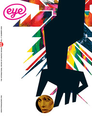
Summer 2008
Beyond the canon

Introduction to special issue by editor John L. Walters
The theme of this issue of Eye has its roots in a conversation with a fellow writer and broadcaster about the difference between nostalgia and history. History provides information and inspiration, while nostalgia breeds an obsession with the past. Apply this ‘golden oldies’ thinking to graphic design and what do we get? Retro borrowings from what Tom Wolfe called the ‘big closet’, with endless trips down memory lane. Even quite serious historical research and publication can be reduced to a ‘greatest hits’ list of eye candy. History is vital, but nostalgia is death.
This is why we have to go beyond the canon. In graphics, the word ‘canon’ refers to the heavy hitters – such as Bass, Cassandre, Bill, Brody and Carson – who turn up in nearly every history of graphic design, however slim. ‘Canonical’ designs by noted individuals – familiar diagrams, posters and magazine covers – are what one young designer describes as the ‘city landmarks’ of design, like ‘Big Ben or the Eiffel Tower’. We often see these images, accompanied by thumbnail accounts, in student essays and design primers. Like it or not, the internet ensures that blurred versions of these histories and images will continue to be repeated and recycled far into the future.
So our aim is both to question and to enlarge the accepted pantheon of graphic design. I asked design critics, curators, designers and design historians to seek out some neglected classics that take us ‘beyond the canon’ of graphic design history. Each writer in the first section (pp.16-53) has nominated an example of design that deserves more attention. Whether the work in question was by a ‘known’ designer, anonymous hands, a big practice or a one-person band does not matter. The items you will see in the following pages reflect myriad historical styles, trends, techniques and processes. Together, these neglected works make surprising, provocative additions to the canon.
For the second section, we asked a selection of notable designers, most of whom graduated in the past twelve years, for their thoughts about the canon. So in contrast to our forgotten icons you can read the lively responses of designers around the world to questions about the relevance of design history, plus their views on how they would teach it. This has elicited some interesting, amusing and wise comments, and we can see how some of them have applied the lessons of the past in their own work.
Framing these sections are three other articles: Rick Poynor’s regular Critique appears as a coda in which he considers the way a piece of relatively recent work enters the canon. There’s my report from the world’s first Graphic Design Museum in Holland. And our graphic overture – which like its musical equivalent is showy, but not to be taken too seriously – is an information graphic that reveals the results of ‘Googling the canon’, accompanied by an essay in which design historian Martha Scotford re-visits the list of canonical names she explored in the 1990s.
First published in Eye no. 68 vol. 17 2008
Eye is the world’s most beautiful and collectable graphic design journal, published quarterly for professional designers, students and anyone interested in critical, informed writing about graphic design and visual culture. It is available from all good design bookshops and online at the Eye shop, where you can buy subscriptions and single issues.
