Summer 2011
Beyond words
Peter Kennard’s angry, wordless montages show a political nightmare in the hope that we wake up and deal with it

In the 1970s, the problem of 21st-century life envisaged on TV shows like the BBC’s Tomorrow’s World was how to deal with the huge amount of leisure time we would have thanks to technology, automation and general abundance. Faced with the realities of 2011 – austerity and global economic crisis, imperialist wars and a seemingly suicidal commitment to destroying our environment – we can only wonder what happened to that earlier, more positive vision.
Peter Kennard’s @Earth, a chunky, 192-page visual essay from Tate Publishing, provides some clues. Throughout the past 40 years Kennard has consistently produced images that expose the realities of imperial power, the madness of nuclear war and the inhumanity of the capitalist system, using the power of photomontage to do so.
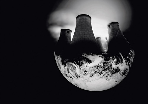
Top: Untitled, 1999: Originally used in Kennard’s Domesday Book (Manchester University Press, 1999), a ‘photopoem’ released at the turn of the millennium.
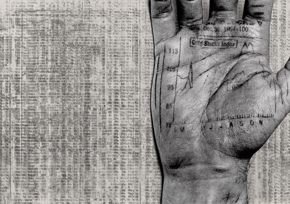
Below: Untitled, 2010. Digital montage created for @Earth for Tarek Salhany.
Montage, as theorised by its first practitioners in the early twentieth century, was the political art par excellence, because of the way it mimicked the relationship of workers to the technologies they operate in production. The crucial difference is that whereas workers have little control over their product under capitalism, the artist, in Kennard’s case using the tools of design, from scalpels to Photoshop, takes back control, at least in the aesthetic realm. Montage is at once a reflection of the real and a construction of potential; both feature heavily in @Earth.
The text-free cover design – an ‘at’ symbol overlaid on to a picture of the Earth against a black void – is, according to Kennard, an attempt to create a cover that can be understood universally, reflecting the global themes in the book.
That image of the blue planet against a vast expanse of black space became a defining image of the 1960s, just as Kennard began to make the earliest work in this book. At the time, seeing Earth from space was a symbol of hope, that helped to kickstart a global environmental consciousness. But the image also reminded us of the fragility of life. While Kennard wants to remind us that this planet is all we have, depicting it almost as if it were a ship travelling through space, the book’s mood is far from the optimism of the 1960s – more a frustrated and angry prophecy of where we are headed if we don’t change direction soon.
Each of the book’s seven wordless chapters starts with an image that represents a theme such as war, oil or poverty, emerging from the icon for a computer folder. This grounds readers in their everyday experience of the world through technology.
Kennard then rolls out a narrative that steers us to contemplate the connections between oil, war, the economy, poverty and the environment. Frustration and anger at the lack of power to stop the actions his images critique often leads to a barely concealed violence and aggression that is unusual in a world so full of smooth, glossy, digital imagery. This violence is reflected in their making: he throws grit and blood on to scanners, capturing the results; desperate, impoverished hands tear at pages of the FT; medals disintegrate into dirt.
Bankers Place Their Bets, 2010. This image is currently being used by the Robin Hood Tax Campaign calling for tax on banking profits.
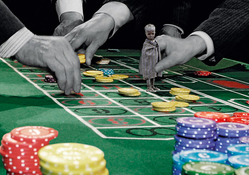
Portraits of nameless Iraqis degrade into satellite images of bombed desert towns. Countries blister in heat. Sometimes, as in the Palestine and ‘surveillance’ chapters, what is absent is as important as what is present: here white space is used in the montage to signify a people forced from their homes and enclosed by the Israeli separation wall, or a post-apocalypse nothingness surveyed by CCTV cameras. There is continual play with scale, zooming in and out, magnifying and reducing, of part to whole and whole to part.
By bringing together work that spans Kennard’s career and drawing on many different media, from the crudely cut-out montages done at speed for the Workers Press to the recent Photoshop work assisted by Tarek Salhany, the format gives his images a forcefulness they might lack in a gallery.
There are a few precedents. David Gentleman’s A Special Relationship (see Eye 78), Jan Van Toorn’s Design’s Delight, certain chapters of John Berger’s Ways of Seeing and the visual essays of Adbusters and Colors aim to tell critical, socio-political stories with images but there is huge unrealised potential in the medium of the wordless book.
In the final section Kennard hints at what the wealth directed at profit and war might do if controlled by those who do the work. Bombs become sacks of wheat in images that dream of a better world. This is what @Earth is about: it shows us a nightmare in the hope that we wake up and deal with it.
Noel Douglas, artist, designer, educator, University of Bedfordshire
First published in Eye no. 80 vol. 20 2011
Eye is the world’s most beautiful and collectable graphic design journal, published quarterly for professional designers, students and anyone interested in critical, informed writing about graphic design and visual culture. It is available from all good design bookshops and online at the Eye shop, where you can buy subscriptions and single issues.

