Summer 1991
BJ

Robert Brownjohn wanted to eliminate the boundaries between experience and design. In an explosively short career of remarkable promise, he pushed graphics, advertising and film to their conceptual limits

Robert Brownjohn left little finished work behind, aside from a few spectacular ad campaigns on film and in print, titles for two James Bond films and a Rolling Stones album cover. On the basis of these projects, or from a knowledge of his lifestyle, particularly the last ten years in London, he might appear to be only a magnificent gangster. But those who taught Brownjohn, worked with him and studied under him claim that he changed their thinking and inspired them greatly. People who knew him speak of an aura of brilliance; his obituary in Architectural Forum notes that he ‘may have been the most talented student ever to have graduated from Chicago’s Institute of Design’. Alan Fletcher of Pentagram calls him simply a ‘genius’.
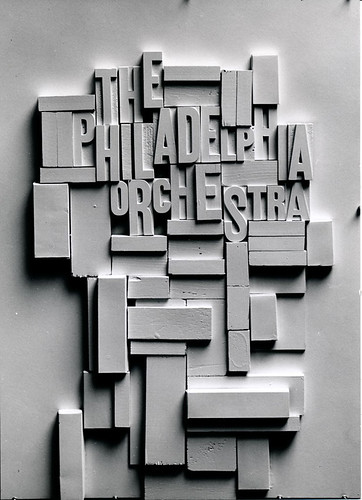
Wood sculpture by Brownjohn for a poster for the Philadelphia Orchestra. Brownjohn, Chermayeff & Geismar, late 1950s.
Top: Record cover, late 1950s. The repetition of bright colours and mechanically imperfect letters evokes the rawness and rhythm of Machito’s latin music.
Bj, as everyone knew Brownjohn, was born in Newark, New Jersey in 1925 and died in London in 1970. In a short but intense career on both sides of the Atlantic, he switched from graphics to advertising to film production. Each step brought him closer to dealing exclusively with ideas and how most directly to express them. By replacing a superficial concern for shape, colour and typography with an obsessive pursuit of the defining idea, he helped to transform graphic design into a conceptual art.
In swinging London, Brownjohn developed an outrageous personality and appearance that made him hugely attractive to an audience clamouring for exciting ideas. Brownjohn ate, drank, smoked, dressed, spoke and acted extravagantly, behaved badly in restaurants, commanded the highest wages from his employers and won enormous fees from his clients. He did as much as anyone to create the 1960s image of the graphic designer or commercial film-maker as a glamorous, fast-living, ‘beautiful person’ who hung out with actors, models, fashion designers and rock stars. Bj himself had a role in the feature film Otley in 1968; and he produced, directed and starred in a movie of his own, Bj’s Party. The lifestyle was integral (he would have it appear) to the art, the design theory and the method of working.
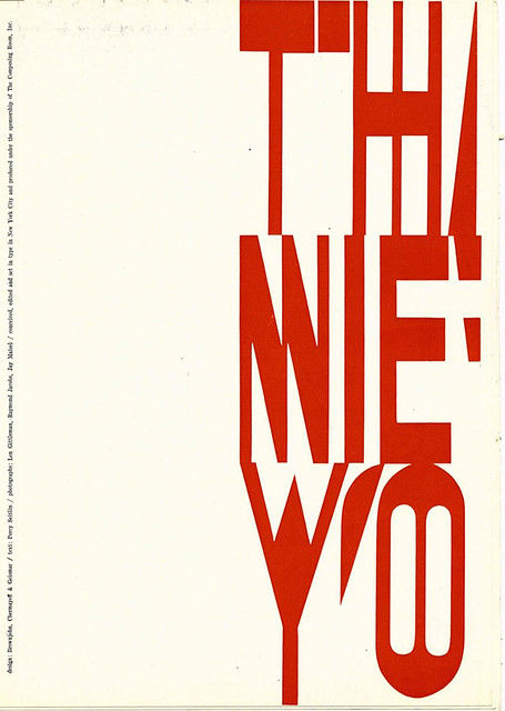
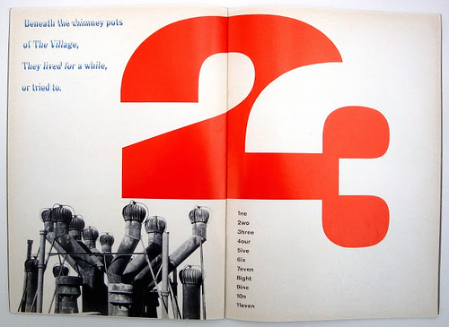
Pages from That New York, a booklet designed by Brownjohn, Chermayeff & Geismar under the sponsorship of the Composing Room. An evocation of Manhattan, writen by Percy Seitlin, the booklet revels in many typographic devices that are once again in fashion: type as texture, extreme distortion of text and display faces, incongruous mixtures of fonts, and layering to the point of obliteration.
Few British admirers would have guessed how much he owed to the sober teaching of Moholy-Nagy and Serge Chermayeff at the Chicago Institute of Design. Brownjohn sought to eradicate the boundary between the vernacular and ‘art’, and he personified Moholy’s grand vision that art and life be integrated. He fulfilled to excess Moholy’s prediction in Vision and Motion that it is ‘the task of this generation to search for its roots … the true artist is the grindstone of the senses; he sharpens eyes, mind, feeling; he interprets ideas and concepts through his own media.’
Book jackets. In contrast to today’s ornate productions, covers were bold and simple, hooking potential readers by the clarity with which they embodied a book’s intention. BC&G, 1950s.

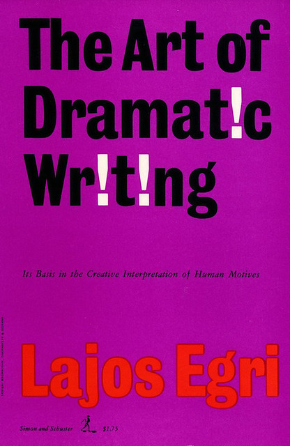
In the spring of 1957, Brownjohn joined Ivan Chermayeff and Thomas Geismar in New York to form Brownjohn, Chermayeff & Geismar. The partners worked closely on a broad range of projects – stationery, advertisements, exhibition design, corporate symbols, book jackets and record sleeves – and the business prospered. Brownjohn and his colleagues looked to the physical world for inspiration and ideas. Tony Palladino, Bob Gill, George Tscherny, Bj and the partners visited Coney Island to take pictures of vernacular detail. ‘We were looking for graphic turn-ons that later we could apply to jobs,’ remembers Palladino. ‘The fresher the essence, the better the job.’ They believed that if they couldn’t describe an idea over the telephone, then it wasn’t simple, clear or direct enough to work.
In 1959, Brownjohn’s behaviour in the office began to change radically. He would stay away for days, and miss meetings and deadlines. At work he spent hours at his desk producing nothing. Physically, he grew rapidly from strikingly thin to bloated and back to thin. Finally, that winter, he checked himself into a private hospital. The partnership was ended one evening in Brownjohn’s hospital room, and six months later he left for England.
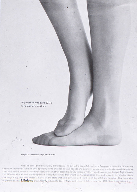
Brownjohn had no trouble finding a job in London. Alan Fletcher and Colin Forbes, who had met Bj in New York, suggested that he try the ad agencies, and he went to work for J. Walter Thompson as an art director. There, and later at McCann Erickson, Brownjohn worked on a wide range of campaigns. Particularly successful was a series of print ads for Lifelons stockings. Brownjohn glamourised the product by showing only the most attractive legs in black and white, cropped to a point of sensuous abstraction. Some of the variations on this theme were double exposures, but most were simple sculptural forms reminiscent of Brancusi and other aesthetic models prevalent at the Institute of Design in the 1940s.
One of a series of Lifelons stocking advertisements that Brownjohn designed for McCann Erickson, early 1960s.
In Typographica no. 4 of December 1961, Brownjohn published a photographic essay entitled ‘Street Level’. Formalising what he and his friends had practised on their trips to Coney Island and in the streets of Manhattan, he showed examples of what careful observation could uncover. ‘Until now,’ Brownjohn wrote,’ everything of any interest in this wide-open area of social uplift [the city] has been done by dead men or by amateurs or vandals or politicians or accident or neglect or dirty old men or the makers of big, busy neon signs … The photographs on the following thirty-one pages were harvested on one trip around London. The things they show have very little to do with Design, apart from achieving its object.’
Among the photographs of design created by accident he included examples of his own work and that of his friends to show how professionals could put these images to use. Odd juxtapositions and the chance meeting of unlikely but familiar elements were a preoccupation of the period and the approach was to prove highly influential. (Brownjohn lived what he preached; his London flat was full of typographic junk: broken signs, individual letters, torn paper with unusual printing.) On the lecture circuit, too, Bj held audiences enthralled for hours with his collection of ‘2000 slides of unused ideas’. Brian Tattersfield saw him speak at the Graphic Workshop organised by Bob Gill soon after he arrived in London. ‘We were all absolutely staggered by it – so much so that one friend was moved to tears, knowing he would never be able to equal it.’
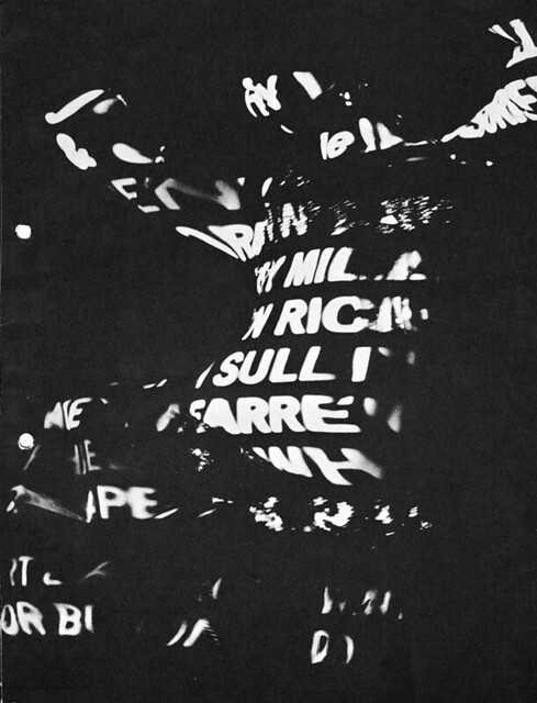
While still at McCann’s, Brownjohn was commissioned on a freelance basis to do the titles for From Russia with Love (1963), the second James Bond film. Largely on the strength of this ground-breaking work, in which type plays across the undulating flesh of a dancer, Brownjohn left the agency to join David Cammell and Hugh Hudson’s film production company. Brownjohn produced award-winning titles for the next Bond film, Goldfinger (1964), and the new company, in Cammell’s words, ‘took off like a rocket’. Cammell, Hudson & Brownjohn were unusual in initiating most of their films. The client would arrive with a problem, or simply a need for publicity, and a generous budget, and the partners would come up with a concept and a storyboard.
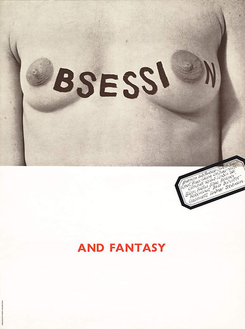
Poster for an exhibition of Pop Art at the Robert Fraser Gallery, London, in the early 1960s. Brownjohn sought, and achieved, a close integration of ‘sex, typography and meaning’.
For the Midland Bank, they produced Money Walks, Money Talks, a series of cinema commercials in which letters and words were animated to amplify their meaning and the story was spelt out visually as well as verbally. The commercials had little to do with Midland, or even with money, but the idea of talking typography quickly came to be associated with the bank.
Brownjohn continued at the same time to design for print. As his ideas for graphic design evolved to meet the demands of over-blown, over-rich, over-stimulated 1960s London, letterheadings became bigger and flashier. A famous stationery set for Michael Cooper, photographer of the Beatles’s Sgt. Pepper sleeve, features the star designer’s name in gigantic type as large as the client’s.
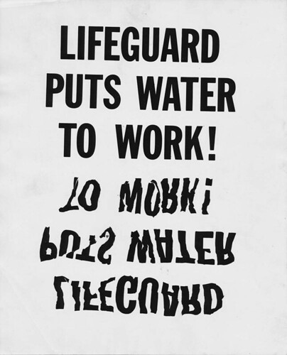
Proposal for a Lifeguard soap advert. London, early 1960s.
Brownjohn’s last completed project was for Dick Davidson, a long-time friend, who had commissioned a series of peace posters to be designed by artists in New York and abroad. Bj’s design uses his own handwriting scrawled in the middle of a blank white sheet, and the last three letters of the word ‘peace’ are represented by the ace of spades – the death card – followed by a question mark. It is signed, as if to his friends, ‘Love, Bj’.
Writing in 1979, Brian Tattersfield recalled a second encounter with Brownjohn at the Graphic Workshop. ‘I remember him arriving an hour late, looking ill and more or less asleep standing up … When he came round he talked as lucidly as ever about deisgn, and had the class completely entranced. Out of some kind of hysteria, a student (I believe he was an architect) stoop up and quite seriously asked Bj the question: “What is graphic design?” Brownjohn, just as seriously, but beginning to fall asleep (and still in his raincoat) replied: “I am”. And he was, God rest his soul.’
Opening titles for From Russia with Love, 1963. Brownjohn’s inspiration came from watching the effect of still type projected on to moving bodies, as people arrived late for a slide presentation.
Katy Homans, graphic designer, Seattle, Washington
First published in Eye no. 4 vol. 1 1991
Eye is the world’s most beautiful and collectable graphic design journal, published for professional designers, students and anyone interested in critical, informed writing about graphic design and visual culture. It is available from all good design bookshops and online at the Eye shop, where you can buy subscriptions and single issues.

