Summer 2017
Brand in the hand

In Melbourne, more than a century ago, a ‘printer’s fist’ inadvertently became one of the earliest corporate identities

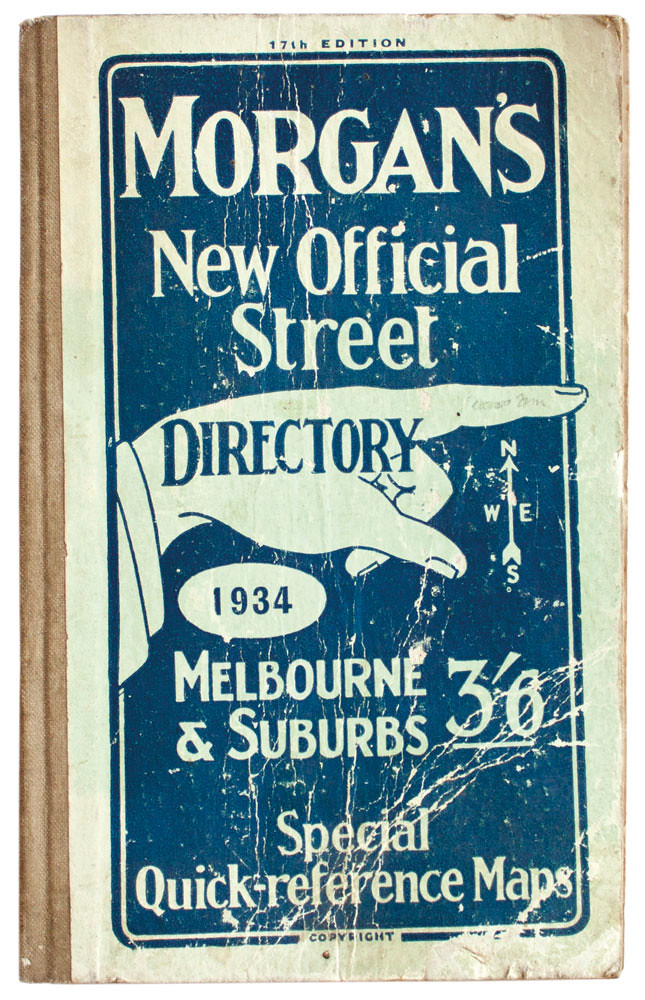
Australian businessman Valentine Morgan (1876-1952) was well versed in the seductive possibilities of the printed image. His print advertising used all the typographic hallmarks of the early advertising age – embellished lettering, unapologetically forceful display faces, snappy headlines. Alongside this was another popular graphic motif commonly found in any compositor’s tray – the pointing finger, a typographic device also known as the ‘index’ or ‘printer’s fist’.
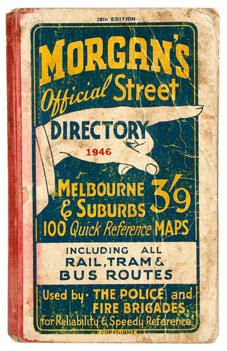
This was used to point the reader’s eye to a key advertising message, but Morgan found a secondary role for it, on the covers of his ‘A-Z’ of Melbourne’s streets, Morgan’s Directory. Here the pointing finger took on a dual meaning – graphically communicating the book’s function (wayfinding) and its commercial intent (advertising).
Civic purpose
Despite its unapologetically commercial motivations, Morgan’s Directory served an important civic purpose: in the newly motorised landscape of 1916 Melbourne, it answered a public need to know what lay beyond walking distance. The Directory lasted through 60 editions; over the years, the titling typography evolved, but the pointing hand remained a striking and emblematic identity design. Early covers featured an illustrated hand with a somewhat grotesque, gnarled and long-nailed pointing finger (sometimes referred to as the ‘Nosferatu’ hand). By the late 1950s this had been streamlined to a black silhouette.
Unlike some of Morgan’s other ventures, such as an attempt to advertise messages on car wheel hubs, the Directory turned a healthy profit. Every available space was considered an advertising opportunity, including blank areas on the Directory maps; but as Melbourne expanded, and open country was filled with new housing or industrial estates, the blanks filled up, and advertising had to be moved from inside the maps to the frames around its borders and to the front cover itself.
The postwar building boom meant a new Directory every year or eighteen months. To ensure the Directory kept pace with development, its draftsman, Alf Yorston,would visit councils to learn about new subdivisions and new streets, amending his meticulous maps and drawing new ones.
All editions from the collection of author Stephen Banham.

One way of keeping print costs down was to use the same printing plates, only changing the colours from year to year. An unintended result is one source of the Directory’s appeal today – an extraordinarily consistent visual identity, branding born of economy. In some periods, many issues would feature exactly the same cover as the previous year, with details such as date and price overprinted in a single colour.
Compared to counterparts in other Australian cities, the pages of the Directory were well covered in advertisements, mainly from local estate agents. Other directories were available but Morgan’s had 90 per cent of the market at its peak in the late 1950s, selling 80,000 copies.
In the mid-1960s, though, the superior Melways Street Directory arrived. Morgan’s attempted to buy out this new competitor, but when the offer was refused it was only a matter of time before circulation declined, and Morgan’s Directory ceased publication in in 1976.
Stephen Banham, designer, Letterbox, Melbourne
Read the full version in Eye no. 94 vol. 24, 2017
Eye is the world’s most beautiful and collectable graphic design journal, published quarterly for professional designers, students and anyone interested in critical, informed writing about graphic design and visual culture. It is available from all good design bookshops and online at the Eye shop, where you can buy subscriptions, back issues and single copies of the latest issue. You can see what Eye 94 looks like at Eye before You Buy on Vimeo.

