Autumn 2011
Case studies

United Visual Artists
Paul Rand
Dalton Maag
The Light Surgeons
Kin
Universal Everything
Human
Case studies from Chris Maillard’s article ‘The far side’

IBM: Learning from history
IBM has a long history of innovative and crisp modern design, notably during its association with Paul Rand, the famed graphic designer whose corporate identities and neat, bold logos emblazoned the letterheads of umpteen famous American corporations from the 1950s onwards. And in many cases still do.
As project manager, brand expression, Randy Golden is responsible for identity and design. He joined the company 30 years ago and has worked in marketing, communications and design there.
‘I had the honour and privilege to be the IBM liaison to Paul Rand in the years preceding his retirement from IBM consulting,’ he proudly mentions. ‘There’s not a day goes by that I don’t think of something I learned from Paul about design.
‘The most challenging aspect of managing design for IBM is the size, scale and integrated nature of our business. Everything integrates with everything else, and it’s all branded. However, IBM senior management are strong champions for design as a critical component of our business. As former CEO Thomas Watson Jr said, “good design is good business”.
‘There are many design efforts I’m proud of, but our most recent work around the concept of a “Smarter Planet” and how IBM can contribute to its development is very gratifying, as it goes much deeper than purely business-to-business benefits.’

Nokia: Creative consistency
Nokia has always had a strong sense of the importance of visual identity, to the extent of commissioning a new typeface recently.
Aapo Bovellan, director of Nokia’s brand and marketing studio, joined the Finnish mobile phone company in 2003 from a design role in an advertising agency.
‘I had turned 30 and started to question whether I was doing what I really love doing in life – designing brands,’ he says. ‘Nokia was looking for a significant change in the way we manage our brand identity. So my re-found love for branding and Nokia’s desire to break out of the tradition met at the right time.
‘Graphic design is really important for us. It’s everywhere – the user interface, services, packaging, manuals, advertising, point of sales, corporate branding…
‘We value good creative [work], and never throw anything away – we always try to find use for things we love, even if it takes a while. Something originally intended for a cancelled strategy project might resurface as a device wallpaper.
‘The best part of leading the brand identity internally is that we can tap into the world’s best small creative shops and individuals – DesignStudio, North, Build, Jane Stockdale, Airside.
‘I admire large companies who have been able to maintain a coherent design ethos, and deliver honest and functional design – that is really hard to achieve. Muji, Adidas, Volkswagen are some of my favourites. They have been able to resist the temptation of going effects crazy.
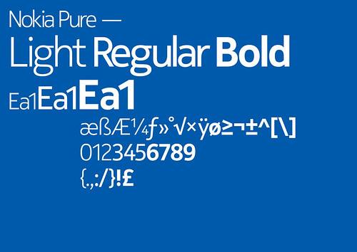
‘In terms of our work, I’m really proud of the Nokia Pure typeface [by Swiss type designer Bruno Maag of Dalton Maag in London], one of the most beautiful, functional humanist sans serifs.
‘We invited thirteen world-class designers to take the typeface for a ride – Alex Trochut, Bond, Cartlidge Levene, Studio Myerscough, for example – and exhibited their work in an evening party aimed at creatives in London. In terms of publicity, positivity and coverage, compared to the investment it was a real success.’

University of Sheffield: Academic ambition
Academic institutions today use smart design as part of their marketing drive to attract today’s visually literate students. The University of Sheffield, being based in a city with an excellent design heritage, is leading the way.
Caroline Lister, the university’s creative manager, is responsible for both print and online marketing communications.
‘Graphic design is very important in reinforcing our brand. We feel that good design makes us stand out and makes our messages stronger.
‘We have an in-house design team and a roster of approved design agencies whom we approach when we want to commission a new job. Whom we use depends on the size of the campaign and the potential cost. If it’s a small job, we’ll ask three similar agencies to give us a price for the work and then choose the most suitable. If it’s a larger campaign, we ask agencies to pitch for the job.
‘There can be problems championing design within a large organisation; it can be difficult to get people to think about what their audience want to see rather than what they personally like. And people often try to direct the design rather than leaving it up to the designer.
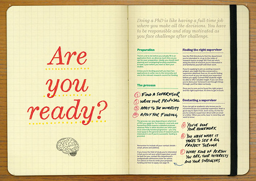
‘But I’m very proud of our postgraduate research prospectus – we wrote the copy in house, Shaun Bloodworth took the photos and the whole publication was art-directed and designed by [Sheffield studio] Human, whom we’ve built up a very good relationship with over several years. They’re always open to our ideas and they come up with creative design solutions.
‘We’re also very proud of our bespoke fonts, Stephenson [a serif] and Blake [a sans serif]. They are modified versions of a design by the Sheffield typefounders Stephenson, Blake & Co (Sir Henry Stephenson was one of the university’s founders).
‘The fonts were chosen with the assistance of the Type Museum in London and redrawn for us by House Style Graphics [see ‘Sense of place’, Eye no. 58 vol. 15]. In their modernised, digitised form, they are our unique signature, our hallmark, our stamp.’

National Maritime Museum: Cutting-edge curation
The National Maritime Museum and Royal Observatory, Greenwich, London, is internationally lauded for the quality of its interactive exhibitions and its graphics.
Fiona Romeo, the museum’s head of digital media (‘everything from collections digitisation to websites and exhibitions – and the green laser that traces the Prime Meridian across London’s night sky’), previously produced community platforms and multiplayer games for brands such as the BBC and Disney.
‘I am particularly interested in the points of intersection between the digital and the physical. My project for Disney, Virtual Magic Kingdom, was an online world that sat at this intersection: achievements in the game unlocked experiences within the physical parks, and retail products purchased in the parks spawned digital copies in the game. I wanted to keep exploring this intersection – but in a more serious context than a theme park.
‘You won’t find the word “design” in our corporate strategy but it does direct us to “stimulate curiosity” and “create a shared sense of ownership”. Given that our assets are relatively fixed – heritage buildings, the collection – our real opportunities to influence culture, or attract new audiences, are to be found in reinterpreting those assets through new research and design.
‘My challenge is in advocating for a particular kind of design. Museums tend to work with ‘exhibition designers’, a type of design practice that usually comes from interior design or architecture.
‘I want the National Maritime Museum to lead with ‘interaction design’ instead: to start with visitor behaviour and to work with designers who treat software and electronics as just another material to work with. I’d point to more experimental practices, such as Berg and Luckybite.
‘I also want to collaborate with nearby design schools, such as Goldsmiths and Ravensbourne, and to help smaller practices navigate our public sector procurement process.
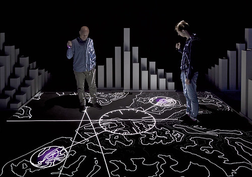
‘We asked the digital arts organisation onedotzero to suggest interesting designers we could consider alongside the usual suspects to develop the spaces in the new Sammy Ofer Wing, [where] we had the privilege of working with United Visual Artists, the Light Surgeons and Kin Design.
‘I really admire Kin [who designed the wing’s interactive lounge]. They work across interior design, graphic design, product development, software and electronics. They seem genuinely agnostic about the materials they use to solve a particular problem and refine their design through prototyping.
‘Most unusually of all, Kin bring their clients in on the real design work, through regular workshops. They perform exactly the kind of design that I think works best for museums.’


Deutsche Bank: Enlightened finance
Deutsche Bank has a strong record in graphic design, and one of the world’s largest private art collections. And it is still commissioning cutting-edge work as well as sharp business graphics (and sponsoring graphic design competitions).
‘We are fortunate that the bank has a heritage of strong design and a strong connection with the visual arts,’ says Michael West, its head of communications, Asia Pacific, who has been working with the bank for fourteen years.
‘So it is not difficult to get good work adopted. The businesses and management respond well to strong graphic work.
‘The benefits of good design are immense. Brand attributes can be communicated far more elegantly, subtly, intelligently and beautifully. It makes for a simpler life from a brand manager’s perspective.
‘Deutsche Bank has one of the most recognisable graphically compelling logos in the world. The global brand team are very diligent and proactive about the development of the brand and leveraging the logo in many forms, often with stunning results.
‘The BrandSpace [an interactive exhibition-cum-marketing exercise, developed with German agencies Art+Com and Coordination, and based around the 1970s Anton Stankowski-designed logo and the recently refreshed brand identity, www.the-brandspace.de] in the bank’s newly renovated head office in Frankfurt is a standout example.
‘Another example is the commissioning of the media wall in our new Hong Kong offices. Matt Pyke [Universal Everything] and his collaborators Vera and Marcus of FIELD [see ‘10,000 one offs’ in Eye 80] designed and executed the work displayed on the media wall.
‘It is a stunning example of what is possible with the right attitude, brief, belief and truly gifted artists and technical expertise. It was a very ambitious project on every level.’
Chris Maillard, writer and editor, London
First published in Eye no. 81 vol. 20 2011
Eye is the world’s most beautiful and collectable graphic design journal, published quarterly for professional designers, students and anyone interested in critical, informed writing about graphic design and visual culture. It is available from all good design bookshops and online at the Eye shop, where you can buy subscriptions and single issues.

