
Winter 2014
Chasing perfection
From Penguin bestsellers to Royal Mail stamps; from elaborate playing cards to the covers of Radio Times; the illustrator and designer Tony Meeuwissen has always taken a dedicated and detailed approach to his exquisitely hand-crafted artwork. Mike Dempsey reflects on a career that has spanned more than 50 years
In November 2013, I attended the presentation of the Royal Designers for Industry awards. These awards, from London’s Royal Society of Arts, were initiated in 1936 to recognise the contribution that designers make to society and include among their early recipients Eric Gill (1936), Edward McKnight Kauffer (1936), Raymond Loewy (1939) and Susie Cooper (1940). Among the nine designers being honoured in 2013 was Tony Meeuwissen – a man who has spent his entire creative life dedicated to the exacting hand-crafted execution of stunningly original artwork. There is nobody quite like him, and he is still the only designer / illustrator to win two D&AD Gold Awards for his work in the 50-year history of the organisation.
Anthony Peter Meeuwissen was born in Mayday Hospital, Croydon in 1938, to his eighteen-year-old mother. The unusual surname (pronounced Maywissen) comes from his Dutch grandfather, who was an engineer by profession, a career that Meeuwissen’s father also followed. When Meeuwissen was young, his mother would read aloud nursery rhymes, classic fairy tales and children’s books from the library. He recalls Andersen, Grimm, Babar the Elephant and Struwwelpeter in particular. Aged twelve, he was awarded a place at a grammar school in Egham, but drawing was his real passion and at sixteen he left school to take up an apprenticeship at Theatre Publicity (later to be absorbed into Rank Screen Services), which was responsible for the advertisements, mostly static slides, between feature films.
At Rank, Meeuwissen worked in both the art and layout departments for six years. Here, he learned to use gouache paints, discovered the beauty of typefaces, and helped develop new graphic ideas. About the same time, he wrote to Gerard Hoffnung, an artist and musician whose cartoons on musical themes were popular in Britain in the 1950s and whose work Meeuwissen greatly admired, having seen it in Lilliput and Punch magazines. Hoffnung replied and invited him to visit his home in Hampstead Garden Suburb, where he was generous with his time and advice, giving Meeuwissen tips on art, books and music. Meeuwissen also became interested in various philosophical movements and individuals, including George Gurdjieff (1866-1949), an influential spiritual teacher of Eastern esotericism.
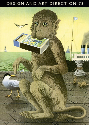
Cover illustration for the 1973 D&AD Annual, commissioned by it’s designer John McConnell. Meeuwissen says the illustration did not symbolise anything
other than things that interested him.
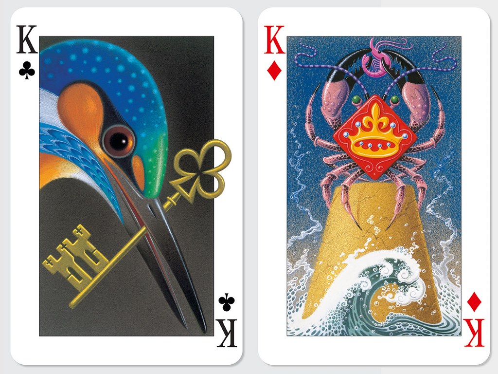
Top: The Key to the Kingdom. Two from a set of 53 transformational playing cards, published as a boxed set in 1993 by Pavilion Books. Meeuwissen won his second D&AD Gold Award for this beautifully crafted piece of work, which took years to complete.
The apprenticeship at Rank equipped Meeuwissen with the basic commercial art skills and he moved on to a variety of small studios and agencies, ending up in 1965 at Gerald Green Associates (GGA), which was just around the corner from über-trendy Carnaby Street, during the height of the Swinging Sixties. It was an agency producing creative ideas for many London advertising agencies and here Meeuwissen came under the influence of Al Vandenberg, an inspiring creative director and a brilliant reportage photographer. Meeuwissen describes Vandenberg as his only teacher and he absorbed all he had to say. Vandenberg helped guide Meeuwissen to the next stage of his career, as he suggested he visit Michael Wolff at Wolff Olins. Recognising Meeuwissen’s potential, Wolff offered him a job. However, Meeuwissen did not want to sever his connections with GGA completely, so he suggested working alternate weeks at Wolff Olins.
It was through Vandenberg that Meeuwissen was introduced to Michael Cooper, a man at the heart of the 1960s pop scene. He was not only responsible for photographing the cover of The Beatles’ Sgt. Pepper’s Lonely Hearts Club Band but was also instrumental in the cover’s overall concept. In 1967, Meeuwissen was commissioned by Cooper to create a border for The Rolling Stones’ Their Satanic Majesties Request. He painted a psychedelic landscape embracing the four elements of earth, water, air and fire, which appeared on the back cover.
Continuing his freelance quest, Meeuwissen visited Michael Rand, the legendary art director of The Sunday Times colour supplement, and David Pelham, the art director at Penguin Books after Alan Aldridge. Both Rand and Pelham offered Meeuwissen regular work, and so began a 45-year freelance journey.
The individuality of Meeuwissen’s work quickly came to the notice of David Driver, who, in the late 1960s, was the art director of BOAC’s inflight magazine Welcome Aboard. It was a gem of a publication and quickly became the showcase for a number of illustrators and photographers. Over the coming years, Driver would graduate to the art directorship of Radio Times, and Meeuwissen would become a regular contributor. Another supporter was the designer John Gorham, a man of considerable talent in his own right and a collector of creative collaborators. If John thought your work was good, then your work was good.
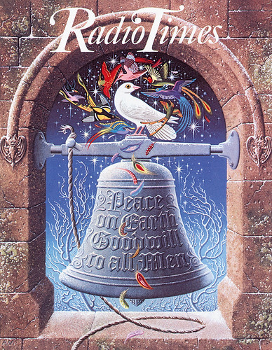
Radio Times New Year edition, 1970. A seasonal celebratory front-cover illustration, with the initials ‘AM’ in the brickwork, bottom left.
With a stable band of loyal clients, Meeuwissen soon settled into a mix of commissions from a variety of sources, including editors, publishers and record industry personnel. In 1971, he moved away from the bustle of London to more tranquil surroundings in Wales, together with his first wife and two children, Cate and Jessica. And by 1972 he was in great demand. He had thirteen pieces of work in the D&AD Annual that year and was working for Island Records, Penguin Books, Lloyds Bank, Transatlantic Records, Music Sales, BBC Publications and Kinney Records, for which he won his first D&AD Gold Award. During his period in Wales, he produced his first complete children’s book, The Witch’s Hat. And in 1974, when I was the art director of Fontana Paperbacks, I also regularly commissioned him for book covers, including a C. S. Lewis series.
The Welsh idyll did not last, and in 1976 Meeuwissen’s marriage broke up. He returned to London and found an agent, Nicholas Dawe at Folio, who had already asked him to design their stationery. Dawe negotiated fees and handled Meeuwissen’s commissions, including one from Nicky Bird, the publisher at the Victoria & Albert Museum. Bird asked Meeuwissen to design a new deck of transformation playing cards. The challenge was irresistible, but the project came to a halt when Bird departed from the V&A.
When Meeuwissen wanted to continue with the project, his agent, Dawe, provided financial support for two years in return for a 50 per cent share in royalties and ownership of all the original illustrations. The Key to the Kingdom – a set of 53 transformation playing cards and an accompanying book – incorporated passages from nursery rhymes, and these were reflected in Meeuwissen’s ingenious card designs, which brought hearts, diamonds, spades and clubs to mind in a series of witty visual tricks. As well as traditional ditties, the cards featured work from authors such as Ogden Nash, Lewis Carroll, Rudyard Kipling and Hilaire Belloc.
To Meeuwissen’s consternation, the British publisher, Pavilion Books, wanted a prize idea to be woven into the book through a series of clues to be solved. The winner would receive £5000 and a golden key. A similar idea had been done with great success some years earlier with Kit Williams’s book Masquerade. Meeuwissen felt the prize device devalued his project’s integrity, but the design fraternity appreciated his efforts, and in 1993 awarded him his second D&AD Gold Award, as well as the W H Smith Illustration Award (now known as the V&A Illustration Award), with a prize of £4000.
Royal Mail stamps on the theme of weather, 2001. Produced in collaboration with graphic designer Howard Brown, these were set inside a barometer dial cut into a circle. They were voted the most popular British stamps of that year by readers of the Royal Mail’s monthly British Philatelic Bulletin.
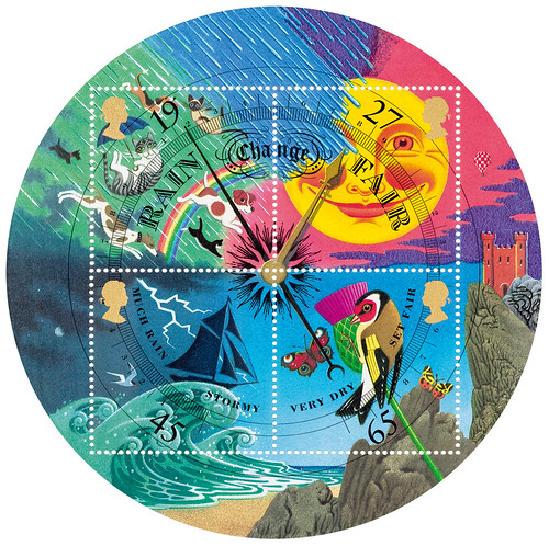
Over the years, Meeuwissen has also produced three memorable sets of postage stamps for the Royal Mail. His first was a set of five for Christmas 1983 – one, depicting a dove and a blackbird, representing peace, won the Italian Francobollo d’Oro Award in 1984 for the world’s most beautiful stamp. His second, issued in 1991, was a stunning set of ten stamps based around the concept of ‘good luck’. These stamps formed a complete frieze design. The third set, produced in collaboration with graphic designer Howard Brown, was on the theme of weather. Four stamps were set inside a barometer dial cut into a circle, with the perforated stamps as an integral part of the design. These postage stamps show Meeuwissen’s love of witty symbolism and visual games.
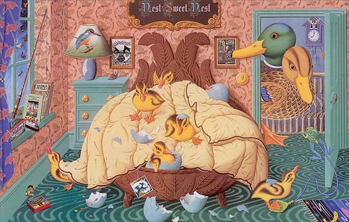
This can also be seen in an advertisement he produced for ICI continental quilts in 1982, which shows a bedroom full of hatching ducklings. In the detritus around the room, you will find a tiny illustration of his book The Witch’s Hat, tucked away on the window-sill. Meeuwissen’s highly detailed work demonstrates an extraordinary level of craftsmanship. It is produced by hand, without the aid of technology. But the very nature of his pictures means that what might take an illustrator with a loose, immediate style two hours to produce could take Meeuwissen two weeks. Today Meeuwissen lives with his second wife, Marie, in Gloucestershire and each day he prepares the gouache and watercolour paints he has always used and settles into another session of absorbed concentration on his latest project – one on which he has already been working a year. Entitled Purple Emperor (after the butterfly) and due for publication in 2015, it is a book of exotic animals set against whimsical verses. His 2002 book Remarkable Animals (Frances Lincoln) has just been republished in a large-format hardback edition.
In an age where digital is king, Meeuwissen is an inspiration to anyone wishing to understand the hand-and-eye craft that is being lost. His illustrations continue to educate, illuminate and delight through their breathtaking beauty and unsurpassed skill. His contribution to society is worthy of celebration.
Press advertisement for ICI duvets, 1982. Meeuwissen craftily featured his first illustrated book, The Witch’s Hat, propped up on the window-sill.
Mike Dempsey, graphic designer, writer, blogger, broadcaster,
London and Dorset
First published in Eye no. 89 vol. 23 2014
Eye is the world’s most beautiful and collectable graphic design journal, published quarterly for professional designers, students and anyone interested in critical, informed writing about graphic design and visual culture. It is available from all good design bookshops and online at the Eye shop, where you can buy subscriptions, back issues and single copies of the latest issue. You can see what Eye 89 looks like at Eye before You Buy on Vimeo.