Summer 2020
Chloe Scheffe: Rethinking editorial design

Brooklyn-based Chloe Scheffe designs books by groundbreaking thinkers and tackles magazines with a similarly radical approach

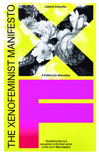
The pages of The Xenofeminist Manifesto: A Politics for Alienation unfold with assertive force, its radical message energised by the dynamism of Chloe Scheffe’s design. Originally published online by the collective Laboria Cuboniks in 2014, Verso Books approached Scheffe in 2017 to design a print version of the manifesto, giving her freedom to interpret its text how she saw fit. Adopting the ‘xeno’ prefix as a starting point – with its suggestion of foreign and ‘unnatural’ bodies – Scheffe envisioned the manifesto as an organism colonising its paperback host.
Cover design for The Xenofeminist Manifesto (Verso, 2017) emblazoned with the letters ‘XF’, the abbreviation for xenofeminism used throughout the text.
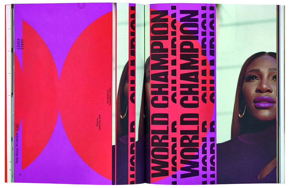
Top. First spread of a four-page opener from Here magazine issue no. 11 (2020), co-designed with Natalie Shields. Portrait of Serena Williams by Shaniqwa Jarvis. Scheffe art directs this customer title for Away luggage.

Fluid, abstract forms mutate into dense panels of custom-made letterforms, with section titles – Zero; Interrupt; Trap; Parity; Adjust; Carry; Overflow – spilling across multiple pages. Royalty-free images depicting stereotypical images of femininity, downloaded from the classical canon of Old Master painting and sculpture, have provided additional content, ripe for subversion. Inverted, multiplied and stretched to fill the pages, they evocatively illuminate the themes in the text: gender abolition; emancipatory technologies; the critique of the ‘natural’ order. The book represents a striking piece of graphic authorship, calling to mind classic text-image synthesis like Marshall McLuhan and Quentin Fiore’s The Medium is the Massage (see Eye no. 8) where the distinction between form and content is dissolved. The text is the image is the material is the message.
Now based in Brooklyn, New York, Scheffe grew up in the Seattle area and studied at RISD. She is the art director of travel magazine Here, a customer title for luggage brand Away. Scheffe has also worked for The New York Times Magazine and Other Means (also in New York), and for Metahaven in Amsterdam. She operates almost exclusively as a print designer, and her practice spans editorial, art direction, books and illustration.
Her jacket design for Jean Baudrillard’s For a Critique of the Political Economy of the Sign is the first in a series of new Verso editions of texts from the most provocative voice of postmodern theory. Scheffe’s design toys with paperback format conventions by inverting the typical layout – a generic stock-image of clouds forms a glossy outer frame, and where the cover image might normally appear, there sits instead a matte black rectangle. It conceals our view of the clouds, or perhaps, simply represents a void.
Scheffe says that the aim was for the design to feel ‘intentional but inscrutable’, and the back cover follows through by presenting a cryptic arrangement of geometric shapes with the blurb and its associated text fragmented inside them. As with The Xenofeminist Manifesto, the effect of the design is suggestive rather than explicit, alluding abstractly to the complex subject matter of the text.
Cover of Here magazine issue no. 11 (2020), co-designed with Natalie Shields. Portrait of Serena Williams by Shaniqwa Jarvis.
She pursues a similarly progressive agenda within the mainstream platform of Here, working to counter the homogeneity of the typical travel magazine format (‘minimalism and near-total reliance on photography across the board’). Scheffe says: ‘In the commercial world we’re used to seeing work that is more diluted, less direct, less statement-making, which is, I think, a symptom of too many voices (or the wrong voices) having input, or the capitalist desire to appeal to the largest demographic possible … I got lucky with Here in that I’m able to make something almost as uncompromising as I would for a small, radical client like Verso.’
John-Patrick Hartnett, designer, writer, lecturer, London
First published in Eye no. 100 vol. 25, 2020
Eye is the world’s most beautiful and collectable graphic design journal, published for professional designers, students and anyone interested in critical, informed writing about graphic design and visual culture. It is available from all good design bookshops and online at the Eye shop, where you can buy subscriptions and single issues.


