Summer 2015
Counter intuition

A short type design course will never turn you into a type designer. But it may make you a better typographer

When I train a new employee at Font Bureau, I am working with a very talented, focused person who really wants to be a type designer. We have the time we need, usually one to two years. The focus is on technique and results.
But when I am teaching a type design elective at Rhode Island School of Design (RISD), the situation is different. Instead of working with an individual, I am dealing with a group. Although most of the students are also talented and focused, they do not want to be type designers. My students are graphic design students. They want to be graphic designers. They just want to give type design a bit of a try for twelve weeks.
Nevertheless, I am interested enough in the subject of type design to have been teaching this class for almost fifteen years. It took me some time before I recognised the differences between training and teaching. When I finally did, I will confess that I found the idea of teaching discouraging – at least at first.
Type design is informed, in part, by a mixture of calligraphy, history, and function. As an experienced type designer, when I draw a letter I use my knowledge of these things to help me visualise its appearance. However, there is only so much a student can learn within the limits of a short elective.
Calligraphy offers time-honoured methods of drawing correct letterforms. I tried various ways of introducing calligraphy into my class. However, in a twelve-week semester, it can easily overpower the entire curriculum. Calligraphy informs type design, but it is not the same as type design. And I am not a calligrapher. My interest in type design comes in large part from what makes it different from calligraphy, not what makes it similar.
Type design also offers a great opportunity to get into the history of type. Studying and copying old typefaces is a sure way of learning about where the letterforms we use today come from. For me, the historical approach is too academic. Research has its place but I am more interested in drawing and making new things. My students and I get excited about using the current technology to do this.
While I do not (and cannot) ignore calligraphy or history, my method of teaching type design to graphic designers is based on neither. In my class, the focus is on thinking about how a typeface will be used. Function is the path we follow to drawing letters correctly.
This is not a dry exercise in problem-solving. I ask the students to imagine designing a novel of their choice. They visualise all the elements of the design of this book, not just the typography. They consider the cover, the paper, the quality of the printing, all the things that make a book itself. Finally, I ask them to focus on a very important detail, the text face. This is what they will draw.
Actually using the font they create to make something provides valuable context. It is an excellent way to guide the design process, and in addition, it provides a concrete way to evaluate the results.
Most importantly, this method builds on the graphic design skills the students bring with them. Graphic designers are trained to visualise different kinds of typography. Instead of grasping for the right font, I ask them to describe what they are looking for. I ask them to sharpen their vision and hone their opinions about the kind of typography they want to make. These are the key elements that go into the typographer’s most important decision: what typeface to use.
I am not training my students to be type designers. That is not what they want and there is not enough time, anyway. But maybe, in twelve short weeks, I can make them into better typographers.
That is the intended use of my class, stated on the syllabus. Personally, I find some of the side effects even more interesting.
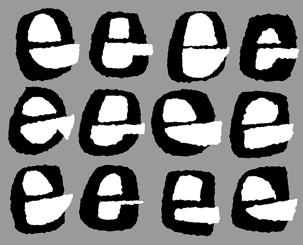
Typographic letters are drawn with contours. The contour represents an edge, where the black shape and the white shape meet. With practice, you can draw while maintaining a simultaneous awareness of both kinds of shapes.
This is not just a mental exercise. I have observed that when a letter’s white shapes are given equal if not greater focus, difficult issues of balance and proportion often resolve themselves. The result is a letter, although not perfect, that has a sense of correctness. This is the way I teach my students to draw letters.
Of course, drawing white shapes is not the ‘one simple trick’ that will make you a good type designer. It is a foundation on to which you add all other kinds of specialised skills and knowledge. Drawing a letter that looks correct is just the starting point for the serious type designer.
In the meantime, this way of looking at letters offers the student an insight into the way movable type works. The white shapes in and around a letter help to form a typeface’s built-in spacing. The built-in spacing, or glyph space, forms the very structure of a paragraph. Anyone who has set metal foundry type also understands this.
More importantly, by learning to draw the white shapes in a letter, the students gain a practical awareness of white space. This awareness can be extended to the space between words, lines, columns, pages, and beyond. Perhaps this is where the real potential of a type design elective lies.
While the importance of white space is often acknowledged in typography education, it rarely goes beyond just that. How to really teach and use white space remains relatively underdeveloped. Type design offers a natural way to do it.
At many design programmes, the time available to teach typography is shrinking. Yet no one is using less type. In fact, the demands placed on typography are getting more intense. My work at RISD has been figuring out if type design can help.
And I think it can. Typography education needs to go deeper and to get there faster. It needs a boost. Instead of being a dilettante exercise, a component of type design within a typography curriculum has the potential to be just that.
Top: Students can gain an understanding of the importance of white space by working with the shapes inside letters. Illustration by Cyrus Highsmith, 2015.
Cyrus Highsmith, type designer, educator, Rhode Island School of Design
First published in Eye no. 90 vol. 23, 2015
Eye is the world’s most beautiful and collectable graphic design journal, published quarterly for professional designers, students and anyone interested in critical, informed writing about graphic design and visual culture. It is available from all good design bookshops and online at the Eye shop, where you can buy subscriptions, back issues and single copies of the latest issue. You can see what Eye 90 looks like at Eye before You Buy on Vimeo.

