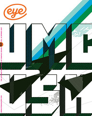
Spring 2007
Cover version

Artist Ellsworth Kelly’s links to design are demonstrated graphically by two projects
Despite his reputation as a painter and sculptor, Ellsworth Kelly’s engagement with, and influence on graphic design is actually quite substantial. A 2006 exhibition at the Serpentine in London keyed the visitor into this – though perhaps not intentionally so – by commissioning a children’s pack by designer James Lambert that emphasised the graphic elements in Kelly’s work.
Kelly’s own first foray into design came with a book. In the proposal for Line Form Colour (1951) he lays out the visual alphabet that will consume him for so many years to come. Using the page and the edges of the paper as the constituent features of the work, the book begins with the subject of line – featuring pages consisting of horizontal and vertical lines, the diagonal, the curve, the circle and the grid. Form is introduced by a mandorla, a triangle, a square and a rectangle. Colour is represented by a page each of red, yellow, blue and green, and then combined with line and form. The book, which was not realised at the time and has only recently been published [by Richter Verlag in 1999], flows elegantly from one section to another in an unbroken stream, and while it could seem like something Kelly just did on the side, it in fact lies at the very fulcrum of his practice.
Given this book, perhaps it should come as no surprise that Kelly’s work proves to be a dynamic starting point for contemporary designers. The Dutch graphic design group Experimental Jetset fashioned an homage to Kelly in 2001. Kelly 1:1 is in three parts: a wall work, a font and a book, each one exhibited in Casco projects in Utrecht. On the wall Kelly’s painting Blue, Green, Yellow, Orange, Red from 1966 was carefully mapped onto 150 A4-sized pieces of coloured paper. These sheets were then attached to the wall with grid-like precision. On the opposite wall was set the title of the work, articulated in the same dimensions as the work itself. Next to it was a bookshelf holding copies of the catalogue, consisting of the same 150 A4 pages but now bound as a paperback publication.
In other words, the publication is a one-to-one scale version of the work on the wall. And since the title Kelly 1:1 exactly describes the work, all the three elements (work, title and catalogue) can be seen as scale 1:1 models of each other.
‘The choice of the original Ellsworth Kelly painting should not be mistaken as cynicism or irony,’ Experimental Jetset has said. ‘It should really be seen as a tribute or homage. And since it is an homage in the same spirit as rock bands cover other bands’ songs, the installation is subtitled: “A cover version by Experimental Jetset”.’ The group continues: ‘Seeing ourselves as quite classic “problem / solution” designers, we felt this exhibition was in many ways a typical “design solution”: a tight hermetic system, with a strong inner logic.’
Lambert’s catalogues
The other example from graphic design comes with the children’s education pack conceived for the Serpentine exhibition. As is so often the case, the pack is more cleverly conceived than the central piece of graphic design that derives from most exhibitions, namely the catalogue. Here the London-based designer James Lambert has set sections of text on top of bold colour configurations that are intended to be evocative of Kelly’s paintings. On one of the cards, just above a purple rectangle, there is the following text: ‘Look out of a window / Make a rectangle with your fingers to look through / Move your hands until you can only see two blocks of colour inside the rectangle.’ Not only the way the pack is designed but also what it instructs the attentive reader to do, then, gets to the conceptual crux of Kelly’s work. It invites the reader to view the world around them through its optic, since all of Kelly’s paintings and designs are based on observed quotidian phenomena recorded through drawing and photography.
When one thinks of the kinds of contemporary painters who still use bold colour and shapes in their work – and there are many – perhaps it is no surprise that only graphic designers can key into the dynamic aspects of Kelly’s production today, both formally and conceptually. For form and content – like art and design – are merely two side of the same coin.
First published in Eye no. 63 vol. 16 2007
Eye is the world’s most beautiful and collectable graphic design journal, published quarterly for professional designers, students and anyone interested in critical, informed writing about graphic design and visual culture. It is available from all good design bookshops and online at the Eye shop, where you can buy subscriptions and single issues.
