Spring 2014
Cup challenge

David Hillman’s photographic designs for Dragonfly changed the look of tea packaging

David Hillman’s relationship with the speciality tea company Dragonfly Teas began in 1999. His clients Mr and Mrs Ginsberg, the owners of the family-run UK business, didn’t have a specific image in mind for their Dragonfly range. So Hillman, then a partner in Pentagram, opted for a modern approach that used abstract photography in order to update the existing visual language used by competitors such as Clipper. In 2000, he revised his initial designs in favour of a predominantly white packaging that implied the product’s purity. This new direction led to a thirteen-year relationship with the company.
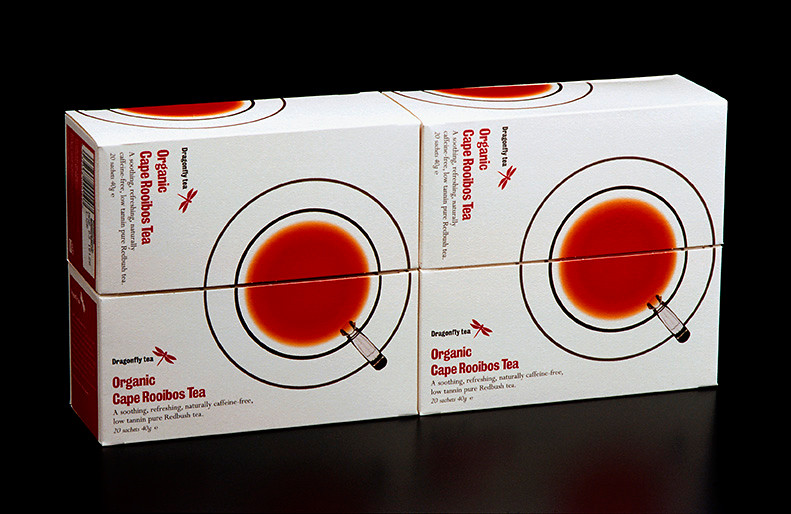
Hillman’s ‘white’ packaging was based around a simplified image of a teacup and saucer, photographed from above. A double black line in two thicknesses represented the cup and saucer that encircled a clear brew, and these were set against a white background.
‘We got a lot of stick from the sellers,’ says Hillman, ‘who said that white doesn’t sell.’ When placed in certain formations, the packaging for the whole range formed an interlocking pattern. This could be seen to its best advantage in stores such as Wholefoods, where boxes were shelved together by brand rather than by flavour.
This design won Best Packaging in the 2001 Food and Beverage Gold Awards. In 2003, Hillman’s design for the Dragonfly Rooibos Naturally Caffeine Free range introduced a new element – a stream of tea cascading into a glass cup. ‘At the time, no-one showed the product in action,’ says Hillman. ‘Instead they used abstract drawings of tea leaves.’
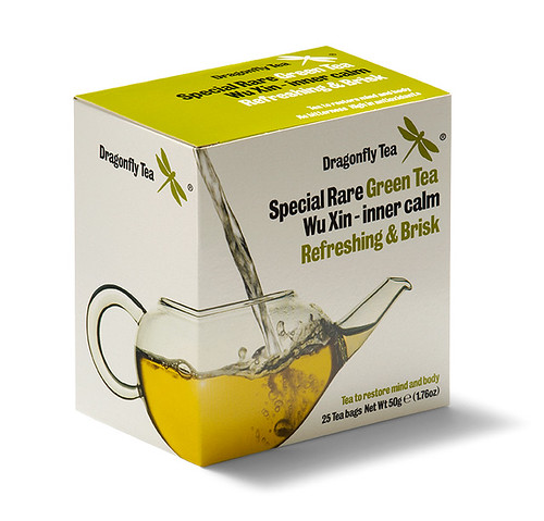
When a Waitrose buyer reported that other manufacturers were ‘catching up with’ and emulating Dragonfly’s packaging approach, Hillman chose an alternative route. The next generation of Dragonfly packaging centred on images of liquids pouring into glass vessels. This feature, says Hillman, ‘was easier to extend with Chinese teas and green teas using different receptacles.’ This box design also incorporated an interlocking pattern that allowed one flavour to ‘pour’ into a neighbouring cup or pot. The new identity was launched around the time that Hillman established his own studio after leaving Pentagram in 2008.
The relationship between Hillman and Dragonfly was based on simple principles. Hillman says: ‘Keep what you believe in and encourage them [the clients] on your convictions … Nobody knows how a person chooses tea!’
Identity and packaging design for Dragonfly Teas by David Hillman. Chinese green and yellow tea range, 2008. Design assistant: Amelia Gainford.
Top: Organic range packaging, 2000. Design assistant: Liza Enebeis. Photography by Nick Turner.

Sarah Snaith, design writer, editor, London
First published in Eye no. 87 vol. 22 2014
Eye is the world’s most beautiful and collectable graphic design journal, published quarterly for professional designers, students and anyone interested in critical, informed writing about graphic design and visual culture. It is available from all good design bookshops and online at the Eye shop, where you can buy subscriptions, back issues and single copies of the latest issue. You can see what Eye 87 looks like at Eye before You Buy on Vimeo.

