Autumn 2009
Do they know it’s communication?
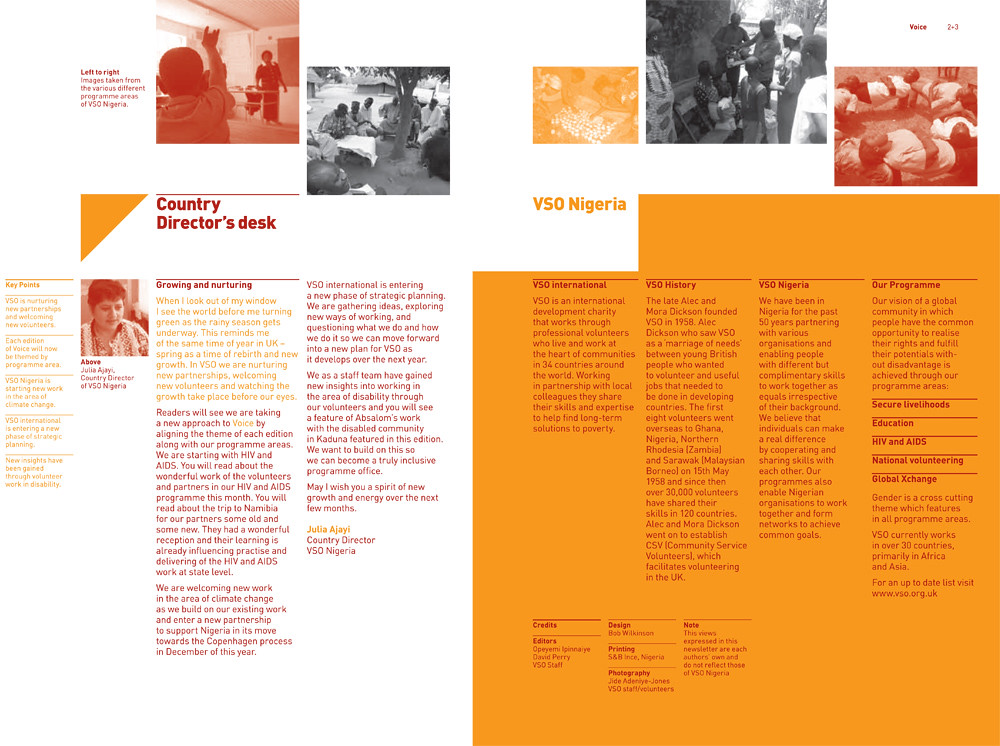
A decade after signing First Things First 2000, Bob Wilkinson tested his design principles by volunteering for a two-year placement in Nigeria.

Because I was born in the United Kingdom at a particular time, I have had years of free education, an enabling environment and many opportunities, including the chance to become a graphic designer. As a result, I believed design could make a difference and contribute to the betterment of society.
Ten years ago, when I signed the updated manifesto ‘First Things First 2000’ (see Eye 33, 1999) – calling for ‘a reversal of priorities in favour of more useful, lasting and democratic forms of communication’ – I knew it would raise questions about what I could give, but also about what I might gain and lose.
For the past two years I have been living in Nigeria on a small allowance, working on projects that I believe to be important and meaningful. Deciding to be a volunteer graphic designer in the developing world was partly a consequence of a belief in, and adherence to, the principles and intentions of the FTF2000 manifesto. And although some of the criticism of the manifesto was rather offensive and / or unjustified, much of it was valid and thought-provoking, particularly the point that none of the 33 signatories had publicly turned away well paid commercial work or made personal or professional sacrifices in support of its aims.
While there has certainly been a level of personal and professional sacrifice on my part, living and working in a developing country gives you a different perspective as to what ‘sacrifice’ actually means. And for me, this decision was as much to do with wanting to relate more to the work I was involved with.
My exposure to images of the developing world probably started with Band Aid in the 1980s – starving children and abject poverty alongside Bono and Bananarama. Something about that juxtaposition made it all appear unreal, and the Peter Blake sleeve for ‘Do They Know It’s Christmas’ conjured up a world that bore no more relation to my own.
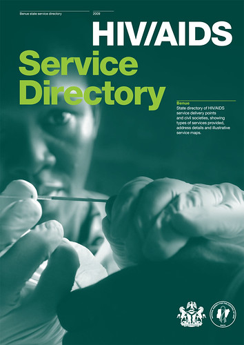
Cover for Benue State HIV / AIDS Service Directory, one of a series of five, top-opening A4 publications for different Nigerian States that uses the same design system with different colour palettes.
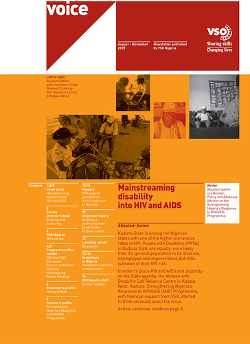
Top: spread from VSO Nigeria newsletter Voice. Each issue is colour-coded to match one of VSO Nigeria’s Programme areas. Graphic design: Bob Wilkinson. Photography: VSO staff and volunteers.
Uncomfortably numb
Twenty years later, looking through images of children from disadvantaged backgrounds, orphaned by AIDS, affected by conflict and natural disaster, for use in the Save the Children international secretariat’s annual reports, I realised I still felt the same way. I had sympathy, but no real empathy.
To tackle this uncomfortable numbness, I volunteered on a short-term project building a children’s resource centre in Sri Lanka. Living and working in a developing country changed my perception. Images I had grown to dismiss became real. I had tangible points of reference.
To see if my graphic design skills could be used more directly in development, I then applied to VSO (Voluntary Service Overseas; www.vsointernational.org), an international development agency that works through volunteers, and was accepted as a graphic designer on a two-year placement with an HIV/ AIDS programme in Abuja, capital of Nigeria.
It took some time for the programme to understand what value a graphic designer such as myself could add, and some time for me to understand the programme, as well as the culture. Fortunately, VSO gave some realistic pre-departure training to help with this.
It also took me a while to understand that, in Abuja at least, there were no Pantone books, no Macs, no QuarkXPress and no InDesign, limited paper supplies and no effective proofing process. The printing industry in Nigeria, in which the graphic design industry is closely embedded, is generally PC-based and uses a design package called CorelDRAW. Finding printers who could accept my InDesign files via a PC was not easy. Different terminology, different communication and a different understanding of quality necessitated a different way of working. Marked-up dummies, extensive notes, frequent phone calls (on painfully bad Nigerian networks) and multiple visits still resulted in 5mm trimmed off my nice tight margins; spot colours changing hue; images filling in; mis-registration; pages in the wrong order and upside down; and jobs delivered a month late.
Eventually, I found a printer in Lagos who was able to produce a certain quality but power cuts, supplies, the effects of humidity upon paper and flooding during the rainy season have all continued to be a challenge.
Flexibility, adaptability and commitment to learning are some of the core personal qualities that VSO looks for in its selection process, but I found myself unwilling to give up sans serif typefaces, ranged left text, grids, and generous use of space. I found it difficult to distinguish between what was the local language of graphic communication and what was simply ‘bad’ design. The materials I came into contact with had a certain look and feel: masses of different sized typefaces filling every inch of the page, patterned backgrounds obscuring text, over-saturated, low-resolution images and poor production quality all combined to make a unique visual statement.
Cover from double-sided Z-bound publication. Graphic design: Bob Wilkinson. Photography: Jide Adeniyi-Jones.
White space
One of my first tasks was to convince the programme’s managers that the design of their materials needed to change. It took a presentation and visual analysis of their newsletter, highlighting basic issues around legibility, consistency, use of white space, structure and quantity of text, and showing examples of successful design.
At the same time I had to ask myself if a western, Modernist approach to graphic design was appropriate for development work in Nigeria, how participatory the process should be, and whether graphic designers are most effective as facilitators, capacity builders or as service providers.
For example, before designing an identity for an advocacy project, I worked with members of the programme to create a clear understanding of what the programme was and how this should be visually communicated. Everyone participated, felt involved and had a level of ownership in the result, which they had determined. Although the process worked well, the result was not, in my opinion, the most successful solution. Should I have been more persuasive? Should it have been less inclusive? Should I, as designer, have had the final say?
Working in the public sector in the UK, where you present a few visuals to one or two individuals with some understanding of design, is a world apart. Here I was opening up the whole design process, and having to relinquish a level of control that I was used to, that I liked and that I thought I was entitled to. Trying to achieve a balance between involvement, ownership and aesthetics was difficult. These issues are not unique to working in development but return to the relationship between the designer and the client, the understanding and trust between both parties that is essential for effective and appropriate graphic design.
Measuring the effectiveness of the work I have done here is difficult, as is the issue of ensuring it is culturally appropriate and sustainable. It wasn’t just the incredible heat that kept me awake at nights but worry that the service directories I worked on would be as alien to their Nigerian audience as that Band Aid cover had been to me.
Like any designer I want people to engage with the publications I design, to be attracted to them, to read them and to learn from them. But design is only one element in the picture; the quality of writing, images and printing, budgets, distribution and dissemination all affect how well information is communicated.
It was difficult to obtain the information I needed to be able to design. Text and images would be promised but delivered weeks late, partly due to lack of power and internet access, but also due to a culture of vague time-keeping, family commitments and lack of capacity – very different to what I had been used to back in London. Understanding this and not necessarily expecting others to have the same work ethic has been a difficult adjustment.
This has been an important lesson for me. I have felt justified in applying my own standards in areas such as printing, demanding higher quality, but not in terms of the work ethic of those working with and around me.
Trust and pride
Gaining the trust of people has taken a long time. At the beginning of my placement, I would find myself in a dispiriting workshop, being told how to lay out materials by 30 non-designers. Now I’m in the position where I can commission a professional Nigerian photographer and use his images across a Z-bound, close-out report.
Through trying to understand, work in and integrate into a different culture – and through a series of (relatively) successfully printed publications – I have eventually become accepted and understood as a professional who can add value through design. My colleagues on the programme now show a certain pride in the publications we have worked on together, as well as genuine surprise that such quality could be achieved.
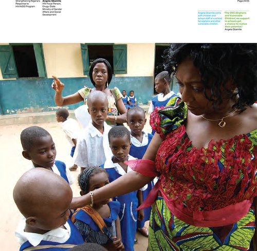
Spread from double-sided Z-bound publication. This section is printed on coated paper and tells the story of the HIV / AIDS programme through photographs, while another section, printed on uncoated paper, describes the programme in the words of its workers and their clients. Graphic design: Bob Wilkinson. Photography: Jide Adeniyi-Jones.
Eye is the world’s most beautiful and collectable graphic design journal, published quarterly for professional designers, students and anyone interested in critical, informed writing about graphic design and visual culture. It is available from all good design bookshops and online at the Eye shop, where you can buy subscriptions, back issues and single copies of the latest issue. You can also browse visual samples of recent issues at Eye before You Buy.

