Summer 2009
Drawn into conversation
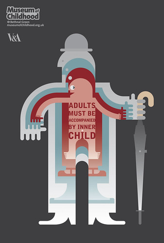
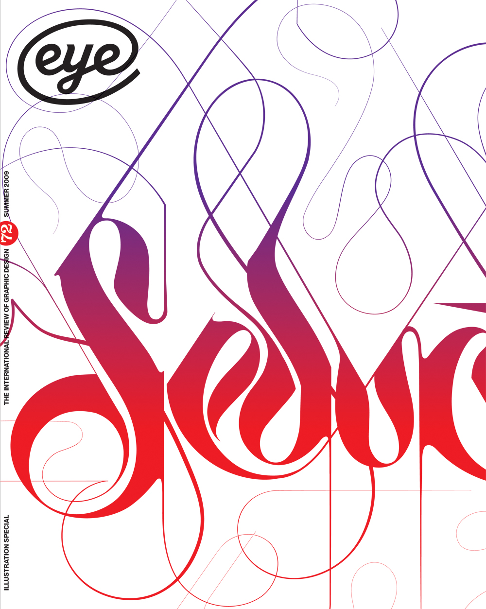
More big brands are making more use of illustration: pastiche, cartoons, caricature - even original ideas. Is this the smarter way to say 'honest', 'natural' and 'popular'?

Illustration is communication at its most basic. Hunters drew their potential menu long before they had a word for the main course. Children draw before they write and undoubtedly lose something in the process of ‘graduating’ to text. The children’s author and illustrator Shirley Hughes made the point forcefully in a recent Guardian interview: ‘The idea that pictures are sternly removed from you as soon as you learn to read is a truly terrible one.’ The most successful and popular illustrators always retain a vital contact with their own childhood: witness Sarah Fanelli and David Shrigley.
Twenty years ago, illustration’s reputation was waning, and graphic design rather muscled it out when the Apple Mac brought technology into the mix. An eventual reaction was inevitable; there’s more to life than staring at a screen all day. The sheer physicality of mark-making is proving to be a potent force in the resurgence of illustration; and it has found unexpected support in the current recession.
Back then, it was often difficult to distinguish between graphic design and pure illustration. ‘There was a very illustrative hand in designers like Alan Fletcher and Milton Glaser,’ argues Guy Featherstone, head of design at Wieden + Kennedy London.
‘It went away for quite some time. Maybe people were focusing on desktop publishing packages like Quark and Photoshop, rather than playing with the illustrative side. People were celebrating a different type of illustrative quality, and it just feels like it’s coming back now. This cross-pollination is creating some really interesting ways of communicating.’
Today, an inevitable grounding in graphic design usually means that the lone artist handles copy as adeptly as image. And the current financial climate favours the small or single practice over the corporate. While economic cycles move slowly but relentlessly, fashions and tastes have a very different speed. The collective attention span is accelerating in its decline to the extent that nostalgia now starts with yesterday, and illustration, like everything else, is caught up in the overwhelming urge for the new and the different. Brands, too, are changing; as are advertising agencies, consumers, and their relationship with the stuff they buy. Consumers have become creators and, we like to think, have ‘conversations’ and ‘engage with’ brands, rather than simply being hectored and doorstepped. Illustration is benefiting from this …
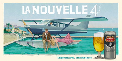
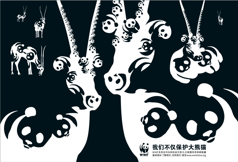
[The printed version of this article includes illustrations and extended captions on various recent campaigns, such as Robert McGinnis’s ‘Riviera’ posters for Stella 4%; David Hopkins’ Hogarthian cartoons for Schweppes; Abbott Mead Vickers BBDO’s 2007 campaign for The Economist; and BBH Shanghai’s ‘WWF Saves More Than Pandas', among others.
First published in Eye no. 72 vol. 18.
Eye is the world’s most beautiful and collectable graphic design journal, published quarterly for professional designers, students and anyone interested in critical, informed writing about graphic design and visual culture. It is available from all good design bookshops and online at the Eye shop, where you can buy subscriptions, back issues and single copies of the latest issue. You can also browse visual samples of recent issues at Eye before You Buy.

