Spring 2016
Face in the crowd
Amid the rush of modern gadgetry, Kuchar Swara’s Sekford watches stand out because they are, paradoxically, timeless

Whether you work in three dimensions or two, the fourth dimension of time is impossible to ignore. It is curious that visual education typically characterises disciplines such as performance art and animation as ‘time-based media’, when just about everything that designers do is subject to the ravages of time. Posters rip, book pages fox and even the most elaborate print jobs can fade and fall apart. Oddly, many items are even more ephemerally fragile in the digital domain, as the inadvertent (or fiendishly planned) obsolescence of hardware, storage media and operating systems wreaks more damage than a warehouse of vermin. However ratty they are, it is likely that your books and music from the past couple of decades are in better shape than your Quark documents. Many award-winning, groundbreaking websites are now distant memories.
The most compelling and powerful information graphics link changes in geography and culture to the inexorable passage of time. A visit to Greenwich might remind us that the understanding and mastery of time, from Newton through the clockmaker John Harrison to Einstein, lies at the ticking heart of modernity, via generations of engineers, scientists, philosophers and inventors.
Time is ever-present in the process of making. It is written in the folios of newspapers and magazines, the datelines of blog posts and in the copyright lines of works grand and mundane. It is hardwired in the urgency of deadlines, the grim limbo of the progress bar and the excitement of beating the clock and / or the competition. Many of the most useful daily smartphone apps – for wayfinding, transport and weather – are linked to time. The mobile phone’s usefulness as an ever-present timepiece has been a contributing factor, alongside the cheapness and ubiquity of digital watches, in the decline of the traditional watch manufacturing industry.
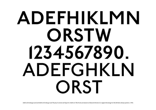
Specimen of Sekford Underground Tiny designed by Christian Schwartz of Commercial Type, 2015, and used for the watch’s crown (or winder) and case back.
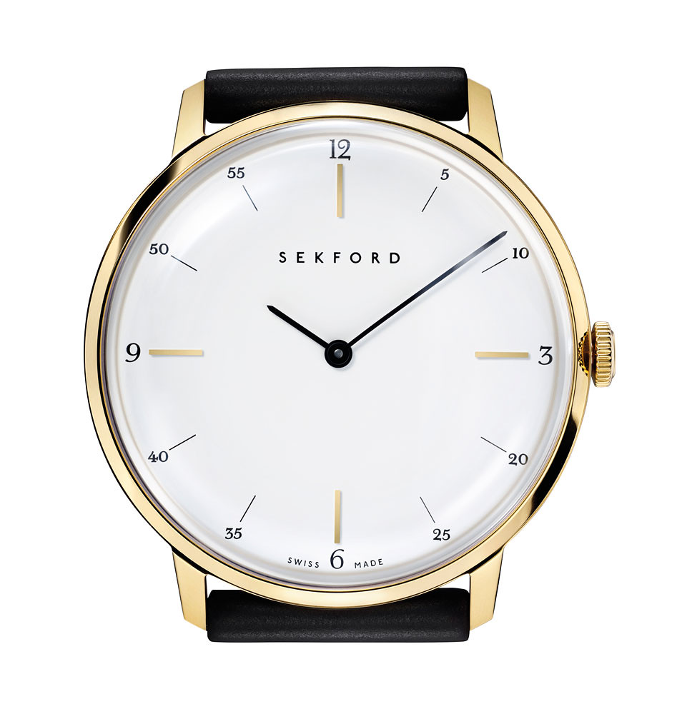
Top: Sekford Type 1A gold watch showing Chiswick for the numbers and Sekford Underground for the letters.
Kuchar Swara’s new venture, Sekford, is a start-up that flies in the face of such gloomy digital futures. His first products form a suite of limited-edition analogue watches, made in Switzerland to high standards of engineering and finish, and designed as a desirable luxury possession for a certain kind of high-achieving person. Though some parts of the luxury watch market aim for jewelled vulgarity, Swara’s design shows faith in a certain kind of British pre-Modernism, a truth to materials and a finely tuned sensitivity to the functionality of a well made watch.
Swara, an experienced magazine art director who has worked at Case da abitare (see Eye 73) and co-founded Port (see Eye 79), says that Sekford is aimed ‘at a design-savvy audience’. He discovered that one cannot buy a ‘quality dress watch for less than £1000 without buying a vintage watch’. Swara says that such timepieces, though beautiful, ‘are unreliable for everyday use… like vintage cars’.
For the design and manufacture of the watch, Swara turned to Cédric Bellon and Pierre Foulonneau, French watchmakers who knew how to make a physical watch that would fulfil his stringent requirements within the price and style he wanted.
Even design-conscious individuals who could never afford a Sekford watch might appreciate its founder’s single-minded devotion to this specialised area. In Swara’s words, the idea is rooted in ‘early Modernist ideas of the mid-nineteenth century’.
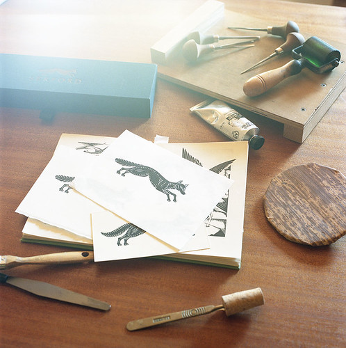
Wilkinson’s tools, showing Pfeil palm-handled lino cutters from Switzerland, Caligo safe wash relief inks, an ink roller and Somerset printmaking paper, used here to make a postcard edition of the Sekford marque. The round object with a reed cover is a Japanese baren, used for pressing paper against plate when printing by hand.
‘During this period,’ says Swara, ‘England was beginning to grasp the importance of balancing industry, and caring for the health of its citizens and countryside. This … can be seen in the work of William Blake, Pugin and Christopher Dresser. This relationship between nature and industry informs all our decision-making.’
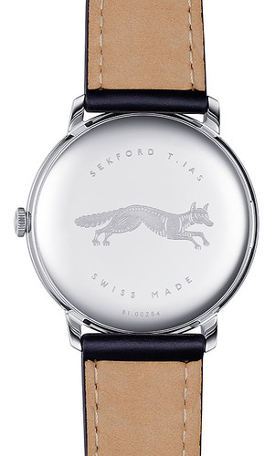
Sekford’s branding expresses a refined kind of British modernity, with an all-capitals logotype by Commercial Type that draws on Edward Johnston’s London Underground typeface Johnston’s Railway. Although this is used throughout Sekford’s branding and packaging, an important element of its design was its suitability for the engraving process: the letters can be engraved on the back of the watch with a thickness of 35 microns. The monochrome fox marque was made by Lincoln-based printmaker Mark Wilkinson of Inkshed Press.
Wilkinson is self-taught and a late starter – he took up printmaking after more than 22 years in the armed forces. ‘I stumbled upon a book of Eric Gill’s wood engravings and was instantly smitten,’ he says. ‘I love the timelessness, clean pure lines and deceptive simplicity of his work and so in my naivety thought I’d have a go at relief printing.’ Through trial and error, he slowly determined the best tools, lino, ink and paper to use for his needs. The bulk of his work consists of linocuts, although he has dabbled in woodcut and aims to try wood-engraving eventually.
Wilkinson’s interest is in work by British and Irish wood engravers of the 1920s and 30s, including Gill, Ravilious and Bawden as well as lesser-known artists such as Robert Gibbings, Ethelbert White, Claughton Pellew, John Farleigh and Reynolds Stone.
An example of a historical watch face design selected by Sekford founder Kuchar Swara. Movement, dial and dust-ring of a cylinder watch with quarter-repeat, made by Perigal & Duterrau, London, 1803-40. Image courtesy British Museum, London.
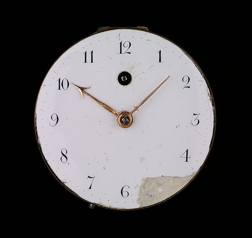
In terms of the Sekford watch’s function, the most distinctive aspect of Swara’s conception may be the numbers. For these, he turned to Commercial Type’s Christian Schwartz, who had never designed numerals for a watch before. Schwartz says: ‘The process of printing numbers introduced some interesting challenges to the project. The ink doesn’t spread the way it would on paper, and there was an opportunity to make the details quite crisp and precise.’
He says that Swara had originally asked Schwartz and his Commercial Type partner Paul Barnes about adapting their typefaces Austin or Brunel (see Eye 82), as a way of referencing early British modernity.
‘I played around a bit with Brunel,’ says Schwartz, ‘but Paul and I both felt that it was too typographic. So I showed Kuchar Chiswick as well. Brunel is based on type, whereas Chiswick comes from lettering and explicitly references old clocks as well as gravestones, and public and architectural lettering for the numbers.’ So a new version of Chiswick was ‘a more natural fit’ for the watch numbers.
The transformation from editorial designer to watch manufacturer may be no more unlikely than that of a designer who launches an app or a new social media channel. And Swara’s hunches are only now being tested in the uncertain waters of the luxury goods market. For the moment, what is remarkable in the conception of these watches is the way Swara has used a sensibility for type and typographic history to rethink an everyday item. With good fortune, Sekford could become a wholly original example of life after graphic design.
Watch case back with Sekford marque, which Swara describes as an ‘English Gothic Revival engraving’ by Mark Wilkinson, Inkshed Press, Lincoln. Typeface: Sekford Underground Tiny.
Andrew Robertson, writer, London
First published in Eye no. 91 vol. 23, 2016
Eye is the world’s most beautiful and collectable graphic design journal, published quarterly for professional designers, students and anyone interested in critical, informed writing about graphic design and visual culture. It is available from all good design bookshops and online at the Eye shop, where you can buy subscriptions, back issues and single copies of the latest issue.You can see what Eye 91 looks like at Eye before You Buy on Vimeo.

