Autumn 2009
Flight of the imagination
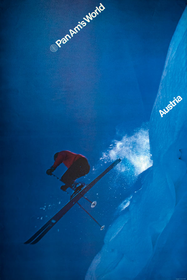
Do Ivan Chermayeff’s uncompromising posters signify the last days of Modernist ambition?

Before retiring in 1968, Juan Trippe, the charismatic founder of Pan American World Airways, ordered 25 Boeing 747s. The world’s largest airline would never recover from this bold move: by 1971, when the first of these ‘jumbo jets’ flew under the Pan Am brand, the company – weighed down by recession, inflation and increased competition – was already heading towards breakdown.
Elected chairman in 1970, Najeeb Halaby tried to inject new life into this notoriously conservative, unsophisticated corporation with a redesign of its visual identity. Tipped by his friend Eliot Noyes, Halaby commissioned Ivan Chermayeff to do the job.
Chermayeff and Tom Geismar ran one of New York’s most influential design practices: their portfolio included identity systems for corporations such as the Chase Manhattan Bank, Mobil and Xerox; as well as graphics for the United States pavilions at the Expo ’67 (Montreal) and Expo ’70 (Osaka) world exhibitions.
Pan Am poster, 1972. Design by Chermayeff & Geismar.
Top: Design by Chermayeff & Geismar, 1971-72. After the airline’s marketing department was reorganised, the campaign was simply rebranded from ‘Pan Am’ to ‘Pan Am’s World’.
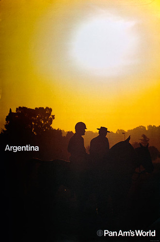
Under the supervision of Patrick Friesner, Pan Am’s head of sales and promotion, Chermayeff & Geismar was one of a handful of studios taken on to produce, at a frenzied pace, promotional materials that carried the new identity; others included George Tscherny, Rudolph de Harak and, in London, Alan Fletcher.
Ivan Chermayeff himself art-directed a set of posters for Pan Am offices and travel agents around the world. ‘The whole idea of this series,’ he said in a recent interview, ‘was to make a simple statement about some part of the world … and to use that simple, straightforward message with the Pan Am identity. Make it as little “corporate” as possible and make as much a sense of adventure and of the place as possible.’
According to both Chermayeff and William Sontag, his designer on the job, it was the evocative, often solemn, photographs of far-flung destinations that ‘made’ these posters. Some were shot by Magnum photographers such as Burt Glinn, for Bali and Japan (not shown here) under an agreement between the airline and the agency.
The posters from the first, 1971, series carry only the airline’s logotype and the destination, both set in neutral Helvetica Medium. In 1972 the ‘Pan Am’ line became ‘Pan Am’s World’, emphasising the airline’s global ambition.
Pan Am poster, 1972. Design by Chermayeff & Geismar. ‘All photography was stock, not commissioned,’ says Ivan Chermayeff. No record of the photographers has been kept. All the images in this feature courtesy of the Chermayeff & Geismar Collection, Milton Glaser Design Study Center and Archives, Visual Foundation, New York.
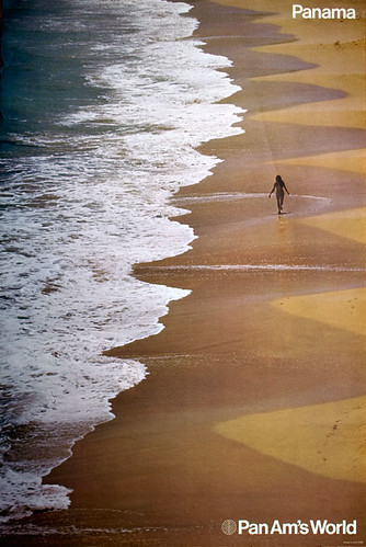
Chermayeff’s Swiss-style, late-Modernist identity programme and posters may have been in tune with the spirit of their time, but Pan Am proved not to be.
‘No effort was made to explain and justify the adoption of enlightened design policies or to get senior staff on board,’ says Patrick Friesner, Pan Am’s head of sales and promotion. ‘They were well aware that the company was struggling but regarded this new direction more as an imposition rather than as a potential help to them.’
When, blamed for the airline’s worsening financial crisis, Halaby was forced to resign in 1972, it would be fair to say that his successors ‘lost the plot’, Friesner admits. ‘Interest in and commitment to modern graphics… and good design in general was limited to very few people – well, there was Halaby and me!’
Once Halaby had gone, Pan Am’s identity, graphics and visual language regressed to pre-1971 standards. What could have been a long-lasting undertaking – as were many of Chermayeff & Geismar’s other redesigns of that period – became a fleeting affair.
But these forgotten posters remain captivating pieces of graphic design and art direction. New York’s Museum of Modern Art acquired six of them in 1972, which were recently displayed to critical acclaim, calling attention to a tiny but extraordinary fold in the visual history of a corporation.
Frederico Duarte design writer and curator, New York
First published in Eye no. 73 vol. 19 2009
Eye is the world’s most beautiful and collectable graphic design journal, published for professional designers, students and anyone interested in critical, informed writing about graphic design and visual culture. It is available from all good design bookshops and online at the Eye shop, where you can buy subscriptions and single issues.

