Summer 2020
Françoise Mouly: The illustrator’s art editor

‘The covers are meant to capture the moment, but we want them to make sense next week, next decade, in a hundred years!’

Paris-born New York resident Françoise Mouly has been the art editor of covers for The New Yorker magazine since 1993. In 1978 she co-founded Raw Books and Graphics with husband Art Spiegelman. She is also publisher, and editorial and design director of Toon Books, born as Raw Junior in 2008, which she established to publish contemporary comics aimed at children. Its first volume, the ‘Little Lit’ collection, evolved into the Toon Treasury of Classic Children’s Comics, which begat the ongoing Toon Books imprint. Mouly’s achievements underscore her singular contribution to a comics, illustration and satiric art renaissance flourishing today. In her role at The New Yorker she has commissioned more than 1000 covers to date.
In 1992 when Tina Brown took the helm of The New Yorker (founded in 1925), the magazine was repositioned in one swoop. The following year Brown hired Françoise Mouly as art editor for covers. The former co-editor of Raw comix revue (see Eye no. 8), Mouly confidently introduced a new stable of cover artists that transformed the look and feel for the next two decades-plus – and counting. She is arguably the most influential art editor for illustration in the publishing world.
‘Bedtime’, The New Yorker, 6 April 2020. Chris Ware’s empathetic response to the lives of hospital staff during the Covid-19 crisis includes characters from a story he has been working on for years. Ware says: ‘Françoise respects artists to shepherd their vision to the page without adjusting to suit any editorial predilection or angle. She’s more like a gallery owner or a literary publisher in that regard.’
Top. Portrait of Mouly by Maria Spann.

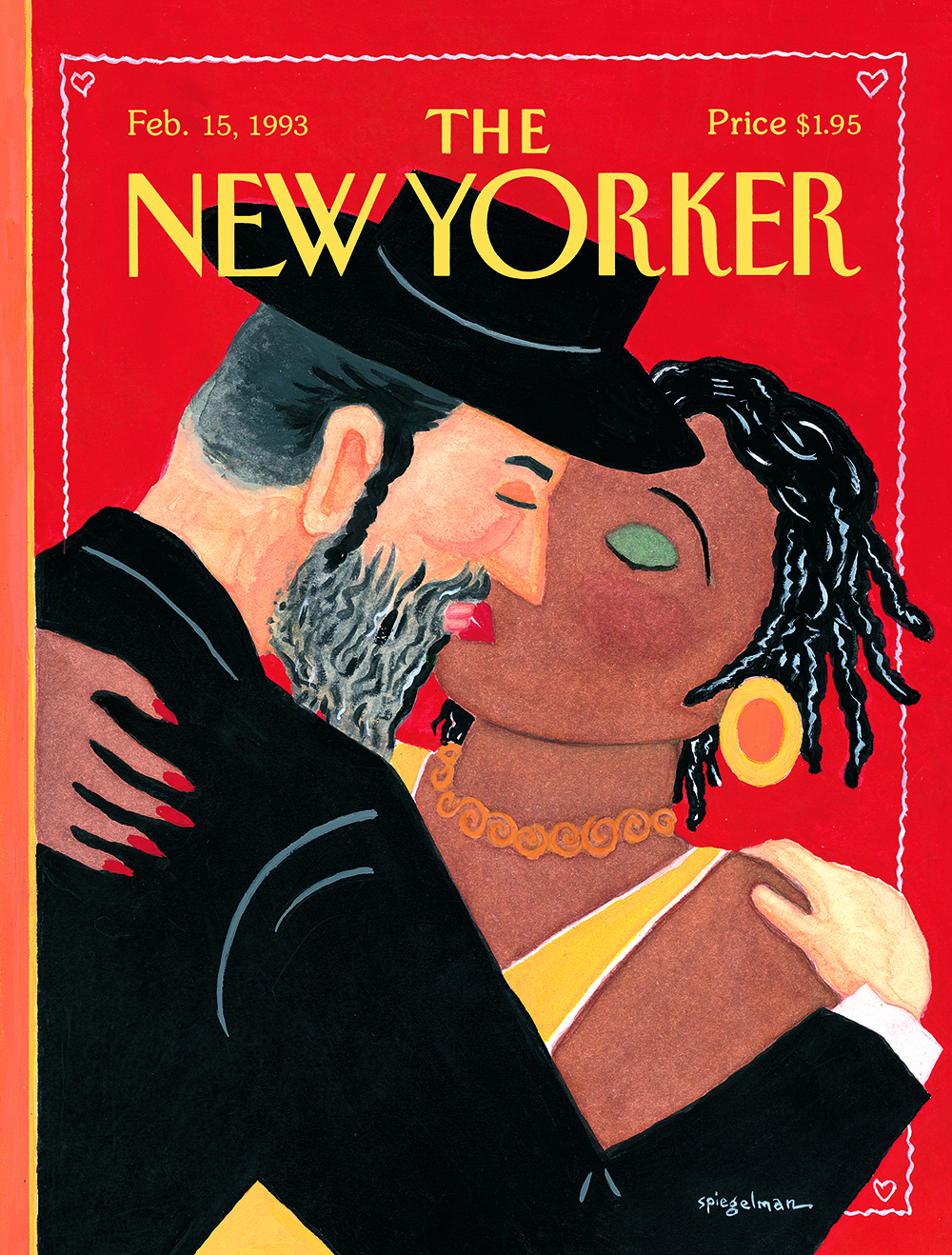
Mouly understood that Brown wanted ‘to go back to the magazine’s roots as a humour publication, driven at least as much by its artists as by its writers’. Mouly’s collaborator and husband Art Spiegelman had already designed the scandalous ‘Hassidic Kiss’ cover, in which a Hassidic Jew kisses an African-American woman, a visual commentary on the tensions plaguing both neighbouring Brooklyn communities. This gave her reason to believe The New Yorker was the place to proffer controversial art. Mouly has since introduced hard-boiled witty satiric artists who have created a slew of memorable images – and this is what she strives for.
‘Valentine’s Day’, 15 February 1993. Illustration by Art Spiegelman

When David Remnick took the editor’s reins in 1998, he made clear that he wanted to be proud of every piece in the magazine. ‘He always stands up for every cover, even in the face of widespread outrage,’ says Mouly, referring to Barry Blitt’s ‘Obama fist bump’ cover. ‘I’m deeply grateful to him for that – it’s the only reason we’ve been able to do so much.’
‘Tailed’, 24 January 1994. Illustration by Peter de Sève.

Mouly is always looking for new artists. ‘The criteria is whether it’s a new and unique voice (why go for second-rate Steinberg when you already have Steinberg?) and whether his or her image can elicit a reaction from the established community of New Yorker contributors.’ Covers have always been freestanding, so there is more at stake than just being a good illustration. ‘Quality sets up a great feedback system,’ she says. ‘When I call to ask for images to put on the cover … I get calls back from all the greatest practitioners in the field; they want a chance to reach our passionately engaged readers and they want to join the company of artists they admire.’
‘The Politics of Fear’, 21 July 2008. Illustration by Barry Blitt, who in May 2020 won a Pulitzer Prize for his editorial cartoons.

Meanwhile, the covers must endure. ‘We want them to make sense next week, next decade, in a hundred years! They’re meant to capture the moment, but designed for a magazine that piles up at the foot of the bed with in-depth articles still worth reading months later,’ she says. The New Yorker covers often deal with consistent themes, including parents’ role in raising children, gay activism and gay rights, the beginning of the NRA campaign that led to the proliferation of guns, Peta’s fight against fur, health and environmental concerns.
‘Evolution’, 30 September 2019. Illustration by Christoph Niemann (see Eye 72).

Today’s reader is not just younger, but more culturally and geographically diverse. Mouly has opened the magazine to more women artists, artists of colour, young, first-time published artists and even a recent cover by 99-year old artist Wayne Thiebaud. ‘I’m excited because there’s plenty more we can do to enlarge the community of artists and that means I can keep working hard and trying to honour the trust put in me.’
‘Sweeping Into Fall’, 2 September 2019. Illustration by Malika Favre. (see Eye 100).

Steven Heller, design writer and educator, New York
First published in Eye no. 100 vol. 25, 2020
Eye is the world’s most beautiful and collectable graphic design journal, published for professional designers, students and anyone interested in critical, informed writing about graphic design and visual culture. It is available from all good design bookshops and online at the Eye shop, where you can buy subscriptions and single issues.

