Summer 2008
Going the distance

Roundel’s identity for Railfreight in the late 1980s unified a multi-faceted business with a strong identity that boosted morale.

When I was young, the sight, sound and smell of a diesel express accelerating through Grantham train station on Britain’s East Coast Main Line was a visceral thrill that more than made up for the tedium of hanging around in the drizzle. Looking back with a designer’s eye, I recall the engine’s distinctive, deep blue livery and bright yellow cab-ends, the ubiquitous British Rail double-arrow, and the occasional flash of a red-and-silver nameplate.
However my nomination for belated inclusion in the pantheon of graphic design history is for a different, but closely related rail transport project. Roundel Design Group’s 1987 programme for Railfreight captures the essence of my boyhood passion and the definitive characteristics that make for a great identity.
Roundel’s Railfreight identity enjoyed barely a decade of exposure before the business suffered the same fate as British Rail, its parent company. Both were sold off under the Conservative government’s plan to privatise Britain’s railways, which led to a plethora of new identities, some awful, some merely bland, but none as sharply distinctive as Roundel’s work for Railfreight.
Mike Denny, the creative director on the project, recalls what a pleasure it was to work on, having been commissioned by BR’s visionary and strongly supportive design director, Jane Priestman. Rather than attempting to educate the client, Roundel could put every effort into creating an appropriate identity that would emphasise the individuality of the six distinct divisions of Railfreight: the core entity, plus metals, construction, coal, distribution and petroleum. While each division needed to be identified as handling a different category of freight, Roundel also had to underscore their shared roots. Furthermore, the chief application would be for the locomotives, which as Denny notes are often only seen by the public at a distance.

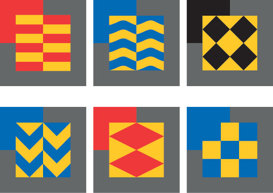
Above: Railfreight’s multiple personality: (clockwise from top left) the core entity, petroleum, coal, construction, distribution and metals.
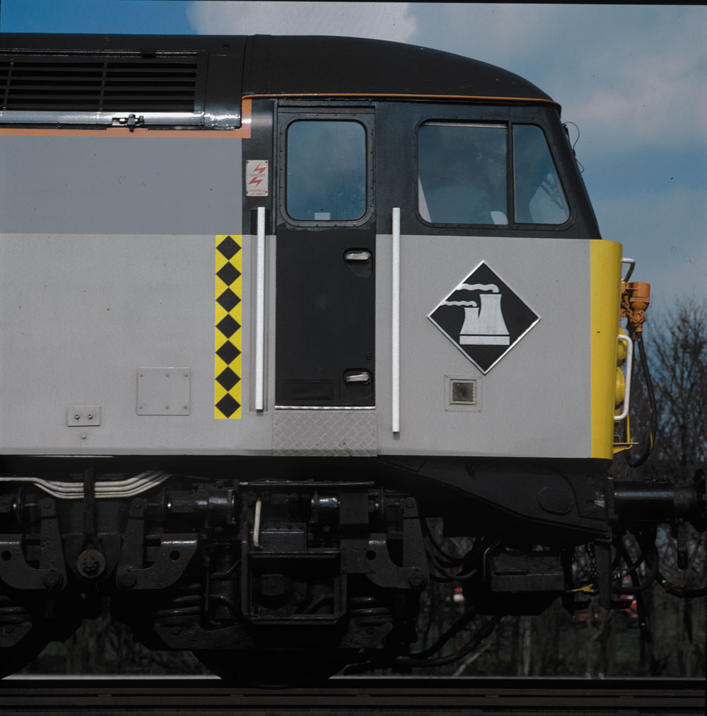
Top: the vertical marker strip and polished aluminium depot plate show the locomotive’s sub-sector, coal, and home depot, Toton.
Roundel’s solution was inspired by the bold, geometric shapes and contrasting colours of the quasi-heraldic markings on Second World War planes. As the exquisitely produced identity manual says, ‘The criteria laid down for the Railfreight identity match very closely the traditionally accepted requirements for military aircraft markings: simplicity of shape to ensure recognition under all circumstances; the requirement for several different levels of identification; the need to express a confident and tough image.’
Each primary-coloured logo is reproduced in vinyl on the side of the locomotive, with an echoing strip down the side of one cab door. This looks particularly dramatic against the mute, tritone body colours, set off with the familiar yellow cab-ends, the BR double arrow and the loco’s number. A smaller, slightly offset square creates an implied letter ‘F’ in all six versions. Supplementary lettering deploys Rail Alphabet [see Eye 71], a version of Helvetica designed by Jock Kinneir and Margaret Calvert, the team behind the British road sign system (see Eye 34).
Denny is quick to point out that the Railfreight redesign took place alongside many other physical improvements. Nevertheless, the designs had a positive effect on a moribund entity formerly dogged by poor performance and low morale. For example, through an initiative called Depot Pride, Roundel developed a unique insignia for each crew /maintenance centre, which then appeared as a diamond-shaped plaque on the locos belonging to that depot. These were often created in consultation with each depot’s staff, and then applied to collateral materials such as lapel pins for the train crews and even football strips for the staff.
The Railfreight work received a Financial Times award for its beneficial effect on the organisation’s culture. Why the lessons of this exemplary project have been forgotten is a mystery.
Matt Soar, professor, University of Montréal
First published in Eye no. 68 vol. 17 2008
Eye is the world’s most beautiful and collectable graphic design journal, published quarterly for professional designers, students and anyone interested in critical, informed writing about graphic design and visual culture. It is available from all good design bookshops and online at the Eye shop, where you can buy subscriptions and single issues.

