Winter 2010
Hail that cab map

Mark Porter on an interactive site that reveals the urban energy of New York
As newspapers try harder to engage with time-pressed readers, visual journalism is increasingly important. Modern papers care more than ever about photography and design, and information graphics are back in the spotlight.
Good graphics have always been time-consuming to produce, and in the pre-digital age they were most successfully deployed in weeklies. Diagrams were essential to Joseph Pulitzer’s The World on Sunday, published from 1898 to 1911. In the 1970s and 80s, the British Sunday papers, most notably The Sunday Times under graphics editor Peter Sullivan, created a new visual language for news graphics. The advent of colour printing and the Apple Macintosh gave another boost in the early 1990s, and the growth of newspaper websites in the late 90s opened up the possibilities of interactivity and live data.
But although the technology meant faster turnaround and greater volume, in many newspapers the ideas did not develop much beyond the conventions of the preceding decades. Graphics departments staffed with technical illustrators and a lack of understanding of the journalistic potential of information graphics on the part of editors has meant that the potential for graphic storytelling in newspapers has rarely been fully realised.
Things are different at The New York Times. After the 9 / 11 attacks, the NYT graphics department rose to the occasion with some stunningly rich and informative work (see Eye 44). They were also quick to grasp the possibilities of the Web, and their interactive work has set the highest standards.
The NYT’s pre-eminence is not accidental. First of all, it has the resources. Good information design is a labour-intensive business, and the NYT has a team of about 30 people (five times more than the average British paper).
Second, it has the skills: an impressive array of talents in cartography, illustration, research, reporting and programming.
But most of all, it has intelligence and journalistic rigour.
Unusually in a newspaper, the standards and attitude that are applied to written journalism at The New York Times are also carried through to the graphics department. Like other reporters, they generate their own (graphic) stories and do their own research, before going on to find inventive visual forms to communicate with readers and users.
This example investigates the millions of taxi journeys taken in Manhattan over a three-month period in 2009. Methodical research and data-gathering, intelligent visualisation and expert programming combine to produce an interactive graphic experience that is informative, visually intriguing and fun – and captures some of the energy and vitality of the city in a form that goes beyond the traditions of text and image.
Mark Porter is principal of Mark Porter Associates.
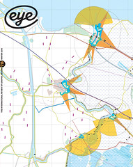
Top: Tracking Taxi Flow Across the City, an interactive map by Matthew Bloch, Ford Fessenden and Shan Carter for nytimes.com. This daily newspaper site has pioneered a form of digital journalism that combines high-quality reporting, research, design and programming into rich interactive experiences, sometimes serious and sometimes - like this one - frivolous but compelling.
First published in Eye no. 78 vol. 20.