Autumn 2010
Human touch
Six opinionated iPad users share their thoughts on apps – photography, entertainment, news, football, finance and fun
HELVETINOTE
RAGE DIGITAL, £1.79.
‘DEATH TO MARKER FELT!’ OR THE ELEGANT ALTERNATIVE TO NOTES
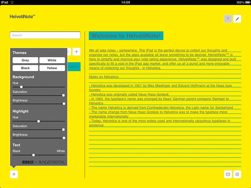
Liz Danzico: No matter which side of the Helvetica divide you fall, Marker Felt won’t be found there. HelvetiNote, therefore, is already several levels above Notes, the iPad’s default note-taking app. With its elegant interface, it allows tight control over visual settings. Visual thinkers and writers alike are supported, as it allows toggling between text and sketch mode.
It just might be too structured.
Tom Hartshorn: Non-techie people will struggle with the interface and unlabelled buttons but for me it’s clean, simple and perfect for taking notes. And a lot of the apps on this list could learn from its shocking ‘designed on a grid’ ethos.
Brendan Dawes: I’m not willing to sacrifice the inherent simplicity of Notes for the sake of a font. This takes two taps to add a note, and another to title it. The drawing feature is nice but after a few lines they become horribly jagged.
Camilla Grey: I’m not entirely sure how they justify charging for this, as the simplicity it sells itself on makes for a pretty basic app. Being able to email notes is helpful but Evernote does that and more.
Jason Fields: You can type notes, and change the colour of backdrop, highlight and text from a small selection of aesthetically complimentary combos.
Includes a drawing tool as well.
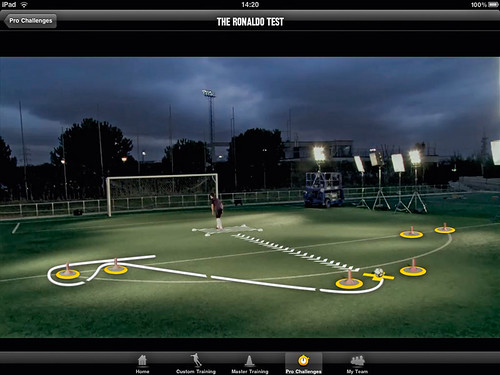
NIKE FOOTBALL+ TEAM EDITION
NIKE, free.
FOR COACHES TO ‘DEDICATE THEIR TEAMS TO GLORY’
Tom Hartshorn: I hope I never get briefed to create a football-training iPad app, as I will have another look at this one, then retire somewhere dark and cry.
Alfrido Triviño: Like Volkswagen’s Das magazine app, this is a great example of how a beautifully video-driven experience can be more suitable for us as storytellers than a 1000-word text and a rotating picture or a touchable graphic. It’s a very engaging, on-target app that offers excellent (and shareable) content, a game and a shop.
Jason Fields: This app enables you not only to train like the pros via ‘master class’ films but also arrange a roster for your real footie team, set up a regimen for them to work towards and train like the pros with benchmarking. Lush presentation – a bit over the top if you ask me – but then I’m not in an after-work footie team and am only marginally interested in fantasy football. But no pre-cached and preview video, Nike?
Brendan Dawes: Football is evil.
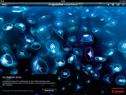
THE GUARDIAN EYEWITNESS
GUARDIAN NEWS & MEDIA, free.
SELF-UPDATING GALLERY OF NEWS IMAGES WITH ‘PRO TIPS’
Brendan Dawes: Quality imagery from current events presented without clutter or distracting interface junk. The ‘pro tip’ makes it a great resource for photographers.
Alfrido Triviño: A trendsetter – and a great up-selling app.
It shows the market that images (both still and moving) are king on the iPad. It also triggers memories of the golden age of Life magazine.
Camilla Grey: Really shows off the beautiful screen resolution of the iPad. It only launched in May so there’s not a huge amount of content yet, but what is there is highly detailed, eye-popping, awe-inspiring and memorable.
Tom Hartshorn: You can tell this app has been well thought through. They’ve kept the navigation simple and intuitive, letting the photography breathe.
Jason Fields: Stunning photography presented with an easy to understand slideshow / proof sheet interface. Load the app and get 100 images curated by The Guardian for your viewing amazement. You can view them by swiping left / right, automate a slideshow with gentle fades, select an index view, flag your favourites, and share on your social network of choice.
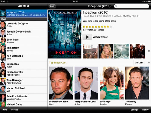
IMDB MOVIES & TV
IMDB, free.
GLOBAL DATABASE OF CREDITS, TRAILERS AND CELEBRITY INFO
Tom Hartshorn: I use IMDb a lot to look up stuff such as ‘who played Potentially Evil Guy On Train in that Morgan Freeman movie?’ So a free app that transplants all the info from the creaky website into a genuinely usable interface is pretty much winning at the app game. Easy access to hi-res trailers and movie images is a big plus, too. (The evil guy was played by Jim Hild, in case you were wondering.)
Liz Danzico: IMDb is the encyclopedia for any film fan, and it’s difficult to contest an encyclopedia. Yet before reaching its contents, you’re stopped by a clunky interface and poor usability. The app has some benefit – presenting movie showtimes of locations nearby [if you live in the US]. But the overall aesthetic seems too tawdry to be even kitsch-cool, and therefore misses the mark.
Jason Fields: Straightforward representation of imdb.com but much better organised, simpler to use and more likely to promote ‘exploratory’ activity.
Brendan Dawes: Much more crafted than its Web counterpart. I’d love to see some better integration, though.
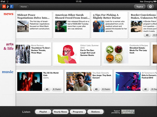
NPR FOR IPAD
NATIONAL PUBLIC RADIO, free.
NEW, ARTS AND MUSIC FROM THE US RADIO STATIONS – WITH PICTURES
Liz Danzico: What does a radio story look like and move like? The npr app gives it form, colour, and motion – a trusted source that does only what it needs to do.
Brendan Dawes: Suddenly my iPad becomes an on-demand radio set. Having been a fan of This American Life (thisamericanlife.org) for a long time, I know there’s some quality content out there, and the npr app brings it to me in a really elegant fashion. And I can listen and browse at the same time.
Jason Fields: The first thing I notice is how clean this app is with its three content carousels, rounded buttons and understated serif type for headlines. The carousels can be swiped left or right to expose more content, but beneath is a wealth of content you can add to the mix. I spent nearly an hour listening to short commentary pieces while exploring the app. You can filter your selection of content by programmes and topics for convenience and even set up your own ‘channel’.
Alfrido Triviño: Nice interactive visual index. Easy to browse, nice to play – love the playlist feature. It shows how tablets are potential substitutes for radio and television as well as print. Makes me wish we had something similar in Europe.
FLIPBOARD
FLIPBOARD,
free.
A ‘SOCIAL MAGAZINE’ POWERED BY YOUR FAVOURITE FEEDS
Brendan Dawes: Could this be the first killer iPad app? Flipboard looks and feels like something completely original. This could only really exist on the iPad – it’s not a print mag, it’s not a website. It’s far from perfect, but this is a start, and a very good one.
Liz Danzico: I nearly couldn’t tear myself away from the magic that is Flipboard to write this review. Its interaction design is masterful; graphic design refined; social media integration subtle. For those who follow Twitter or Facebook links consistently, Flipboard is your new magazine.
Jason Fields: A visual manifestation of a typical Twitter or Facebook stream. Sniffs out the links in feeds, and renders their contents via the images they reference. Elegant design and experience.
Alfrido Triviño: The richest and most organic experience in the news / magazine section of the Apple Store. However, apps like Pulse do social networking activities faster and simpler – flipping can become a bit overwhelming.
Tom Hartshorn: I hate Flipboard. Calling a crippled RSS reader ‘the world’s first social magazine’ is nothing more than an emperor’s new clothes sound bite.
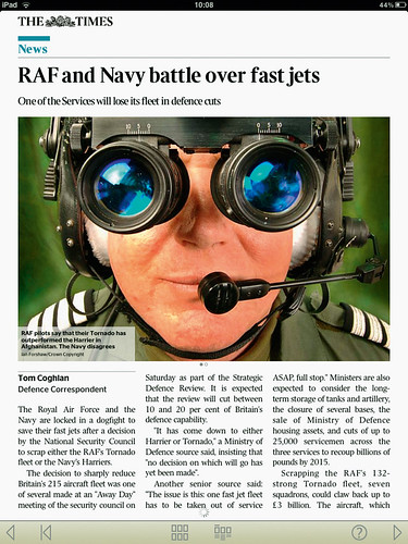
THE TIMES
TIMES NEWSPAPERS,
£9.99 / month
.
DAILY NEWS ON THE IPAD FROM THE UK'S ‘NEWSPAPER OF RECORD’
Tom Hartshorn: This app is like a terrible joke with a punch line that has to be paid for. When you do get it to work, there’s very little in it to recommend – an ugly navigation bar offers a variety of odd ways to navigate with little to no enhanced content or interactivity.
Liz Danzico: Makes news choices simple with edited stories across categories. Stories are set off with judicious white space, which itself is an active element, and straightforward navigation tools keep the focus on reading.
Brendan Dawes: Why do people think it’s acceptable to throw things together when it’s digital? It crashed my entire iPad when it was downloading the day’s edition. Not for me.
Jason Fields: I love the simplicity of the design but the app is hard to use, is slow and offers less content than its online counterpart. I expected more.
PULSE NEWS RADIO
ALPHONSO LABS,
£2.39.
ALL THE VISUAL LINKS YOU CAN FIT ON A SCREEN
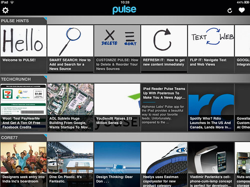
Liz Danzico: The visual mosaic that Pulse gives to news is a bit of visual poetry. See the headlines not just by name but also by thumbnail sketch. I’m hoping it will eventually allow more than twenty news sources.
Alfrido Triviño: My favourite stress-free feed. It’s where I gather what I want and consume it when I want it – from news content to comments from my friends. I shape up my own journey. Simple idea and effective functionality. It delivers what it promises.
Tom Hartshorn: A lot of app developers appear to ignore everything we’ve learnt from usability on the Web. Pulse does a nice job of explaining its interface but simple things like the absence of scroll bars or any indication of the amount of information in a feed make it confusing.
Brendan Dawes: Pulse makes great use of the larger iPad canvas to present a beautiful visual window to your rss feeds. The flow through the navigation has a wonderful rhythm to it that instantly feels intuitive, without tacky page curls, or other relics of a bygone age.
MARKETBOARD
THOMSON REUTERS,
free.
EQUITY INFO FOR THE WOULD-BE MASTER OF THE UNIVERSE
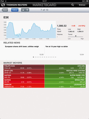
Alfrido Triviño: It’s the best live-content dashboard of the App Store, with a fascinating feature called Briefcase for managing briefs, transcripts, events, news and watchlists. Top content-driven design, extremely well presented. Lots of content but very manageable.
Jason Fields: I tried to use this but the ‘search’ field did not work. I wanted to set up Apple, Nokia, (Warren Buffet’s) Berkshire Hathaway, Google, etc, to see how it managed a stock portfolio, but no love. Also very buggy, jerky and lagged quite a bit.
Tom Hartshorn: Sometimes I like to open this app and pretend I’m Randolph Duke from Trading Places. I smoke a cigar and laugh loudly to myself while pretending to understand what the graphs about frozen orange juice sales are telling me. (OK, I’ve never used this app.)
UZU
COLORDODGE LABS, £0.59.
‘MATHS-PHYSICS-ART-TOY’ THAT FILLS THE OLD SPIROGRAPH GAP
Liz Danzico: I expected this ‘kinetic multitouch particle visualiser’ to be an interactive riddle. But I was transported to childhood summers where we made light patterns in the air with sparklers. Endless joy.
Tom Hartshorn: I’m usually a massive fan of ‘art games’ such as Flower or Flow, but maybe I’m just not high enough to appreciate Uzu.
Brendan Dawes: A whimsical toy that rewards exploration. Could do with more colour options – red and green feel a bit too geeky.
Camilla Grey: Great introductory app to the iPad’s multitouch interface. For ‘family time’ on the iPad, Uzu is fantastic, allowing everyone to manipulate the ‘particle visualisation’.
Jason Fields: An intriguing multitouch animation app, which allows you to manipulate a stream of pixels to mathematically generated trajectories, sizes, shapes and patterns. Single touch, double touch, multiple fingers, twist, pinch, zoom, etc., all affect the variables in real time. This may be hours of fun for little ones but only a passing sexy ‘demo’ app for the design elite.
Alfrido Triviño: I prefer Star Walk, which offers a richer experience thanks to better use of the iPad’s sensors.
EW: THE MUST LIST
TIME INC, free
.
ENTERTAINMENT WEEKLY'S GUIDES FOR POP-CULTURE JUNKIES
Jason Fields: I was ready for the Hollywood cheese factor when loading this app, but I was pleasantly surprised. The photo mosaic of the week in review animates like a train station arrival / departure board; you’re able to click the article images for more details on each, or drag and drop them to your favourites tray at the bottom edge of the screen.
Tom Hartshorn: A simple app with some genuinely interesting content even to Web leets like me who normally balk at sites like ew.com.
WIRED (US EDITION)
CONDÉ NAST DIGITAL. Free, then £0.99 / issue.
THE GRANDADDY OF THEM ALL, IN INTERACTIVE MODE
Alfrido Triviño: Superbly designed – excellent cross-platform brand consistency – but without soul. It brings a lovely touch of interactivity but it is the same product as in print – which makes a considerable piece to download. Loyal customers will have had greater expectations – it’s still my favourite magazine app, though.
Tom Hartshorn: Usability problems, but luckily the content is decent and purchasing new issues is so easy that it’s worth persevering with.
Jason Fields: One of the first apps to really take advantage of the swipe gestures and landscape / portrait modes of the iPad viewing experience. The content has seamless transitions from article to article to advert to article. One of my favourite features is the interactive table of contents, which is basically a thumbnail view of all the spreads from front to back.
Camilla Grey: Sadly, the app is not yet pushing the boundaries of digital magazines. The interface is intuitive but not innovative. No doubt Wired will update it as users become more familiar with the gestural capabilities of the iPad.
Brendan Dawes: There’s a certain irony in a magazine that used to be the vanguard of all things new releasing an iPad app that’s so incredibly awful. Essentially, it’s old-school magazine layout trying to hide behind interaction gimmicks. This is the future being ruined by print designers.
Liz Danzico: The interactive features are visible in a way that stands between reader and story. While impressive, the app is still rough around the edges, as readers need more help in sliding, gesturing and pinching towards a better experience.
THE JURY
Liz Danzico is equal parts user-experience designer, consultant, educator, editor and lecturer. She is chair of the MFA in Interaction Design at New York’s School of Visual Arts, New York City, a columnist for Interactions and Core77, and a board adviser for Design Ignites Change.
Brendan Dawes is creative director of Magnetic North, Manchester, and has been making digital things for different-sized rectangles for years. His own particular rectangle can be found at brendandawes.com.
Jason Fields describes himself as a user-interface fanatic and a bleeding-edge early adopter of emergent design, technology, mobile and disruptive innovations. As well as running app review blog app.itize.us, he is head of user experience and design at the BBC.
Camilla Grey is a digital strategist and trends analyst at Moving Brands, in London. She blogs about social media, fashion and emerging technology, and is, she says, ‘hooked on forecasting’.
Tom Hartshorn is creative director at Nation, a boutique design studio in East London specialising in the development, design and production of websites, apps and interactive installations for brands such as Cartoon Network, John Lewis and Diageo.
Alfredo Triviño is creative director of NewsCorp’s new digital venture for tablets only and is involved in the design of the Sunday Times iPad app. He was also instrumental in imagining the iPad app for The Times.
First published in Eye no. 77 vol. 20.
Eye is the world’s most beautiful and collectable graphic design journal, published quarterly for professional designers, students and anyone interested in critical, informed writing about graphic design and visual culture. It is available from all good design bookshops and online at the Eye shop, where you can buy subscriptions, back issues and single copies of the latest issue. You can also browse visual samples of recent issues at Eye before You Buy.

