Summer 2008
Iguana stew

Ko Sliggers conveyed a complex, subtle message with a seemingly effortless collage.

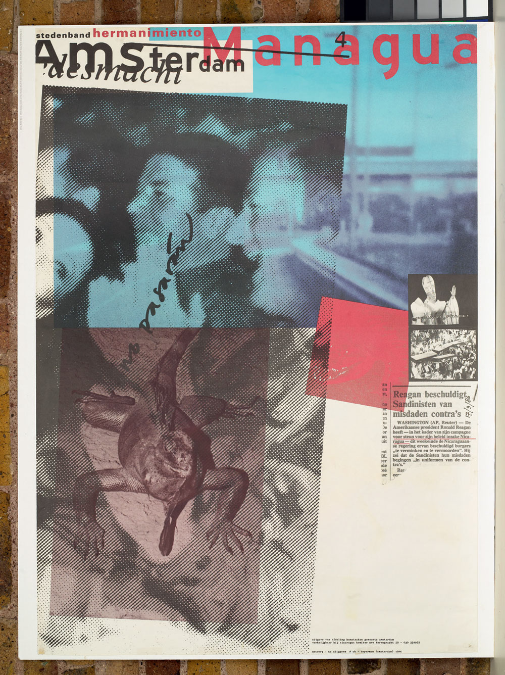
In his design of this poster, the Dutch graphic designer Ko Sliggers succeeded where many other self-indulgent collagists of the time (from the mid-1980s to the early 90s) fell short. The idiom of collage was extremely popular and it was a time when hordes of graphic designers, myself included, were at pains to make design apparent in their work – resulting in much that was earnestly complex and overwrought.
Sliggers, however, was creating striking work that appeared to come together without evidence of much design. This poster’s visual power lies in the apparent carelessness of its haphazard arrangement: the overlapping imagery, the colliding type – all of which seem to be about to fall off the poster’s edges. All the images are raw, used as found, and betray the media from which they are appropriated: for example, the coarse newspaper halftone of Ronald Reagan and the priest photographed from a television screen. This is a method for harnessing the political charge that images carry and perhaps shows the influence of designer-educator Jan van Toorn, with whom Sliggers was working at about the same time.
This poster can be viewed as a rare example of the kind of work that Van Toorn has been pleading for from graphic designers for the past twenty years or more. That the designer should take advantage of their privileged position as a communicator and use their client commissions to propagate their own contrary points of view in a world media that is dominated by just a few corporate voices.
Sliggers, who during the 1990s took a five-year break from design to work as a chef (and now runs a restaurant in Burgundy, where he also designs typefaces), was more interested in expressing his own opinions than he was interested in design itself. So what was he trying to say through his apparently arbitrary selection of elements – images that produce such strange juxtapositions as an iguana and President Reagan, or a priest and a petrol station (the blue image in the background)?
First of all, it is important to point out that his client was Gemeente Amsterdam, the city’s municipal governing body, and, typical of many Dutch government institutions, a sincere patron of graphic design. Its brief called for ‘a very personal interpretation of the subject.’ The subject was the twinned cities of Amsterdam and the Nicaraguan capital, Managua.
During his research into the subject Sliggers found out that the future of development projects in Managua (instigated in Amsterdam) was being threatened by terrorist attacks carried out by the Contras – the US-backed anti-Sandinista government counter-revolutionary group. He also discovered evidence to suggest the increasing popularity of socialism under the Sandinistas was leaving the Nicaraguan Roman Catholic church very worried about its waning influence over the people.
So why the iguana? The explanation is that iguanas are native to Nicaragua, and iguana stew is a popular dish with which Nicaraguans fortify themselves during Lent when the Catholic church restricts the consumption of red meat. The handwritten words ‘no pasarán’ (‘they shall not pass’), used by the Sandinistas, is an international anti-fascist propaganda slogan made famous by its use during the Spanish Civil War.
Sliggers recalls that ‘in the original design I added a comment of my own which criticised the dubious role of the US. This text was censored by the city council of Amsterdam. Instead of this text I added a newspaper article with similar import – Reagan accusing the Sandinistas of crimes against the Contras.’
Sliggers brings all these jarring ingredients to the mix but stops short of defining his own point of view. It is not too hard to guess where he stands, but the enduring visual interest of this poster could be down to the work one has to do in order to piece his thoughts together. And it is a pleasure.
Top: ‘Stedenband [town twinning] Amsterdam Managua’. Design: Ko Sliggers, 1986. Dimensions: 595 x 420mm and 1180 x 840mm, offset litho.
First published in Eye no. 68 vol. 17 2008
Eye is the world’s most beautiful and collectable graphic design journal, published quarterly for professional designers, students and anyone interested in critical, informed writing about graphic design and visual culture. It is available from all good design bookshops and online at the Eye shop, where you can buy subscriptions and single issues.

