Winter 2008
It’s about time

From a technical viewpoint, digital photographic images can be every bit as good as film. The difference is in the way we think about them

Is digital photography as good as film? In a sense this is really no longer the issue – from a technological point of view, most of the long-running arguments have been won. Using good, top-of-the-range lenses and camera backs, pretty much everything you might have wished to do with film can be replicated using digital files, which are big enough to capture every nuance. Furthermore, you can do it all more quickly and efficiently – the so-called ‘dry darkroom’ has set many photographers free. The significant difference, in the process and in the end result, is the time factor. And here, the jury is still out.
The key to this difference is the apportioning of time, before the conception of the final image, and again between conception and realisation. Time has always been integral to the way photographers deal with their subject matter and how it is lit; and to the processing and printing of the final image. With digital, most of this time is given to post-production; the picture-taking becomes a smaller proportion of the process. To produce the picture intended, particularly with portraiture, analogue demands more knowledge and understanding from the photographer.
An understanding of light (whether natural or electric) is fundamental to image-making. Though digital cameras and post-production software cannot yet make aesthetic decisions, they do effectively – and ‘by default’ – make key technical decisions about lighting, which can nevertheless deliver perfectly acceptable images. Yet for the many photographers who believe light to be the element that evokes emotion – a core part of one’s image-making vocabulary, rather than a constraint enforced by the technology – this can be a problem.
However, new styles often emerge from such visual and technical ‘illiteracy’ – most effectively when content overrides aesthetics. Sometimes a digital snap is all that will be needed to convey the information necessary, even if such an abbreviated, money-saving approach may soon usher us into a visual and cultural desert.
Printing is the area where the photographer has regained both time and control. Whether you are using a high-res scan from a transparency or a file from a simple digital camera, this aspect of the digital revolution is possibly the most liberating, at every level. Proficiency in the subtleties of Photoshop, the ability to manipulate colour images in a ‘dry’ darkroom, has opened a revelatory layer of image control simply not available in the traditional ‘wet’ darkroom. From subtle tint changes to the complete removal of unwanted objects, this control represents a major shift in practice for professionals, who previously had prints made elsewhere, at a lab, sometimes even by a particular printer with a certain style.
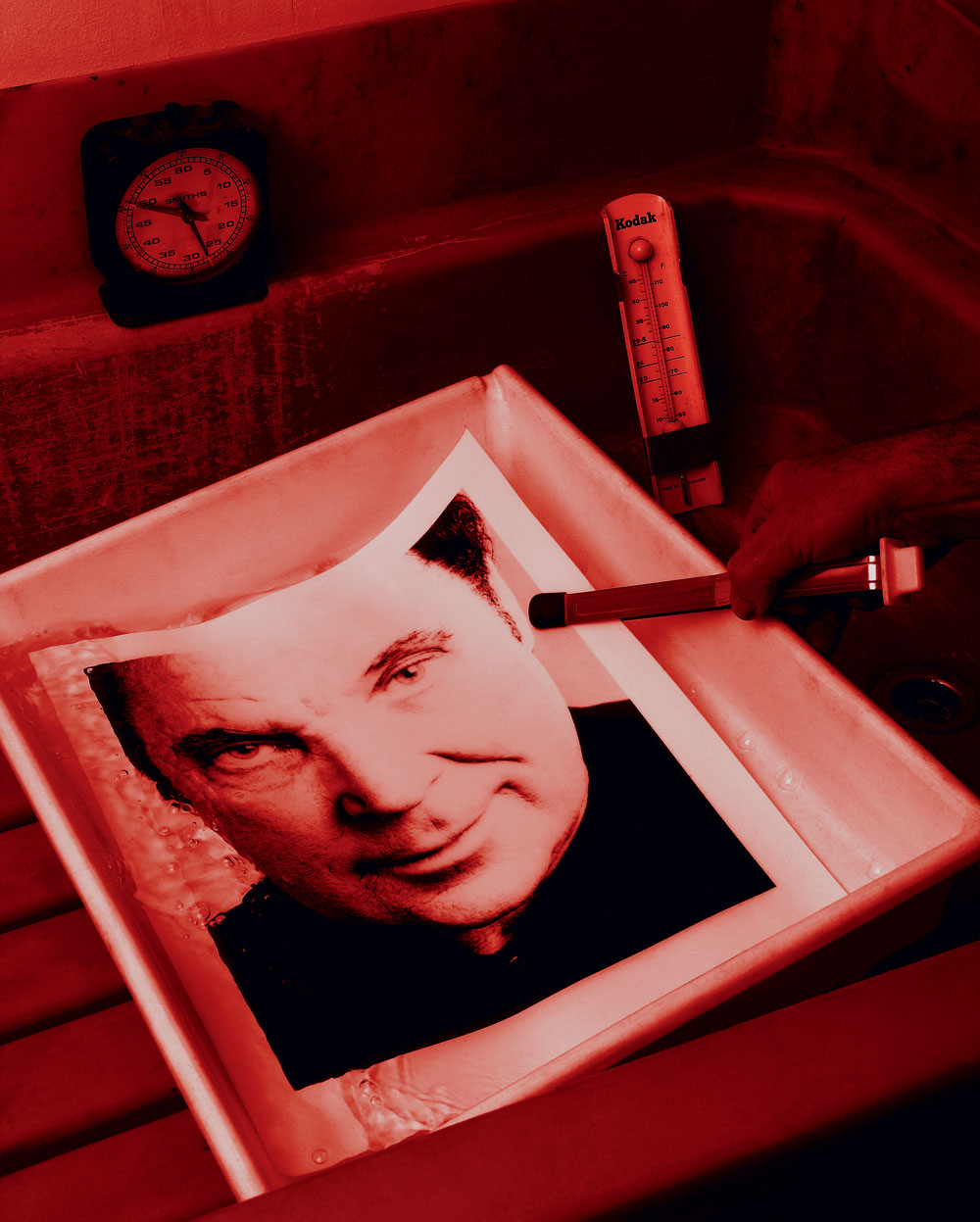
Black and white is quite another matter. Digital b&w images often have almost too fine a tonal range, making them slightly sterile, sometimes too hyper-real. Moving one’s hands under an enlarger – dealing directly with light and time – is an intuitive process, with (to date) no equivalent in digital black and white printing.
Perhaps unexpectedly, the move from analogue to digital has had significant implications for lens choice. German and Japanese lenses have always been different: the former (for example, Carl Zeiss lenses) are supremely sharp while remaining subtle, while the latter tend to rely more on contrast, making their images appear sharp and punchy, which suits the digital image.
Post-production software makes up the difference. If you are working in natural light on a dull day, the final image, with a digital camera, will rely heavily on the contrast of the lens and post-production software to render it acceptable. Shoot the same scene with transparency film and a German lens, and there will be a noticeable increase in information in the more subtle areas, such as partial shade. (Actually, another factor here is the manner in which our expectations may have been dulled by contemporary monitors and flatscreen televisions, which deliver ‘grabby’ imagery that can lack subtlety because of the reduction in mid-tones.)
Students have traditionally been given a camera with just one lens to begin with, ensuring they think (and therefore learn) more. The discipline of having to create the final image ‘in camera’ necessitates a level of knowledge that brings the photographer close to the image-making process. A zoom lens can and does make one lazy – being able to compose an image and change the composition from one spot may seem like a godsend, and is sometimes a necessity for sports photographers, but it can profoundly affect one’s interaction with the subject matter. With a prime lens (that is, one with a fixed focal length) the photographer must spend more time positioning him or herself physically in relation to the subject.
Ultimately, tools are only ever as good as their user. When there are fewer constraints, as there are with digital, it is the user’s responsibility to be disciplined. Freedom is often a good thing, of course, but it presents the photographer with a dilemma, not unlike the choice between Art and Graphic Design. A graphic designer is expected to come up with good work working within tight constraints; in art, where anything goes, the weak link may well be the human element. Training and technique are important, but photography is hardly tree-surgery – my other profession – and bad photographs rarely cause injury.
Anthony Oliver, photographer, tree surgeon, Kent, UK
First published in Eye no. 70 vol. 18 2008
Eye is the world’s most beautiful and collectable graphic design journal, published quarterly for professional designers, students and anyone interested in critical, informed writing about graphic design and visual culture. It is available from all good design bookshops and online at the Eye shop, where you can buy subscriptions and single issues.

