Summer 2021
Jacqueline Casey. Science and design

Jacqueline Casey was instrumental in developing what became known as the MIT Style. By Elizabeth Resnick

When the United States entered the Second World War, after the bombing of Pearl Harbor in December 1941, traditional roles for women changed forever as women began working outside the home while the men were away at war. Women who had held jobs before the war were now allowed to fill positions that were better paid than those previously available to them. This combination created more work opportunities for women well into the 1950s, and one young woman who directly benefitted from this was graphic designer Jacqueline S. Casey (1927-92).
Casey was born Jacqueline Shepard on 20 April 1927, in Quincy, Massachusetts, the only child of Helen Kingston and Roy Shepard, a working-class couple who struggled to make ends meet. Later, her mother married George Barkas and Jacqueline took her stepfather’s name. (At 21, she changed her name back to Shepard.)
By several accounts Casey was a committed school student, shy but blessed with a sense of humour. She attended Boston Girls’ High School, where students were required to choose a major. Though she was determined to become an artist, her parents insisted her major be in bookkeeping and administration services, and she persevered in spite of being forced to specialise in a subject she did not like. (Later she wrote: ‘My parents tried to thwart my wish to be an artist as much as possible.’) She was elected senior class president and graduated at the top of her class on 6 June 1945, just months before the formal ending of the Second World War.
Studying art in Boston
In September 1945, Casey prevailed over her parents’ objections by enrolling at Massachusetts School of Art – a state-funded college in Boston, now known as Massachusetts College of Art and Design. Now free to explore artistic practice, Casey thrived. Following a formative studio foundation year, she majored in Fashion Design and Illustration intending to work professionally after graduation. ‘I loved fashion and clothes. I followed all that stuff,’ she said in an interview in 1973.
To help pay for art supplies and expenses, she worked as a bookkeeper and cashier at Art School Associates, the college’s art supply and bookstore, becoming friends with fellow student then known as Candy Cooper, but better known as the pioneering designer Muriel R. Cooper (1925-94), of whom more later. Describing their time together, Cooper wrote: ‘Jackie and I both went to Mass College of Art in the late 1940s. We were cashiers in the school store, both eventually becoming bookkeepers – first Jackie and then me. We learned more in the store that we did in school. When the store would close in the afternoon, the students who worked there – about a dozen of us – had the studio to ourselves, and our little bin of paints and papers and materials.’
Casey graduated with a certificate in Fashion Design and Illustration in 1949, and a Bachelor of Fine Arts degree a year later. In the 1950s, both fashion design and fashion illustration were considered narrow specialisations and there were few existing full time opportunities. Casey supported herself with a variety of jobs while accepting freelance assignments in fashion illustration, despite becoming increasingly disillusioned with the fashion world: ‘I tried working as an illustrator, but I didn’t like the whole fashion thing. The values weren’t interesting enough for me. I was the production manager of Boston’s version of Women’s Wear Daily. I worked there for two and a half years, but there was no-one there that knew more than I did, so I never learned anything.’ She also worked as an interior decorator for six months.
In 1951, John I. Mattill (1921-2019), an administrator at Massachusetts Institute of Technology’s News Office, established the Office of Publications to centralise and manage the expanding volume of communications across the Institute. The Office provided writing and editing services in addition to giving these materials visual form. ‘Effective writing is not enough,’ said Mattill in a published interview in 1956. ‘Visual presentation does many jobs that words cannot. Typography can add a perspective of atmosphere, environment, and attitude which no publication can treat with indifference. So design becomes an essential partner in virtually all our undertakings.’
Environment of good ideas
In early 1953, Mattill hired Muriel Cooper – the first office staffer responsible for graphic design. Cooper had been recommended by Mattill’s MIT colleague György Kepes (1906-2001), who had taught visual design in the Department of Architecture since 1945. As the Office’s workload grew, Mattill hired Casey in 1955, on Cooper’s recommendation. In a published interview many years later, Casey recalled: ‘I had always known Muriel and admired her. She offered me a job, a temporary job, to come and help her during the busy season, which in the old days meant 30 to 40 special summer programmes, each one a design project. Although I never studied graphic design, I wanted to know how to do something. So I accepted her offer. I just stayed on and on and on.’
Both women worked four full days in the Office, sometimes collaborating on a single project, but more often, they would alternate on incoming projects. Mattill gave them both a free hand to work within a contemporary design style for all MIT’s books, folders, and catalogues. In describing the general working atmosphere in the Office, Mattill suggested that both designers enjoyed working within the MIT scientific environment because it was receptive to good ideas. Once the concepts for projects were defined, each designer was free to translate the idea into print using ‘good design judgment and good taste’. By early 1957, Cooper was ready for new challenges. She applied for a Fulbright fellowship to travel and study in Italy, and left the Office in September 1957. She returned to Boston in March 1958 because of an illness in her family and freelanced before becoming the first design and media director of MIT Press in 1967.
In Cooper’s absence, Casey recommended Ralph Coburn (1923-2018) join the Office after she visited an exhibition of his geometric abstract paintings on display in a Boston gallery. Coburn had studied architecture as an undergraduate at MIT in the early 1940s before leaving to pursue his passion for painting. He was an established minimalist and a driving force behind the founding of the Institute of Contemporary Art in Boston. Although not trained as a graphic designer, Coburn accepted the position because it provided him with financial security and a creative work environment.
Jacqueline Shepard became Jacqueline S. Casey in 1958 upon her marriage to William ‘Bill’ Casey. A gregarious, prickly, in-your-face personality, Bill Casey was a psychologist affiliated with a local social work organisation who worked from an office in their art-filled Brookline home.
In the late 1950s, Mattill initiated an innovative visiting programme for designers from Europe. His reasoning was pragmatic: he wanted to introduce Europe’s progressive design influences into the MIT culture. The idea was that invited designers would come for five months, from January to May, to tackle the crush of design work needed to advertise the MIT summer session courses. In the process, the MIT design staff would learn by working alongside them. In a 1977 interview, Casey said: ‘We went through a series of visiting designers, but I would say that Ralph and I were most influenced by a Swiss girl. It was really then that we started thinking about the grid and design in the Swiss style.’
The young Swiss designer with impeccable design credentials was Thérèse Moll (1934-61), see Eye 98. Thérèse ‘was the critical visitor,’ said Casey. ‘She introduced the Office to European typography. She had been well trained in the design of modular systems. This use of proportions in designing publications series became a useful tool for developing MIT’s image. Although much has been modified by time, technology, and the work of other designers in the Office, the basics that Thérèse brought with her are still operating today.’
Moll had studied with Armin Hofmann (1920-2020) and Emil Ruder (1914-70) at Allgemeine Gewerbeschule (AGS), now known as the Schule für Gestaltung Basel / Basel School of Design, from 1949-54. Moll had worked as an assistant at Studio Boggeri in Milan, and had joined Karl Gerstner’s atelier from 1954-56 upon her return from Italy, and from 1957-58 at Geigy Pharmaceuticals, where she designed some of her best work before leaving for MIT in early 1959.
There is no doubt that Casey and Coburn were creative and talented individuals, but they lacked educational training in the fundamentals of typographic design. Although Casey was able to apply the principles of the ‘Swiss’ style acquired from carefully studying international design publications, it was Moll who brought the concept of the modular typographic grid. ‘I was influenced by the Swiss,’ said Casey. ‘I certainly grew up in art during the time of hard-edge painting and abstraction. When I finally understood about typography, it came together very nicely.’
Grid of invention
In a short essay for the ‘MIT/Casey’ exhibition she organised in 1989, designer and curator Ellen Lupton wrote: ‘The grid and other restricting parameters, such as a fixed set of typefaces, constitute a system within which the designer works, rather as one might speak through the rules of a language. Whereas some designers see the grid as impersonal and mechanical, Jacqueline Casey has used it in her work as a means for invention.’
Casey said: ‘For me, it was a nice combination of two cultures: the American interest in visual metaphor on one side and on the other side, Swiss planning, fastidiousness, control over the concept and technical execution. No more Russian roulette, where the designer throws elements on a two-dimensional surface and pushes them around in hopes that all will turn out right in the end … It is important to have a process in which logic determines where things are placed.’
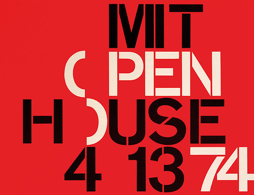
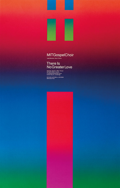
To this rational design methodology – typified by the use of a grid, sans serif typefaces, and abstracted imagery – Casey added her playful sense of visual metaphor and wordplay in the posters and other materials she created to publicise MIT events and exhibitions during the 1960s, 70s and 80s. She used the Swiss-designed typefaces Helvetica and Univers almost exclusively to create both visually and verbally compelling typographic compositions. Casey exemplified what came to be labelled the ‘MIT Style’, which relied on bold geometric forms, contrasting planes of colour and high-contrast dense type compositions designed to stand out on already cluttered university bulletin boards.
In many of her posters, a typographic image forms the core of a message, often prominently placed in a visual hierarchy through its size, placement, and colour. The 1972 poster for the MIT ‘Faculty-Student Exchange Program’ is an excellent example of the way space and order are vital to the design. There are two ways to view this playful visual gestalt: a meticulously cropped white ‘x’ with three different coloured triangles (red, blue, and black) that define the negative space, or three coloured triangles organised as such on a white field to shape a white ‘x.’ Either way, the ‘x’ represents the word ‘exchange’ while the position of the coloured triangles draws the viewer’s eye to the centre of the composition, affixing meaning.
In Casey’s 1982 poster ‘Body Language’, the letters that spell out the title are placed on a black background and highlighted by a light source, making them appear three-dimensional. These monumental letterforms possess both scale and physicality, insinuating possible life-size ‘figures’. The overall effect produces a dynamic visual pattern that seduces the viewer while enhancing the message.
‘Invited by the Shoshin Society (also known as the Hiroshima Appeals peace campaign) to commemorate the 40th anniversary of Hiroshima’s bombing, ‘Russia, USA Peace, 1985’ is one of the few posters Casey created outside of the MIT community. The predominantly black poster has a clear gloss varnished image of the planet Earth in the upper right-hand corner. Casey employs wordplay – the ‘USA’ nestled within the word ‘RUSSIA’ – and uses colour (red and white) to separate the two superpowers. The lettering is placed at the base of the poster with the letters ‘R’ and ‘A’ extending off the trim edges, visually pleading for a continuing peaceful coexistence.
‘MIT is a source of design inspiration’
The increasing workload necessitated hiring a third full time designer; Dietmar Winkler, born 1938 and educated in Germany, joined the Office of Publications in 1965. Winkler was a decade younger than Casey and Coburn and served an essential role by producing sophisticated ‘European’ design for MIT clients. He shared his knowledge of designing with typography, print-production methodology, and offset-printing techniques. ‘My design training and job experience – practising typography in the real world rather than relying on theoretical interpretations from books or Swiss design example – may have put me ahead for a moment, but both Jackie and Ralph caught up quite quickly. Ralph, with his background in architectural design, was quite comfortable experimenting with more complex typographic systems. Jackie, on the other hand, inferred her typographic structures from the organism within the most critical component, letterform, or image. When it came to complex text environments like books and pamphlets, she used straightforward geometric systems like Müller-Brockmann’s grid.’
The MIT community was considered progressive in many aspects, yet the pay scales would have reflected that women received less money than their male counterparts in similar positions. So Casey’s salary was meagre even when she assumed the role of Director of Design Services in 1972. Casey was well aware of prevalent institutional inequality, yet, her bond with MIT only intensified in 1975 after her husband Bill died of cancer. Deeply saddened by his death, MIT filled the void: ‘I can just walk around and immerse myself in knowledge. It is a cultural sanctuary. When you come right down to it, everything that happens at MIT is a source of design inspiration. It’s where all the material for my designs comes from.’
Celia Metcalf, a graphic designer who worked directly with Casey from 1984-89, described Casey as a ‘humorous, imaginative, intelligent woman and a tenacious leader. She was passionate about design excellence, and at times would stay in her office for days. She craved privacy during her creative spurts, and all her energy went into one project at a time. Her greatest strength as a designer was in cultivating a publications office where art and design were integral to the educational process. The poster became an important means of communication at MIT.’
In one of her many published interviews, Casey is quoted as saying ‘my objective was to design a product with an accurate visual and verbal message that could be understood by the audience. I measure my success as a designer when the work is displayed in offices and dormitories on and off the campus when the event is a memory.’ Casey also understood that she could build public recognition for her work outside of the MIT community by entering annual design competitions and submitting her work for publication in magazines and books, and for public exhibitions.
Muriel and Jackie
Jacqueline Casey’s career path was closely linked to her friendship with former MassArt classmate Muriel Cooper. As close friends, their lives intertwined both professionally and personally; they were neighbours in nearby Brookline. When Cooper made the transition from designer to teacher and researcher, forming the MIT Visual Language Workshop in 1974, Casey strove to understand the significance of the emerging design technologies and how they could fit into her work.
Casey was diagnosed with cancer in 1982 and struggled to keep pace with the workload in the Design Services office. Her staff became very protective of her and covered her health-related absences for as long as they could. But by February 1989, she was forced to retire. Knowing that her friend would be devastated by the loss of her position, Cooper arranged for Casey to join to the MIT Media Lab as a visiting design scholar. She was given her own office space with a computer. She was available to interact with Cooper’s graduate students and she worked on several projects while in residence at the Media Lab. In 1989 Cooper was an influential member of MassArt’s Board of Trustees. She nominated Casey for an honorary doctorate of fine arts. The award ceremony took place at the college on 23 January 1990, adjacent to an exhibition of her poster work installed in the President’s Gallery. Casey died from cancer on 18 May 1992 at the age of 65. In eulogising her dear friend, Cooper wrote: ‘The spirit of MIT nurtured her work and, in turn, her work nurtured the humanity of MIT.’
Thank you to Dietmar Winkler who provided detailed information on Casey’s personal and professional life. Thank you to Kevin Keane, Celia Metcalf, David Small and Michelle Fineblum for their contributions to this article.
One of two poster designs – black on red background and vice-versa – for ‘MIT Open House’, 1974. 559 x 432mm.

Poster for gospel concert, ‘There is no greater love’, featuring the MIT Gospel Choir, 30 April, 1988. Casey loved experimenting with different printing techniques. Casey’s colleague Dietmar Winkler introduced her to the striking ‘split-fountain’ effects used in this poster. 560 x 880mm.

Photobooth self-portrait of Jacqueline S. Casey (right) with her former MassArt classmate and MIT colleague Muriel Cooper in Boston, Massachusetts, early 1960s. Muriel R. Cooper Collection, courtesy of Massachusetts College of Art and Design Archives.

Elizabeth Resnick, design educator, curator, writer, Massachusetts, US
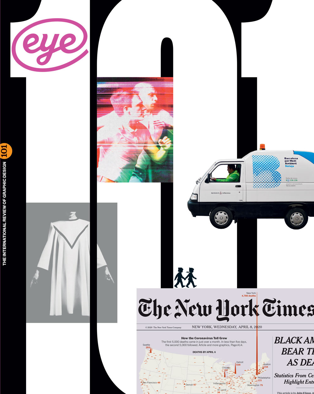
First published in Eye no. 101 vol. 26, 2021
Eye is the world’s most beautiful and collectable graphic design journal, published for professional designers, students and anyone interested in critical, informed writing about graphic design and visual culture. It is available from all good design bookshops and online at the Eye shop, where you can buy subscriptions and single issues.

