
Spring 2016
Killing joke at the expense of history
Swissted’s typographic homages turn Modernist design history into hollow commodities for a new ‘blank generation’
Mike Joyce’s Swissted re-presents the textual contents of classic gig flyers as posters reminiscent of the International Typographic Style. Since debuting as a website in 2012, the project has grown to become an online retail store, the subject of exhibitions, a popular book, and a frequent choice of essay topic for students wishing to write about anything from Modernism to colour theory at London College of Communication, where I teach.
In the foreword to the book Swissted: Vintage Rock Posters Remixed and Reimagined (2013), Steven Heller praises Swissted as one of the most engaging homages that he has ever seen, a sentiment widely shared from the evidence of the enthusiastic endorsements to be found on many design and music blogs. The flyers are ‘re-imagined’ to honour the ‘independent spirit’ of both Swiss graphic design and the bands featured. [1] But when these posters are hung on the walls of designers and music fans, or circulated online, what do they represent? My view is that Swissted, far from celebrating its subject matter, guts the meaning from history in order to sell its hollow shell as a commodity – and further, that the project’s enduring popularity raises questions about the internet’s relationship with design history.
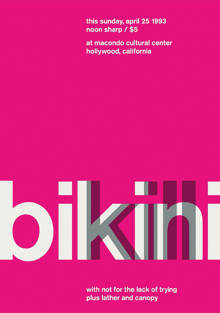
There are more than 200 Swissted posters by now, each mimicking modernist mannerisms historically associated with Swiss designers such as Armin Hofmann, Hans Neuberg and Josef Müller-Brockmann. It’s difficult however, not to feel that the designs are anything other than a ‘blank parody’, to recall Fredric Jameson’s definition of pastiche. [2] If we consider the Bikini Kill poster for example, which appears to be arbitrarily based on the layout of Müller-Brockmann’s famous Der Film poster, there does not appear to be much that connects its subject matter and form, besides a worrisome suspicion that it is pink because the band is female. In order to acquire meaning, the poster must be considered within the context of all the other posters, but the featured bands are far too varied to contain anything that might bind them sensibly, that would legitimise their blanket recasting within Swissted’s visual palette. The shows are ‘punk, hardcore, new wave, and indie rock’, which is to say, basically, anything: from the startling intensity of Minor Threat to the flamboyance of Ziggy Stardust era Bowie. Hundreds of diverse artists are thus herded under the banner of something like ‘alternative cool’, the rich variety of meaning associated with their music negated by its incarceration within a lifeless pastiche. The project treats both design and music history as entirely disposable: design is no more than style, and style can be imitated with scant consideration of its original context and function; equally, a gig flyer linked to a specific time and place can be extracted from that context, ‘minimalised’ and sold for up to 150 dollars.
A defining feature of postmodernism and consumer culture for Jameson is ‘the disappearance of a sense of history’, whereby our social system has lost its ‘capacity to retain its own past, has begun to live in a perpetual present…’. [3] Though articulated in 1982, this view feels timely, as if anticipating our current circumstances amidst the exponential development of the internet, which is dramatically rewiring our relationship with history. Could there be a more apposite term to describe the feeling of being online nowadays than as the experience of the ‘perpetual present’? Computer scientist David Gelernter has described how streams of real-time narratives, or ‘lifestreams’ on social media have become the ‘dominant organising paradigm for new data on the web today’, predicting that before long ‘we will think of the Cybersphere as information ordered by time, not scattered in space … as an enormous, fast flowing river of information roaring backwards into the past.’ [4]
Jameson already viewed the media of the 1980s as an agent of ‘historical amnesia’, due to its ability to relegate ‘historical experiences as rapidly as possible into the past’. [5] Might it be possible now that the frequently overwhelming volume and complexity of new information that we are flooded with daily online, will further sever us from our sense of history?
In a Print article entitled ‘Design History’ (2003), Steven Heller laments his realisation that ‘despite all its accomplishments, the contemporary design world is afflicted by a deep vacuousness’, calling for a more thorough integration of history programmes in design schools that encourage students to understand ‘the intertwining, ongoing influences of design, art, politics, culture, and technology.’ [6]
In the context of the history of Swiss graphic design, a book such as Richard Hollis’s meticulously assembled volume Swiss Graphic Design: The Origins and Growth of an International Style 1920–1965 (see review in Eye 60) would be a model for such a course of study – it treats history within that framework exactly, it states that history is complicated. But it’s difficult to imagine how such a book will find a future online. Everything about it – from the content of the main text, to the captions and the way that the layout functions – requires a patient, attentive form of reading, of exactly the kind that the internet presently discourages, and it is the internet that currently looks set to determine the future reading habits of many people.
Yet for the author Will Self (in a 2014 essay for Writers’ Centre Norwich and Cheltenham Literature Festival) the majority of those now considering the impact of digital technology on literacy have already missed the boat: the young are in the process of developing a relationship to reading that bears little resemblance to the one that print-nourished readers understand, and it is only a matter of time before our ‘Gutenbergian’ (from McLuhan) methods of interpreting culture become permanently antiquated. [7]
Distressing as this forecast may sound for those with a fondness for such interests, I suspect that many involved in teaching on a design course in the last few years would find that the argument holds some resonance. Books appear to be fast becoming an anachronism for students, they no longer hold primacy in their minds as a source of knowledge. Heller calls for designers to learn more about history, but the internet is where students learn most about history now – the same visual space where they also conduct all of their other day-to-day activities, amid the ‘lifestream’ that meshes all information together, prioritising updates, hashtags, and the viral, above all else.
It’s difficult to imagine Swissted without the internet, where Joyce’s superficial interpretation of history fits neatly within the logic of communication restricted to 140 characters: ‘It’s colorful, it’s print, it’s typography, it’s rock and roll. It’s #SWISSTED!’, ‘Fine Art for Font Nerds. Rock posters with a Swiss modernist spin.’, ‘A mash-up of punk + swiss design for your eyes #swissted #design’, to pick out just a few comments from Twitter. The Swissted website layout is very much attuned to the present moment, also – a wall of scrollable images with minimal textual content, similar to that of a Google image search, or the visual displays on Pinterest. Appropriately enough, the top results of a Google search for ‘Swiss Typography’ currently return more Swissted images than any other images of Swiss graphic design, perhaps because popularity is among the criteria through which Google sorts information. But the Google image search is the ultimate context stripper. It juxtaposes content drawn from innumerable sources, suspends their connection to the world of things and alternatively presents them as a grid of pure visual surface. A trained eye will be able to interpret this surface, to locate meaning within it, but for those without that level of understanding (particularly students?), its efficiency and technological authority suggests that the meaning is already fully present in the arrangement in front of them. Search = answer.
In the chorus of the song ‘Blank Generation’, Richard Hell (of the band Television, featured in Swissted) repeats the lines ‘I belong to the blank generation and I can take it or leave it each time’, except that on the second time, he pauses to leave out the word ‘blank’, which reads on the album artwork as: ‘I belong to the ______ generation, and I can take it or leave it each time.’ Whether Hell’s ‘blankness’ refers to a feeling of vacant detachment from the reality of the world, or whether this blank space signifies an area to be filled with whatever identity one chooses, I feel it’s an appropriate lyric to borrow from. Swissted is detached from the reality of its subject matter and, like Hell’s omission (but without the potentially positive implications), has hollowed out the substance of its own content, in order to ‘re-imagine’ both its subjects as products to be sold to an audience who are only interested in surface readings, in what is presented immediately via the internet, in design that has no meaning beyond its own popularity. All of the vacuousness that Heller is concerned about can be found in abundance here – Swissted is graphic design for the Google image search generation, the new ‘blank generation.’
The study of graphic design history is impoverished without access to its original artefacts, but as these are frequently difficult to obtain in a classroom scenario, serious scholarship on the subject – well researched, written, edited, illustrated and designed – provides a vital support for learning. This kind of material generally finds its best articulation in print, while the internet, for all its vast educational potential, does not yet appear capable of supplanting these combined qualities, nor of competing with the more holistic quality of learning experience that sustained engagement with print provides. This is not a nostalgic position, but one borne of practical concerns – taking into account not only the still often superior quality of print content, but also other important considerations such as the immersive nature of non-hyperlinked reading (vital for in-depth study and critical reflection) and the implicit educational value present in individually designed objects that are visually distinct from one another. There is also an argument for the worth of these objects as physical embodiments of historical moments in time (even when just a few years old), as opposed to the endlessly recycled, reposted and editable sources found online.
We must find ways to facilitate re-engagement with these non-digital sources in post-internet classrooms. The question is how to do this without appearing reactionary: efforts must constructively accommodate all aspects of the all-pervasive digital context that we find ourselves in, exposing the deep problems currently inherent in internet-only based reading and research, while at the same time taking advantage of the internet’s powerful capabilities to develop new ways to learn. How this is to be achieved I do not know yet. But if we let the internet drive the interpretation of design culture within a framework in which quantity, frequency and ease of access consistently trumps depth, then we might well be concerned for the level of historical awareness that graphic designers will display in future.
Notes
1. Mike Joyce, Swissted: Vintage Rock Posters Remixed and Reimagined (United States: Quirk Books, 2013), p. 05.
2. The full passage reads: ‘Pastiche is, like parody, the imitation of a peculiar or unique style, the wearing of a stylistic mask, speech in a dead language: but it is a neutral practice of such mimicry, without parody’s ulterior motive, without the satirical impulse, without laughter, without that still latent feeling that there exists something normal compared to which what is being imitated is rather comic. Pastiche is blank parody, parody that has lost its sense of humor…’ Fredric Jameson, ‘Postmodernism and Consumer Society’, in The Anti-Aesthetic: Essays on Postmodern Culture, ed. Hal Foster (Washington: Bay Press, 1983), p. 114
3. ibid., p. 125
4. David Gelernter, ‘Cyberflow’, OpenMind https://www.bbvaopenmind.com/en/article/cyberflow/
5. Jameson, p. 125
6. Steven Heller, ‘Design History’, Print, September / October, 2003
7. Will Self, ‘The Fate of Our Literary Culture Is Sealed’, The Guardian, 4 Oct 2014
Top: ‘Bikini Kill’ poster by Mike Joyce from Swissted, 2013, courtesy Quirk Books.
John-Patrick Hartnett, designer and lecturer, London
First published in Eye no. 91 vol. 23, Spring 2016
Eye is the world’s most beautiful and collectable graphic design journal, published quarterly for professional designers, students and anyone interested in critical, informed writing about graphic design and visual culture. It is available from all good design bookshops and online at the Eye shop, where you can buy subscriptions, back issues and single copies of the latest issue.You can see what Eye 91 looks like at Eye before You Buy on Vimeo.